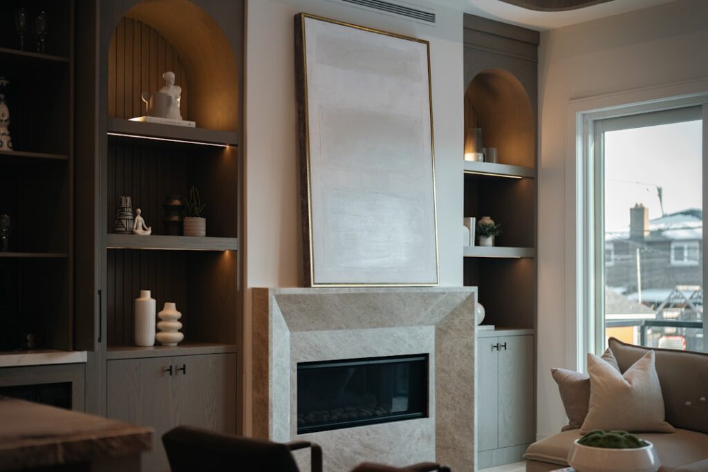
Pure white can feel sterile, and beige has fallen out of fashion — but light cream color occupies the warm, inviting middle ground that works in virtually every room and design style. Cream adds just enough warmth to feel welcoming without the yellowish cast that made beige kitchens and living rooms look dated. Choosing the right shade requires understanding undertones, testing in your specific lighting, and pairing with materials that complement rather than clash.
Top Light Cream Paint Colors
- Benjamin Moore White Dove OC-17: The most popular cream in design circles. Barely-there yellow-gray undertone that reads as a warm white. Works in any room, any lighting
- Sherwin-Williams Alabaster SW 7008: Slightly warmer than White Dove with a subtle yellow-beige lean. Beautiful on cabinets and trim
- Benjamin Moore Swiss Coffee OC-45: A touch deeper than White Dove. More visible warmth — reads definitively as cream rather than warm white
- Farrow & Ball White Tie No.2002: Rich, complex cream with depth. Premium price ($110/gallon) but exceptional coverage and color consistency
- Sherwin-Williams Creamy SW 7012: True to its name — a clean cream without gray or pink undertones. Warm and approachable
- Benjamin Moore Navajo White OC-95: Deeper cream approaching light beige. Cozy and traditional, particularly effective in dining rooms and bedrooms
Understanding Cream Undertones
Every light cream color has an undertone that becomes more visible on large wall surfaces. Yellow undertones feel sunny and warm but can look dingy in rooms with limited natural light. Pink or peach undertones add warmth that flatters skin tones in bathrooms and bedrooms. Gray undertones keep cream feeling modern and prevent it from reading as dated beige.
The same cream paint looks different on every wall. North-facing rooms receive cool, blue-tinted light that amplifies gray undertones and mutes yellow ones — choose a slightly warmer cream for these rooms. South-facing rooms get consistent warm light that amplifies yellow undertones — a cream with a gray lean balances this effect. Test a sample in your actual room and observe it at morning, midday, and evening before committing.
Where Light Cream Works Best
Cream is one of the most versatile colors in residential design. It works as a primary wall color in living rooms and bedrooms where white would feel cold. On kitchen cabinets, cream softens the space and pairs more naturally with wood tones and warm countertops than pure white. As trim color against white or gray walls, cream adds subtle warmth and visual depth that bright white trim lacks.
- Whole-house color: Use the same light cream color throughout for a cohesive, flowing feel. Works especially well in open floor plans
- Kitchen cabinets: Cream cabinets pair with quartz, granite, and butcher block countertops without the stark contrast of white
- Trim and molding: Cream trim on gray, blue, or green walls adds warmth at the transitions
- Ceilings: A cream ceiling feels lower and cozier than white. Best in rooms with tall ceilings where intimacy is desired
- Exterior siding: Cream exteriors with white trim create a classic, elegant facade that suits colonial, craftsman, and farmhouse styles
Pairing with Other Colors
Light cream color provides a warm neutral foundation for a wide range of accent colors. Blue (from navy to powder) creates the most popular pairing — cream walls with blue accents feel both classic and fresh. Green (sage, olive, or forest) pairs naturally with cream for an organic, nature-inspired palette. Warm metals (brass, gold, copper) complement cream’s warm undertones, while cool metals (chrome, nickel) create a pleasing warm-cool balance.
Avoid pairing cream with stark bright white on the same surface — the cream will look dirty by comparison. If your trim must be white, choose a warm white (such as Benjamin Moore Simply White OC-117) rather than a cool white to maintain visual harmony across surfaces.
Paint Finish Recommendations
The paint finish affects how light cream reads on the wall. Flat or matte finishes absorb light and produce the richest, most velvety appearance — ideal for bedrooms and ceilings where washability is less critical. Eggshell ($35-$45 per gallon for premium brands) provides slight sheen with good washability and is the standard choice for living room and dining room walls.
Satin finish works best in kitchens, bathrooms, and hallways where moisture resistance and easy cleaning matter. Semi-gloss ($40-$50 per gallon) suits trim, doors, and cabinets where durability is paramount and the higher sheen creates visual definition against flatter wall surfaces. Cream colors show sheen more subtly than dark colors, so the finish choice is less dramatic than it would be with a bold color.
Common Cream Color Mistakes
Choosing cream from a tiny paint chip is the most frequent mistake. Colors appear more saturated on large surfaces — a cream that looks barely tinted on a 2-inch chip can read as noticeably yellow on a 12-foot wall. Always buy a sample quart ($8-$10) and paint a 3×3-foot test area. If the color looks right on the chip but too yellow on the wall, go one shade lighter on the manufacturer’s strip.
Another common error is mixing cool and warm creams in the same room. Different brands formulate their creams with different undertones — Sherwin-Williams Alabaster and Benjamin Moore White Dove are both cream but look distinctly different side by side. Stick to one brand and one color for consistency across walls, trim, and ceiling within a connected space.