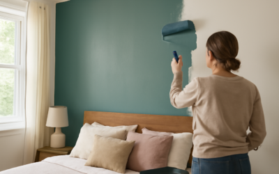
The comeback of light green paint colors caught a lot of homeowners off guard, but it makes perfect sense once you live with one. A soft sage or a pale celadon brings the calm of nature indoors without the moodiness of a deep forest green or the coolness of gray. These gentle shades flatter kitchens, bathrooms, bedrooms, and living rooms alike, and they pair effortlessly with white trim, warm wood, and brass. The trick is choosing a green with the right undertone for your light, because the wrong one turns minty or drab fast. This guide walks you through the best shades and how to use them.
Part of our Paint & Walls guide — explore the full guide →
Why Soft Green Feels So Livable
Green sits at the center of the color wheel, balanced between warm and cool, which is exactly why it feels so restful on a wall. Light greens carry that balance in a low-commitment package: enough color to add character, gentle enough to live with every day. They evoke the outdoors, which research consistently links to a calmer, more restorative mood at home.
Unlike bolder colors that dominate a room, light green paint colors recede softly and act almost like a warm neutral. That makes them a smart pick for a whole room rather than a single accent wall, and it explains why sage in particular has become a go-to for kitchen cabinets and bedrooms.
They also have staying power that trendier colors lack. Gray dominated interiors for a decade and then began to feel cold and dated; soft green offers the same versatility with a warmth that does not read as a passing fad. Because green connects so directly to the outdoors, it rarely feels tired the way a fashion color can. That timelessness makes it a low-risk choice for permanent elements like cabinetry, where repainting is a real chore.
The Best Sage and Muted Greens
Sage, a grayed-down green, is the most popular and forgiving choice. These muted tones read sophisticated rather than juvenile, and they hold up beautifully in both traditional and modern homes.
- Sherwin-Williams Evergreen Fog (SW 9130): a gray-green that earned a Color of the Year title, gorgeous on cabinets.
- Benjamin Moore October Mist (1495): a soft sage with a silvery base, another Color of the Year.
- Sherwin-Williams Sea Salt (SW 6204): a green that leans blue in some light, spa-like and serene.
- Farrow & Ball Cromarty: a barely-there green-gray for a whisper of color.
These shades excel on walls throughout a room and look especially striking on kitchen cabinetry paired with brass hardware and white oak floors.
What makes sage so easy to live with is its chameleon-like neutrality. Because it borrows gray from the neutral spectrum, it behaves almost like a soft taupe with a hint of color, which means it rarely fights with the furnishings you already own. A sage bedroom accepts everything from crisp white linens to warm wood nightstands to black metal lamps without a hint of clash. That flexibility is exactly why designers reach for it when a client wants color that will not lock them into a whole new decor scheme.
The muted greens also read differently depending on how much of the room they cover. A single sage accent wall pops as a clear color statement, while the same shade wrapped around all four walls softens into a serene, almost neutral backdrop. If you love the color but worry about commitment, start with cabinetry or a lower wall in a two-tone treatment, then decide whether you want more. This staged approach lets you test how the green feels in your specific light before going all in.
Fresh and Airy Pale Greens
When you want more brightness and a spring-like lift, a clearer pale green delivers freshness without the gray. These work wonderfully in bathrooms, laundry rooms, and sunrooms where you want an energizing, clean feel.
Look at Benjamin Moore Guilford Green (HC-116), a light gray-green with a sunny warmth, or Sherwin-Williams Softened Green (SW 6177), a gentle, airy tone. For a nursery or a cheerful kitchen, a clean celadon like Benjamin Moore Palladian Blue leans green-blue and feels fresh. Pale greens amplify natural light, so they shine in rooms with good sun exposure.
Because pale greens bounce light so readily, they can also help a small or dim room feel larger and more open, much the way a soft white would but with a touch more character. In a windowless powder room or a north-facing laundry, a light celadon keeps the space from feeling flat while still reading as bright. The one caution is that the palest greens can wash out to near-white or drift gray under weak artificial light, so if the room lacks natural sun, lean toward a shade with a little more pigment to keep the color reading as green.
Understanding Green Undertones
Green undertones make or break the result, and they are easy to miss on a small chip. A green can lean yellow, blue, or gray, and each direction changes the mood entirely.
- Yellow-based greens: warmer and sunnier, cozy but can read acidic in low light.
- Blue-based greens: cooler and calmer, spa-like but can feel chilly in a north room.
- Gray-based greens: the most neutral and versatile, the safest bet for most homes.
In a north-facing room with cool light, choose a warmer, gray-green to keep it from feeling cold. In a bright south-facing room, a cooler green stays balanced. Always test, because the same light green paint color can look completely different across two rooms.
Pairing With Wood, Metal, and Trim
Light green is a natural partner for organic materials. Warm wood tones like white oak, walnut, and even honey-toned floors glow against sage, grounding the cool green with warmth. Brass and aged bronze hardware pop beautifully, while black fixtures add a crisp, modern edge.
For trim, a soft white such as Benjamin Moore White Dove keeps the look gentle and cohesive, while a bright white sharpens the contrast for a fresher feel. Layer in natural textures, jute rugs, linen curtains, rattan, and a few live plants, to lean into the biophilic, brought-the-outdoors-in quality these greens do so well.
Finish choice shapes the result too. A matte or eggshell keeps sage soft and hides wall flaws, ideal for bedrooms and living rooms. On kitchen cabinets, step up to a durable satin or semi-gloss enamel that wipes clean and lets the color read crisp rather than chalky. If you are painting cabinets yourself, a bonding primer and a self-leveling enamel like Benjamin Moore Advance give a smooth, professional finish that stands up to years of hands and splashes.
Room-by-Room Ideas
Match the green to the room’s purpose. Restful spaces want muted sages; bright, functional rooms can carry a clearer pale green.
In a bedroom, Evergreen Fog or October Mist on all four walls creates a calming retreat. In a kitchen, sage cabinets with white walls and brass pulls read timeless and warm. In a bathroom, a light spa green in satin finish resists moisture and feels fresh. For a home office, a soft gray-green reduces eye strain and photographs well on video calls. And in a laundry or mudroom, a cheerful pale green brings energy to a utilitarian space.
Testing Before You Commit
Landing on the right shade is simple once you commit to testing. Narrow your list to two or three light green paint colors, buy $6 sample pots, and paint large swatches on two different walls. Watch them across the day and under your evening bulbs, since green is one of the most light-sensitive colors on the wall.
Colors That Pair Well With Green
Building a whole palette around a light green is easier than most people expect, because green sits comfortably beside so many companions. For a serene, monochromatic scheme, layer your sage with creamy whites and soft taupes. For more contrast, warm terracotta, blush, and rust tones create a rich, earthy pairing that feels current and grounded.
Blues and greens, long considered a clash, now read as sophisticated when both are muted, so a dusty blue accent pillow against sage walls looks intentional. Black adds crisp definition through window frames, hardware, and light fixtures. And natural wood in every tone from pale ash to deep walnut is a reliable partner. When choosing accent colors, pull them in through textiles and accessories first, since those are cheap to change if your taste shifts, while the wall color anchors the whole scheme.
Making Your Final Selection
Let the room and its light decide rather than the store’s lighting. Do that, and you will land a soft, nature-inspired shade that feels calm and current, one of the reasons well-chosen light green paint colors have quietly become the most versatile trend in modern home design.