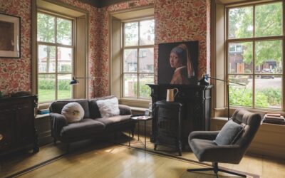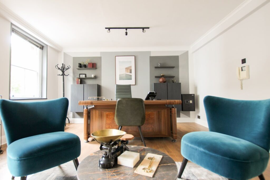
Color changes how a room feels before you consciously register the shade. In a workspace, that first impression translates directly into focus, energy, and how long you can sit at the desk without feeling drained. Choosing modern office paint colors is less about chasing trends and more about matching a wall to the work you do in front of it. The right hue quiets visual noise, supports video calls, and makes a small home office feel like a place you want to be at 9 a.m.
Part of our Paint & Walls guide — explore the full guide →
- How Color Affects Focus and Mood
- The Best Modern Office Paint Colors by Category
- Choosing a Color for Your Room's Light
- Accent Walls and Two-Tone Schemes
- Picking the Right Sheen
- Colors to Approach With Caution
- Pairing Paint With Furniture and Trim
- Colors That Work on Camera
- Coordinating With Wall Art and Shelving
- Bringing Your Modern Office Paint Colors Together
- Frequently Asked Questions
How Color Affects Focus and Mood
Decades of color research point to a few reliable patterns. Cool tones like blue and soft green lower perceived stress and help with sustained concentration, which is why they dominate open-plan corporate offices. Warm tones, from muted terracotta to soft gold, raise energy and warmth, useful for creative or client-facing spaces. Stark, high-contrast walls tend to fatigue the eye over a long workday.
The practical takeaway: pick your dominant wall color for the mood you need most. If your job demands deep focus, lean cool and muted. If your work is social or creative and the room feels sterile, introduce warmth. Balance matters more than any single “best” color.
The Best Modern Office Paint Colors by Category
A modern palette in 2026 favors complex, slightly grayed hues over the flat primaries of a decade ago. Below are the categories that consistently perform in a workspace.
Soft Grays and Greiges
Warm gray remains the workhorse of home offices because it reads clean without feeling cold. Look at Sherwin-Williams Repose Gray or Benjamin Moore Classic Gray for a light, airy backdrop that won’t fight your monitor. Greige, the gray-beige hybrid, adds just enough warmth for a north-facing room that trends blue in natural light.
Muted Greens
Sage and eucalyptus greens are having a long moment for good reason. They connect a room to nature, reduce eye strain, and photograph well on camera. Sherwin-Williams Evergreen Fog and Benjamin Moore October Mist are two of the most-used desaturated greens in current design work.
Calming Blues
Blue is the classic productivity color. A soft slate or dusty blue keeps a workspace serene without going juvenile. For a deeper, more dramatic take, a navy accent wall behind the desk creates a rich video-call backdrop that makes you look sharp on screen.
Warm Whites and Off-Whites
A warm white maximizes light in a compact office and pairs with any accent. Avoid a stark builder white with blue undertones; it can feel clinical. Reach instead for a creamy white like Benjamin Moore White Dove that softens the room.
Choosing a Color for Your Room’s Light
The same swatch looks like two different colors in a bright south-facing room versus a dim north-facing one. Natural light is the single biggest variable, so never commit from a paint chip alone. North-facing rooms get cool, indirect light that pushes colors bluer and grayer, so choose warmer versions than you think you need. South-facing rooms flood with warm light that intensifies color; here you can handle cooler, more muted tones.
Buy sample pints and paint two coats on a two-foot square of poster board. Move it around the room over a full day. What looks perfect at noon can turn muddy or garish under warm evening lamps or the LED bulbs you actually work by.
Accent Walls and Two-Tone Schemes
A single accent wall is the easiest way to add personality without committing the whole room. Put the accent behind you so it frames video calls, or behind the desk so it energizes the space you face. Deep greens, navy, and warm charcoals all make strong, professional accent choices.
Two-tone schemes, where a darker color runs the lower third of the wall and a lighter shade rises above, add architectural interest to a plain box of a room. Keep the darker tone below chair-rail height so the ceiling still feels lifted. This trick works especially well in a converted spare bedroom that lacks trim or molding.
Picking the Right Sheen
Color is only half the decision. Sheen controls durability and glare, both of which matter in a room full of screens.
- Matte or flat: Hides wall imperfections and kills glare, ideal behind a monitor. Less scrubbable, so keep it away from high-touch zones.
- Eggshell: The most popular office choice. Slight softness, easy to wipe, minimal glare.
- Satin: More durable and washable, good for trim and doors, but it can throw glare from a window or ring light.
- Semi-gloss: Reserve for trim, shelves, and doors where you want crisp definition.
For most home offices, eggshell walls with semi-gloss trim strike the right balance of looks and cleanability.
Colors to Approach With Caution
Bright red raises heart rate and can feel aggressive over a full workday, so use it only in small accents. High-chroma yellow looks cheerful on a chip but becomes fatiguing across a whole wall and reflects an unflattering cast on your face during calls. Pure black walls absorb light and shrink an already small room. If you love drama, use these colors on a single accent surface or in accessories rather than as the dominant field.
Pairing Paint With Furniture and Trim
Your wall color should coordinate with the desk, shelving, and floor already in the room. A warm walnut desk sings against sage green or greige; a cool white or black-metal desk pairs cleanly with slate blue or gray. Keep the palette to three colors total, one dominant wall tone, one trim color, and one accent, to avoid a busy, unsettled look.
White or near-white trim remains the safe, timeless frame for almost any modern wall color. If you want a more contemporary edge, painting the trim the same color as the walls, called color-drenching, makes a small office feel larger and more intentional.
Colors That Work on Camera
Video calls have quietly become the most important test any office wall faces, and some colors that look great in person betray you on screen. A pure white wall behind you blows out under a webcam’s auto-exposure, washing your face into shadow. A busy pattern or high-gloss finish creates distracting glare and hotspots. The camera flattens and cools most colors, so what reads as a rich hue in the room can look muddy or gray on a laptop lens.
Muted mid-tones photograph best. A soft sage, dusty blue, or warm greige gives the camera something to expose against, keeping your face properly lit and your background calm. If you want a professional backdrop that flatters on every platform, a matte-finish accent wall in a medium-depth color behind your desk is nearly foolproof. Test it by hopping on a call and reviewing your own video before committing the whole room.
Coordinating With Wall Art and Shelving
Paint never lives in isolation. The bookshelves, framed prints, and pinboards that fill an office all interact with the wall color, and a smart palette leaves room for them to shine. Against a deep navy or forest accent, light-toned wood shelving and white-matted art pop with contrast. Against a soft neutral, you can hang bolder, more colorful art without the room feeling chaotic.
Think of the wall as the quietest element and let accessories carry the personality. This keeps the space flexible, when you refresh the art or rearrange the shelves in a year, a restrained wall color still works. Reserve any strong statement for a single accent wall or the accessories themselves, not every surface, so the room reads as composed rather than competing for attention.
Bringing Your Modern Office Paint Colors Together
Start with the mood you need, test real samples in your room’s actual light, and choose a sheen that fights glare. A muted green or soft gray backdrop with a navy accent wall and warm-white trim is a nearly foolproof combination for a productive, camera-ready workspace. The best modern office paint colors are the ones that disappear into the background of a good workday, keeping you calm, focused, and comfortable from your first cup of coffee to your last email. Invest an afternoon in sampling and you’ll live happily with the result for years.
Frequently Asked Questions
What dark paint colors are calming for an office?
Deep navy, forest green, charcoal and muted dark teal are the most calming dark office colors. These shades feel enclosed and focused rather than gloomy when they have a slightly grayed, low-saturation tone. Pair them with good layered lighting, warm-white trim and light wood or brass accents so the room does not feel like a cave, and consider using the dark color on one wall first.
What is a good office wall color combination?
A reliable office combination is a soft neutral for the main walls, a deeper accent color, and a crisp white for trim. Examples include greige walls with a navy accent, warm white walls with a sage accent, or light gray walls with a charcoal accent. Keep the palette to about three colors and repeat the accent in a rug or artwork to tie it together.
What colors are energizing for an office accent wall?
Warm, muted colors such as terracotta, soft mustard, coral and warm olive add energy to an office accent wall without the strain of bright red or neon yellow. Place the accent on the wall facing the desk if the goal is an energizing view, or behind the chair if it should frame video calls. Balance it with calmer neutrals on the remaining walls.
What paint color works best in an office with no windows?
Warm whites, soft creams and light warm grays work best in a windowless office because they bounce artificial light and keep the room from feeling closed in. Avoid cool, gray-blue whites, which can feel flat under LED lighting. Choose bulbs around 3000K to 4000K, test samples under that exact light, and use an eggshell finish to reflect light without glare.