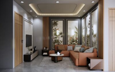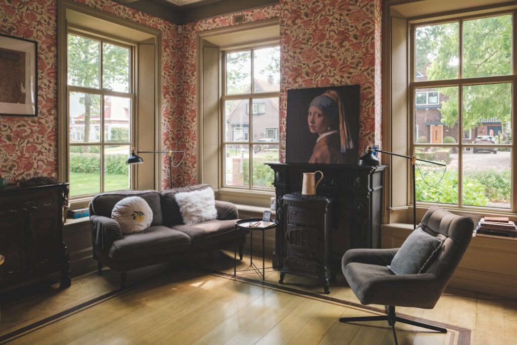
The wall color behind your monitor affects focus more than any productivity app you can install. Studies from Texas A&M and University of Sussex show that occupants of green and blue offices score 6-15% higher on concentration tasks than those in white or beige rooms. Choosing the right home office paint colors is one of the cheapest performance upgrades you can make, costing under $100 in materials for most rooms.
Why Color Affects Productivity
Color triggers measurable physiological responses. Blue lowers heart rate and slows breathing, encouraging sustained focus. Green reduces eye strain because the eye lens does not need to refocus to perceive green wavelengths. Warm grays and earth tones reduce cortisol levels in artificially lit environments. Bright whites and stark contrasts increase cognitive load and contribute to screen fatigue after 3-4 hours.
The catch: extreme saturation in any color backfires. A vivid red or orange wall behind a monitor causes visual fatigue within an hour and tracks worse than even bare drywall on focus tests. Aim for medium-low saturation and slightly warm undertones unless you genuinely thrive on bold environments.
Best Colors for Focus and Calm
Five color families consistently rank well for home office walls in both designer surveys and productivity research. Each works best in specific lighting conditions, so consider your window orientation before committing.
- Sage green: Calming, low eye strain, works in any light orientation
- Soft blue-gray: Cool focus, ideal for east-facing offices with morning light
- Warm taupe: Grounding, reduces glare, best for screen-heavy work
- Muted navy: Sophisticated, good for video calls, needs supplemental lighting
- Creamy white: Bright but not stark, best for north-facing offices needing light
Skip pure white walls in home offices unless you have abundant natural light and use a monitor brightness above 250 nits. The contrast between a bright white wall and a dark monitor causes the iris to constantly adjust, contributing to headaches and reduced focus over long sessions.
Top Specific Paint Colors by Brand
These ten specific colors get specified more than any others for home office work in 2026, drawn from designer projects and Sherwin-Williams plus Benjamin Moore color-of-the-year selections from 2022-2026.
- Sherwin-Williams Evergreen Fog SW 9130: Sage green, 2022 COY, exceptional for focus
- Benjamin Moore October Mist 1495: Soft sage, 2022 COY, calm and modern
- Sherwin-Williams Sea Salt SW 6204: Blue-green, versatile in any light
- Benjamin Moore Hale Navy HC-154: Deep navy for accent walls
- Sherwin-Williams Repose Gray SW 7015: Warm gray, monitor-friendly
- Benjamin Moore Pale Oak OC-20: Greige, soft and grounding
- Sherwin-Williams Naval SW 6244: Saturated navy, dramatic accent
- Benjamin Moore Revere Pewter HC-172: Classic warm gray, low contrast with screens
- Sherwin-Williams Accessible Beige SW 7036: Warm neutral, hides handprints
- Benjamin Moore Simply White OC-117: The “right” white, slightly warm
Light Direction and How It Changes Color
Paint colors look dramatically different depending on natural light orientation. North-facing offices get cool, even light all day, which makes warm undertones essential to avoid a clinical feel. South-facing offices get warm, intense light that can wash out saturated colors. East-facing offices get warm morning light then cool afternoon shade, calling for balanced neutrals. West-facing offices get harsh afternoon glare that intensifies warm tones uncomfortably.
Always test paint with large samples (Samplize peel-and-stick squares, $7 each) on multiple walls of the actual room. Observe at 8 a.m., noon, and 6 p.m. before committing. Colors that look perfect in the store under fluorescent lighting often shift dramatically in residential spaces with mixed natural and incandescent sources.
Accent Walls and Two-Tone Approaches
Single-color rooms feel calm but can read flat on video calls. Two-tone approaches add depth without sacrificing focus benefits. Paint the wall behind your desk in a deeper accent color (like Hale Navy or Naval) and the remaining three walls in a lighter neutral (Pale Oak, Repose Gray). The dark wall reduces glare in the camera frame and makes you look more polished on Zoom calls.
Skip horizontal stripes and busy patterns. The visual noise competes with monitor content for attention. If you want pattern, limit it to one wall opposite your sightline rather than in your peripheral vision while working.
Trim, Ceiling, and Door Colors
Trim color affects how the wall color reads. White trim makes any wall color look more saturated; trim painted close to the wall color makes the room feel larger. The most flexible default is a soft white trim like Benjamin Moore Chantilly Lace OC-65 or Sherwin-Williams Pure White SW 7005, both of which work with cool and warm wall colors.
Ceilings should run 1-2 shades lighter than walls in most cases. The standard “one shade lighter than the wall in the same color family” approach makes ceilings recede visually and adds 6-12 inches of perceived height. For low ceilings under 9 feet, consider painting the ceiling pure white to maximize that lift.
Finishes That Work in Offices
Eggshell and satin finishes work for office walls. Eggshell looks flatter and hides imperfections better; satin reflects more light and cleans easier with frequent wiping. Matte finishes show fingerprints around light switches and door frames after 6-12 months and need touch-ups more often than higher-sheen options.
For trim, semi-gloss is standard. It cleans easily and reflects light to outline architectural details. Avoid high-gloss in offices because it amplifies monitor reflections on adjacent walls. Premium paints like Sherwin-Williams Emerald Urethane Trim Enamel ($85/gal) or Benjamin Moore Advance ($75/gal) self-level for a smooth furniture-like finish on built-in shelving and trim.
Common Mistakes to Avoid
The biggest mistake is picking colors at the store under fluorescent lighting without testing at home. Store lighting skews warm and bright, making cool grays and blues look more saturated than they will in your office. Always buy sample sizes ($8 each) and test under your actual lighting before committing $200-400 to a full project.
Avoid pure black or near-black walls in primary work areas. They look cinematic in photos but make small offices feel cramped and require dramatically more artificial lighting to work effectively. Reserve dramatic dark colors for podcast nooks, video backgrounds, or accent walls only. Finally, skip color-changing or chameleon paints — they create unpredictable visual conditions that interfere with sustained focus work.