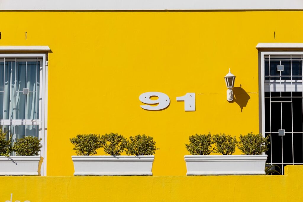
Picking outside paint colors for house exteriors is a higher-stakes decision than any interior color, because you are committing 20 to 40 gallons of paint and a $4,000 to $12,000 job to a choice that everyone on the street will see for the next decade. Exterior color fades faster, reads lighter in full sun, and has to work with fixed elements you cannot repaint — the roof, the stone foundation, the brick, and the neighbors’ homes on either side. Get the combination right and you can add real resale value; get it wrong and the house looks off in a way that is hard to name but impossible to unsee.
Part of our Paint & Walls guide — explore the full guide →
Here is how to build an exterior palette that flatters your home’s architecture, harmonizes with what you cannot change, and holds up to weather and time.
Start With What You Cannot Change
Your roof is usually the largest fixed surface, and it dictates the temperature of your whole palette. A brown or tan shingle roof leans warm and pairs with beiges, warm grays, greens, and creams. A cool gray or black roof reads cool and welcomes blues, cool grays, and crisp whites. Hold roof shingle samples against your candidate colors before anything else — fighting the roof is the most common exterior mistake.
Brick and stone accents are equally binding. Existing brick carries strong undertones of red, orange, pink, or brown, and your siding color has to sit comfortably beside it. A warm terracotta brick clashes with a cool blue-gray but glows next to a sage green or a warm greige. Any masonry that stays is a fixed member of your palette, so choose the siding color to complement it.
Use the Three-Color Rule
Nearly every well-designed exterior uses three colors in specific roles, and following this structure keeps the result balanced rather than busy. The field color covers the largest area — the siding — and should be the most restrained. The trim color frames windows, corners, and fascia, typically a lighter or crisper shade that makes the architecture pop. The accent color, used sparingly on the front door and shutters, is where you get to have fun.
A dependable formula is a mid-tone field, a clean white or cream trim, and a saturated accent door in navy, black, deep green, or a warm red. Keep the field-to-trim contrast noticeable but not jarring, and let the door be the boldest note. Limiting yourself to three colors prevents the circus effect that too many competing shades create.
Match Color to Architectural Style
The right palette respects the era and style of the house. Certain combinations simply read as authentic:
- Craftsman: Earthy greens, ochres, and browns with contrasting trim and a rich accent door.
- Colonial or Cape Cod: White, cream, or soft gray siding with black shutters and a classic front door.
- Modern or contemporary: Monochrome schemes — charcoal, warm white, or black with minimal contrast and clean lines.
- Victorian: Deeper, layered multi-color schemes that highlight ornate trim detail.
- Farmhouse: Crisp white or warm greige body with black windows and natural wood accents.
Working with your home’s style rather than against it makes the color choice feel inevitable and correct to anyone who sees it.
Account for Sun, Size, and Sightlines
Exterior colors read dramatically lighter and brighter outdoors than they do on a chip, because full sun floods the surface with light. Choose a color one or two shades deeper than what looks right on the sample, or the finished house will wash out to a pale ghost of your intent. This is the opposite instinct many homeowners have, and skipping it is why so many houses end up looking bland.
Scale matters too. A dark, dramatic color that looks sophisticated on a small sample can feel heavy and imposing across a large two-story facade, while it grounds a small bungalow beautifully. Always buy sample quarts and paint 2 by 2-foot patches on multiple sides of the house, then check them in morning light, harsh midday sun, and evening shade before committing.
Consider the Neighborhood and HOA
Your house does not exist in a vacuum. Walk the block and note the palettes around you — you want your home to stand out pleasantly, not clash with every adjacent property. If your neighbors run warm earth tones, a stark cool-white modern scheme can look out of place, though a tasteful contrast can also be an asset. Aim to complement the streetscape while still expressing your own taste.
If you live in an HOA, check the approved color list before you buy anything. Many associations restrict exterior colors to a pre-approved palette and require written approval, and repainting an unapproved color is an expensive lesson. A quick email to the board saves a world of trouble.
Buy Quality Paint and the Right Sheen
Exterior paint takes a beating from UV, rain, and temperature swings, so this is not the place to save $15 a gallon. A quality 100 percent acrylic latex exterior paint costs $45 to $75 per gallon and holds its color and film for 10 to 15 years, versus 5 to 7 for a cheap product that chalks and fades. Factor 300 to 400 square feet of coverage per gallon and two coats when you estimate quantity.
Match sheen to surface. A low-luster or satin finish suits the main siding — it sheds dirt and resists moisture while hiding minor surface flaws. Reserve semi-gloss for trim, doors, and shutters, where the extra sheen highlights detail and stands up to frequent contact. With the right colors, the right sequence, and quality paint, your exterior will look intentional and hold its beauty for a decade or more.
Popular Exterior Palettes That Age Well
If you want a starting point that will not look dated in five years, a handful of exterior schemes have proven timeless. Warm white siding with black or dark bronze windows and a natural wood door reads clean and modern-farmhouse without chasing a fad. Soft greige — a gray-beige hybrid — paired with crisp white trim and a black door flatters almost any architecture and hides dust between washes. Deep charcoal or navy siding with white trim delivers drama on a well-detailed home while staying sophisticated rather than trendy.
Earthy, nature-derived colors are also having a durable moment because they blend with the landscape rather than fight it. Sage and olive greens, warm clay, and muted taupes ground a house in its setting and pair beautifully with stone and natural wood accents. Whatever direction you choose, restraint is the through-line: the palettes that still look right decades later are the disciplined ones, not the boldest.
Time the Project and Prep the Surface
Even the perfect color fails if the paint cannot bond, so preparation and timing determine whether your work lasts a decade or peels in two years. Paint in mild, dry weather — most exterior paints need surface and air temperatures between roughly 50 and 85 degrees Fahrenheit and a dry stretch, since rain within a day of application or dew overnight can ruin an uncured film. Avoid painting in direct blazing sun, which flashes the paint too fast and leaves lap marks.
Prep is the unglamorous work that makes the color choice worthwhile. Pressure-wash the siding to strip off chalk, dirt, and mildew, scrape and sand any peeling or failing paint, and prime bare wood and stains before the topcoat. Caulk gaps around windows, doors, and trim to seal out water. A house painted over a dirty or flaking surface will fail no matter how expensive the paint, while a well-prepped surface lets even a mid-grade paint reach its full lifespan. Do the prep, mind the weather, and your chosen colors will look as sharp on year ten as on day one.