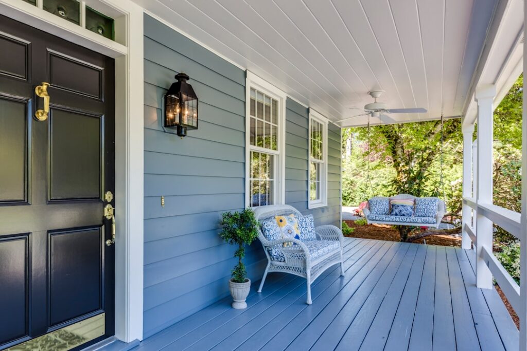
The color of your house is the single biggest visual decision you’ll make about your home, and it’s one you’ll live with for a decade. Choosing exterior paint colors for houses means balancing personal taste against fixed elements you can’t change, your neighborhood, and how a shade will look under real sunlight rather than a two-inch swatch. Get the exterior paint colors for houses right and you boost curb appeal and resale value; get them wrong and you’re staring at an expensive repaint or a house that fights its own roof.
Part of our Paint & Walls guide — explore the full guide →
This guide covers the colors that consistently work, how to build a three-part palette, and the practical rules that keep you from an expensive mistake.
- Start With What You Can’t Change
- Timeless Body Colors That Always Work
- Building a Three-Color Palette
- Popular Combinations to Steal
- Match the Color to Your Home’s Style
- How Climate and Exposure Affect Your Choice
- Trending Colors Versus Timeless Choices
- Coordinating With Roof, Brick, and Stone
- Test Before You Commit
- Neighborhood, HOA, and Longevity
Start With What You Can’t Change
Before you fall in love with a color, take inventory of the fixed elements. Your roof, stone or brick accents, driveway, and even large landscape features all carry undertones that your paint has to live beside. A roof with warm brown shingles clashes with a cool gray body, while a bluish-gray roof pairs beautifully with it.
Walk the perimeter and note the undertones of every permanent material. If you have red brick, greens and warm whites flatter it; stark cool grays fight it. This single step prevents the most common regret, which is picking a body color in a vacuum and discovering it wars with the roof.
Timeless Body Colors That Always Work
Some shades have stayed popular for decades because they flatter almost any architecture and hold up well to sun. If you want a safe, resale-friendly choice, start here:
- Warm white and greige: Sherwin-Williams Alabaster and Benjamin Moore White Dove read clean without going stark
- Soft gray: Sherwin-Williams Repose Gray and Agreeable Gray suit modern and traditional homes alike
- Deep charcoal and navy: Benjamin Moore Hale Navy and Iron Mountain for a bold, current look
- Sage and muted green: Sherwin-Williams Evergreen Fog, a favorite that grounds a house in a landscape
- Classic taupe and tan: forgiving on dirt and flattering to stone and brick
Darker bodies like navy and charcoal look striking but absorb more heat and can fade faster on sun-blasted walls, so factor in your climate and exposure.
Building a Three-Color Palette
A polished exterior almost always uses three coordinated colors rather than one. The proven formula divides them by role and proportion.
- Body color covers the majority of the house and sets the overall mood.
- Trim color frames windows, corners, and fascia, usually a crisp white or a shade lighter or darker than the body.
- Accent color goes on the front door and shutters to add personality without overwhelming.
A reliable ratio is roughly 60 percent body, 30 percent trim, and 10 percent accent. That accent is where you can be daring; a bold front door in a deep teal, cherry red, or mustard reads as intentional against a neutral body and trim.
Popular Combinations to Steal
If you’d rather start from a proven pairing than build from scratch, these combinations show up on the most admired homes:
- Warm white body, black trim, natural wood door for a modern farmhouse look
- Navy body, white trim, brass or black accents for classic coastal charm
- Sage green body, cream trim, terracotta door for a warm, earthy craftsman feel
- Charcoal body, light gray trim, red door for bold contemporary contrast
- Greige body, white trim, muted blue-gray shutters for a transitional, buyer-friendly palette
These work because the body and trim stay quiet while a single accent carries the interest.
Match the Color to Your Home’s Style
Architecture should steer your palette as much as personal taste. A color that sings on a modern farmhouse can look wrong on a Victorian, because each style grew up with its own color conventions. Working with your home’s architecture rather than against it produces a result that looks intentional and increases curb appeal.
- Modern farmhouse: warm white, soft black, or greige bodies with black trim and natural wood accents
- Craftsman and bungalow: earthy greens, browns, and muted golds that echo the style’s nature-inspired roots
- Colonial and traditional: classic white, soft yellow, or muted blue bodies with crisp white trim and black shutters
- Victorian: richer multi-color schemes that highlight ornate trim and gingerbread detailing
- Mid-century modern: warm neutrals or bold saturated accents that suit clean horizontal lines
You don’t have to be a purist, but leaning into your home’s era gives you a reliable starting point and keeps the finished look coherent rather than arbitrary.
How Climate and Exposure Affect Your Choice
Where you live and which way your house faces should shape the palette too. Color performs differently under intense sun than in a cloudy, damp climate, and that affects both appearance and longevity.
Keep these practical factors in mind:
- Dark colors absorb heat and fade faster under strong sun, so in hot, sunny regions lighter bodies stay cooler and hold color longer.
- In humid or shaded climates, mildew-resistant paint and slightly lighter tones help hide the inevitable algae streaking.
- A south- or west-facing wall takes the most UV punishment, so test your color specifically on that exposure.
- Coastal homes face salt and moisture, rewarding durable, quality exterior lines over budget paint.
- Snowy regions read colors against a white backdrop for months, which can make pale bodies look washed out.
A shade that photographs beautifully in a magazine shot from a mild climate may behave very differently on your sun-blasted or fog-bound wall, which is exactly why on-site testing matters so much.
Trending Colors Versus Timeless Choices
Every year brings a fresh crop of trending exterior colors, and it’s tempting to chase the look of the moment. The catch is that an exterior paint job lasts a decade, while trends cycle every few years, so a color that feels current now can date your home before you repaint.
A smart approach balances current appeal with staying power:
- Trending now: moody dark bodies like charcoal and black, warm earthy greens, and creamy warm whites
- Reliably timeless: soft warm whites, classic grays, and muted greiges that never look dated
- Riskier over time: very saturated or unusual body colors that can feel of-the-moment
The savvy move is to keep the large body color timeless and express trends through the small accent, like a fashionable front-door color that’s cheap and quick to repaint when tastes shift. That way your home stays current where it’s easy to change and classic where it counts.
Coordinating With Roof, Brick, and Stone
Your paint has to live in harmony with the materials you’re not painting, and their undertones set hard boundaries on your palette. A roof, in particular, is a huge expanse of fixed color that can make or break a scheme.
Use these pairings as a starting point:
- Gray or black roof: pairs cleanly with cool grays, whites, blues, and greens.
- Brown or weathered-wood roof: flatters warm tones like tan, cream, sage, and warm gray.
- Red brick accents: love warm whites, greens, and soft taupes, but fight stark cool grays.
- Tan or beige stone: works with earthy greens, warm neutrals, and deep browns.
- Multicolored stone: pick a body color that echoes one of the stone’s tones to tie it together.
Ignoring these fixed elements is the single most common reason a freshly painted house looks slightly off even when the color itself is attractive. Match the paint to what’s already there, and the whole exterior reads as intentional.
Test Before You Commit
Never choose from a paint chip alone. Exterior color shifts dramatically with sunlight, and a shade that looks soft indoors can turn glaring on a sunny south wall. Buy sample quarts and paint large swatches, at least two feet square, directly on the house.
Then watch them over a full day:
- Check the swatch in morning light, midday sun, and evening shade.
- View it on both the shaded north side and the sunlit south side.
- Look at it next to your roof, brick, and existing landscaping.
- Step back to the street, since color reads differently at a distance.
What you see at noon under full sun is often two shades lighter and cooler than the chip suggested.
Neighborhood, HOA, and Longevity
Your house doesn’t exist in isolation. Glance down the street to make sure your choice complements rather than clashes with neighbors, and check any HOA rules before you buy, since many require approval from an approved palette. Picking a color that flatters your home while fitting the block protects both your enjoyment and your resale value.
Finally, think in decades. A quality exterior paint job lasts 8 to 12 years, so lean toward shades you’ll still like well after trends move on. The boldest current color can feel dated in five years, while a well-chosen neutral body with a confident accent door stays handsome far longer. Choosing exterior paint colors for houses is really about balancing personality with permanence, and the homes that age best pair a timeless body with just enough accent to feel like yours.