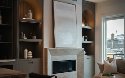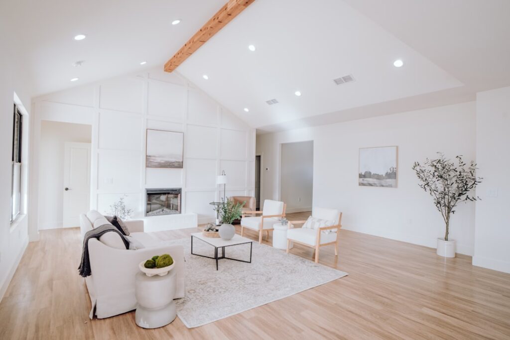
Most people assume a room full of espresso leather and dark walnut demands pale walls to “lighten things up.” That instinct is only half right. Choosing the best paint colors for living room walls with dark furniture is less about brightness and more about undertone, contrast, and how much daylight the space actually gets. Get the pairing right and your furniture reads as intentional and grounded; get it wrong and everything looks like a showroom liquidation. After decades of watching homeowners repaint the same room three times, the pattern is clear: the winners think in temperature and contrast, not just light versus dark.
Part of our Paint & Walls guide — explore the full guide →
- Why Dark Furniture Changes the Rules
- Warm Whites and Soft Creams
- Greiges and Warm Grays That Actually Work
- Going Moody: Deep Blues, Greens, and Charcoals
- Reading the Room: Light and Orientation
- Don't Forget Sheen and Trim
- Sample Pairings That Rarely Miss
- Balancing the Room With Texture and Accents
- How Flooring Changes the Equation
- Coordinating Ceiling and Adjacent Rooms
- Final Thoughts
Why Dark Furniture Changes the Rules
Dark pieces absorb light instead of reflecting it. A charcoal sofa or a mahogany armoire pulls warmth out of the surrounding air, which means the wall behind it has to do more work. A wall color that looks perfect on a chip in the store can turn dull and flat once a heavy sectional sits in front of it.
There are two workable strategies. The first is high contrast: pale, clean walls that let dark furniture pop as sculptural silhouettes. The second is low contrast, or tone-on-tone, where deep walls wrap the room and let the furniture melt into a cocoon. Both look sophisticated. What almost never works is the murky middle, a medium beige or flat gray that competes with the furniture without committing to either drama or serenity.
Warm Whites and Soft Creams
If your furniture is genuinely dark, warm white is the safest high-contrast bet. Skip the stark, blue-based whites you would use in a modern kitchen. Those go cold and clinical against wood tones. Reach instead for whites with a hint of yellow or greige in the base.
- Benjamin Moore White Dove (OC-17): a soft, creamy white with just enough gray to avoid looking sterile. It flatters walnut and espresso alike.
- Sherwin-Williams Alabaster (SW 7008): warm without turning yellow, and forgiving in north-facing rooms.
- Benjamin Moore Swiss Coffee: a step warmer, ideal when you want cozy rather than crisp.
Expect to pay roughly $50 to $70 a gallon for premium interior paint in these lines, and budget one gallon per 350 to 400 square feet per coat. A standard 14-by-16-foot living room usually needs two gallons for two coats.
Greiges and Warm Grays That Actually Work
Greige, the greige-gray hybrid, is the workhorse for homeowners who want a neutral backdrop without going bright white. The trick with dark furniture is choosing a greige warm enough to keep the room from feeling like a parking garage. Cool grays plus dark wood equals gloom, every single time.
Sherwin-Williams Agreeable Gray (SW 7029) remains a reliable default because it leans warm and shifts gracefully with the light. Accessible Beige (SW 7036) goes even warmer and pairs beautifully with dark brown leather. For a slightly deeper backdrop that still reads neutral, Benjamin Moore Revere Pewter (HC-172) gives you a putty tone that makes black and espresso furniture look deliberate rather than heavy.
Going Moody: Deep Blues, Greens, and Charcoals
The most striking living rooms with dark furniture often skip contrast entirely. Wrapping the walls in a saturated color lets the furniture recede and the whole room feel intentional, layered, and expensive. This approach rewards good lighting, so add lamps.
Deep Greens
Benjamin Moore Hunter Green and Sherwin-Williams Pewter Green (SW 6208) both play well with dark wood because green shares botanical DNA with timber. A forest-green wall behind a chocolate leather Chesterfield looks like a library in a country estate. For something softer, Farrow and Ball Green Smoke gives a smoky, dusty green that reads almost neutral in low light.
Navy and Slate
Navy is the classic partner for dark furniture with brass or gold accents. Benjamin Moore Hale Navy (HC-154) is deep without going black, and it makes warm-toned wood glow. If you want something between blue and gray, Sherwin-Williams Cyberspace (SW 7076) delivers a slate that feels modern and grounding.
Reading the Room: Light and Orientation
Before you commit, learn which way your windows face. Orientation changes everything.
- North-facing rooms get cool, indirect light all day. Lean warm to counteract it; a cool gray here will look downright blue by afternoon.
- South-facing rooms flood with warm light and can handle deeper, cooler colors without feeling gloomy.
- East-facing rooms get warm morning light and cooler evenings, so test your sample at the time you use the room most.
- West-facing rooms turn golden and intense at sunset, which can push warm walls toward orange.
Always buy a sample pint, paint a two-by-two-foot swatch on at least two walls, and live with it for 48 hours. Colors shift dramatically between 9 a.m. daylight and a lamp-lit evening. This ten-dollar step saves the two-hundred-dollar mistake of repainting.
Don’t Forget Sheen and Trim
Sheen matters as much as color in a room with dark furniture. Flat and matte finishes hide wall imperfections and give a rich, velvety look that suits moody colors. For high-traffic family rooms, an eggshell finish adds a touch of durability and washability without the plasticky glare of satin.
Trim should generally go a shade or two brighter than the walls in a semi-gloss or satin. If your walls are a deep green or navy, crisp white trim frames the room and echoes any white in the furniture or built-ins. When walls are already warm white, painting the trim the same color in a higher sheen creates a seamless, tailored look.
Sample Pairings That Rarely Miss
- Espresso leather sofa: White Dove walls, white trim, warm brass lamps.
- Black metal and dark wood industrial pieces: Cyberspace or Hale Navy walls with light oak floors.
- Mahogany traditional furniture: Accessible Beige or Revere Pewter for a soft, collected feel.
- Charcoal fabric sectional: Alabaster walls to brighten, or Pewter Green to go cozy.
Balancing the Room With Texture and Accents
Paint sets the stage, but dark furniture needs friends. Break up heavy pieces with lighter textiles: a cream throw, a jute rug, linen curtains. Add reflective surfaces like a mirror or a glass coffee table to bounce light around. Metallic accents in brass, gold, or brushed nickel keep dark furniture from feeling like a black hole. These small moves let even a bold wall color feel balanced rather than oppressive.
The goal is layers of contrast at different scales, not just wall against furniture but soft against hard and matte against shiny. When those layers work together, a living room full of dark furniture stops looking heavy and starts looking curated.
How Flooring Changes the Equation
Your floor is the third leg of the stool, and homeowners forget it constantly. A dark wall plus dark furniture plus dark floors can turn a room into a cave, while light floors under dark furniture create built-in contrast that lets you go bolder on the walls. If you have dark hardwood, lean toward lighter walls to keep the room from closing in. If you have pale oak, light-gray, or blond floors, you have earned the freedom to wrap the walls in a deep green or navy without the space feeling heavy.
Undertone matching applies to floors too. Red-toned hardwoods like cherry and mahogany warm a room, so a cool gray wall will clash; reach for a warm greige or a green instead. Gray-washed or whitewashed floors read cool, which means they pair happily with slate walls and crisp whites. Stand in the room, look down, and let the floor cast the deciding vote whenever two wall colors feel equally good on the swatch.
Coordinating Ceiling and Adjacent Rooms
A living room rarely lives in isolation. In open-concept homes, the color you choose has to flow into the kitchen, dining area, or hallway without a jarring seam. The reliable trick is to keep one neutral running through the shared spaces and reserve any bold, moody color for a single well-defined wall or an enclosed room. That way your dark furniture gets its dramatic backdrop without committing the entire floor plan to a deep hue.
Ceilings deserve a decision, not a default. A standard flat white ceiling brightens a room with dark furniture and gives the eye a place to rest. But painting the ceiling the same warm white as the trim, or even a hair lighter than the walls in a moody room, creates a wrapped, cocooning effect that makes a lounge feel intimate. In rooms with low ceilings, keeping the ceiling lighter than the walls visually lifts the height, which matters when heavy furniture already presses the space downward.
Final Thoughts
There is no single perfect shade for every home, but there is a reliable method: decide whether you want contrast or cocoon, respect your window orientation, and always test samples in your own light before buying gallons. Warm whites and greiges keep things airy and timeless, while deep greens, navies, and charcoals turn dark furniture into the anchor of a dramatic, grown-up space. Commit to one direction, layer in texture, and your living room will finally feel like it was designed on purpose rather than assembled by accident.