Choosing among the many trending kitchen cabinet colors is one of the most impactful and most agonized-over decisions in any kitchen remodel. Cabinets cover more visual surface than almost anything else in the room, so their color sets the entire mood, from bright and airy to moody and dramatic. This guide walks through the colors homeowners are gravitating toward, how to pick one that will still look good in ten years, and practical tips for getting the finish right whether you paint or buy new.
Part of our Kitchen Remodeling guide — explore the full guide →
- Warm Whites and Creams Are Back
- Deep Greens for Richness and Character
- Navy and Deep Blues Endure
- Moody Blacks and Charcoals
- Natural Wood and Stained Finishes
- Two-Tone Kitchens
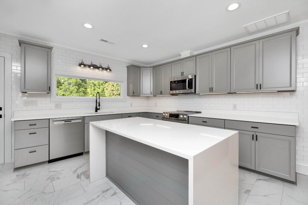
- Greige and Soft Neutrals
- How to Choose a Color That Lasts
- Painting vs. Buying New Cabinets
- Hardware and Finishes That Complement Color
- Common Mistakes to Avoid
- How Lighting Changes Cabinet Color
- Coordinating Counters, Backsplash, and Walls
Warm Whites and Creams Are Back
Stark, cool white cabinets dominated kitchens for a decade, but the trend has shifted toward softer, warmer whites and creamy off-whites. These tones feel cozier and more timeless, and they hide everyday smudges better than a bright cool white. Shades with a hint of greige or a warm undertone pair beautifully with wood floors, brass hardware, and natural stone. If you want a light kitchen that will not feel cold or quickly dated, a warm white is the safest and most enduring choice on this list.
Deep Greens for Richness and Character
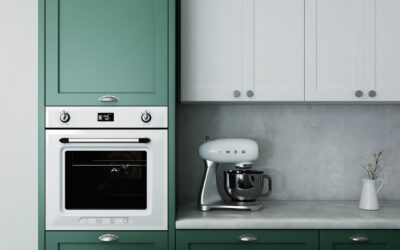
Green has become the standout color of the moment. Deep, earthy greens like sage, olive, forest, and hunter bring nature indoors and add richness without the heaviness of black. Sage and muted greens work well on full kitchens for a calm, organic feel, while a deep forest green on a large island or lower cabinets adds drama while keeping the room grounded. Green pairs handsomely with brass or matte black hardware, white counters, and wood accents, and it reads as both fresh and classic.
Navy and Deep Blues Endure
Navy has proven it is more than a fad. Deep blues bring depth and sophistication and act almost as a neutral, pairing with white, wood, gold, and marble. Navy lower cabinets with white uppers remain a hugely popular combination because they add color and contrast while keeping the room feeling open. Softer blue-grays are also trending for homeowners who want a hint of color without full saturation. Blue’s staying power makes it a lower-risk choice than more novelty colors.
Moody Blacks and Charcoals
For homeowners who want drama, black and charcoal cabinets create a bold, modern, high-contrast look. Matte black is especially striking paired with brass hardware, light counters, and plenty of natural light to keep the space from feeling closed in. Charcoal offers a slightly softer alternative that still reads dramatic. These dark tones show dust and fingerprints more readily, so a matte or satin finish and a kitchen with good lighting make them far more livable.
Natural Wood and Stained Finishes
Painted cabinets have dominated for years, but natural wood is returning, especially warm mid-tone oaks, walnut, and white oak with visible grain. Homeowners are embracing the texture and warmth that only real wood provides, often in a light or medium stain rather than the orange-toned oak of decades past. Wood works beautifully on islands, open shelving, and full kitchens, and it pairs naturally with the warm whites and greens elsewhere on this list. A wood-tone island under white perimeter cabinets is a particularly popular current look.
Two-Tone Kitchens
Rather than committing to a single color, many homeowners are choosing two. Common two-tone strategies include:
- Different island color from the perimeter, such as a navy or green island with white cabinets.
- Darker lowers, lighter uppers, which grounds the room and keeps the upper half feeling open.
- Wood accents mixed with painted cabinets, like a wood range hood or open shelving among white boxes.
Two-tone designs let you introduce color confidently while keeping the overall room balanced, and they add custom character that a single flat color cannot.
Greige and Soft Neutrals
For those who want warmth without committing to a bold color, greige, a blend of gray and beige, and other soft mushroom neutrals are quietly popular. They are more interesting than plain white but just as flexible, working with nearly any counter and hardware. Soft taupe and mushroom tones feel current and sophisticated while remaining easy to live with and easy to sell later, which matters if resale is on your mind.
How to Choose a Color That Lasts
Trends are fun, but cabinets are expensive to change, so choose with the long view. A few guiding principles:
- Test big samples on your actual cabinets and view them at different times of day, since lighting dramatically changes how a color reads.
- Consider your fixed elements like flooring, counters, and backsplash, and choose a cabinet color that harmonizes with what is staying.
- Balance boldness with permanence. Put trendy, saturated colors on easily changed elements like an island, and keep the bulk of the cabinets in a more timeless tone.
- Think about resale. If you may sell soon, warm whites, soft neutrals, and navy have the broadest buyer appeal.
Painting vs. Buying New Cabinets
You do not always need new cabinets to change the color. If your cabinet boxes and doors are solid, repainting is far cheaper. Professional cabinet painting typically runs $2,000 to $6,000 for a full kitchen, versus $15,000 to $40,000 or more for new custom cabinets. DIY painting costs only a few hundred dollars in materials but demands patience and prep. The single most important factor in a durable painted finish is preparation: clean, degrease, sand, and prime before applying a quality cabinet enamel, and use a sprayer or a fine roller and brush for a smooth, factory-like result. Rushed prep is why so many DIY cabinet paint jobs peel and chip.
Hardware and Finishes That Complement Color
The right hardware amplifies a cabinet color. Brass and gold hardware warms up greens, navies, and whites; matte black grounds lighter cabinets and pops against them; and brushed nickel keeps things soft and neutral. Match your hardware finish to your faucet and lighting for a cohesive look, or deliberately mix metals in a controlled way for interest. Do not overlook the finish sheen of the paint itself: satin and semi-gloss are the norm for cabinets because they are durable and wipeable, while matte hides imperfections but is harder to clean.
Common Mistakes to Avoid
- Choosing color from a tiny chip. Always test large samples in your own light.
- Ignoring undertones. A white with the wrong undertone can clash with your counters or floor.
- Chasing every trend. Very novel colors can date quickly; anchor bold choices with timeless ones.
- Skipping prep when painting. Poor prep means a finish that chips within months.
- Forgetting the whole room. Cabinet color must work with counters, backsplash, flooring, and wall color together.
How Lighting Changes Cabinet Color
No factor fools homeowners more than lighting. The same cabinet color can look crisp white in a bright, north-facing kitchen and creamy or even yellowish under warm-toned bulbs at night. Natural light shifts throughout the day, and the color temperature of your bulbs, measured in Kelvin, dramatically changes how a color reads. Warm bulbs around 2700K make whites and greens look cozier and yellower, while cooler bulbs around 4000K render colors closer to their true daytime appearance. Before committing, paint large sample boards and view them in the actual kitchen at morning, midday, and night, under both natural light and your fixtures. This single step prevents the heartbreak of a color that looked perfect in the store but reads completely different once it is on all the cabinets.
Undertones are the hidden variable. A white with a gray undertone can look cold next to a warm wood floor, while a white with a yellow undertone can clash with a cool quartz counter. Hold your samples directly against your fixed finishes to check that the undertones harmonize rather than fight.
Coordinating Counters, Backsplash, and Walls
Cabinet color never lives in isolation; it must work with the counters, backsplash, flooring, and wall color as a whole. A busy, multi-colored granite counter pairs best with a calm, solid cabinet color, while a simple quartz counter can support a bolder cabinet choice. The backsplash bridges the counters and uppers, so a neutral backsplash gives colorful cabinets room to shine, whereas a statement backsplash pairs better with restrained cabinet tones. Think of the whole palette as a team: choose one or two elements to be the stars and let the rest play supporting roles. When every surface competes for attention, the kitchen feels chaotic; when the cabinet color is chosen in concert with everything around it, the room feels designed and intentional.
The best of the trending kitchen cabinet colors are the ones that fit your home, your light, and your fixed finishes, not just the ones filling magazine spreads. Warm whites, earthy greens, enduring navies, dramatic blacks, natural wood, and thoughtful two-tone combinations all offer ways to refresh a kitchen. Test generously, harmonize with what is staying, prep meticulously if you paint, and you will land on a color that looks intentional and stays appealing for many years.