
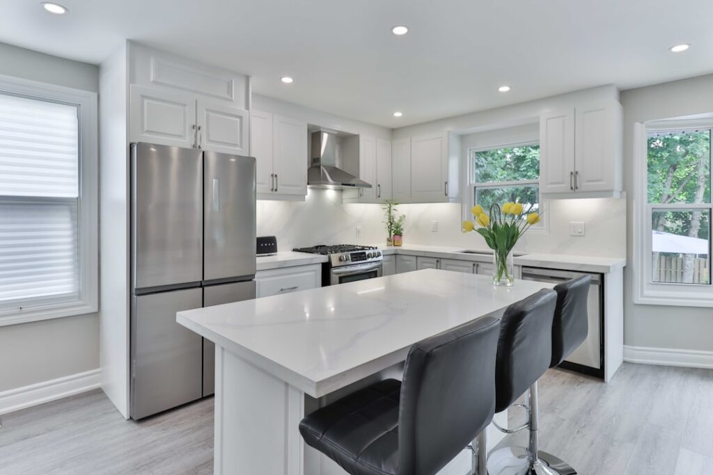
The all-white kitchen had a 15-year run, and it is finally giving up the throne. Today’s popular kitchen colors lean warmer, deeper, and more layered, with painted islands, tinted whites, and earthy greens replacing the bright cool whites that defined the 2010s. If you are remodeling now, picking a palette that balances current taste with long-term resale value matters more than chasing whatever is trendy this quarter. Here is what is actually selling, what designers are specifying, and what holds up over a decade.
Part of our Kitchen Remodeling guide — explore the full guide →
- Why Color Choice Matters More Than Ever
- Current Top Kitchen Whites
- Greens That Are Having a Moment
- Blues That Hold Long-Term Value
- Warm Neutrals: Beige Is Back
- Two-Tone Kitchens: The Standard Approach
- Wall Color and Backsplash Coordination
- Colors to Avoid Right Now
- Sampling Before Committing
- Picking a Color That Lasts
Why Color Choice Matters More Than Ever
Kitchen cabinet color drives the perception of the entire room, often more than countertop or flooring choices. A 200 sq ft kitchen typically has 80 to 120 sq ft of cabinet face, which is the largest single visual element. Get the color wrong and even premium materials feel disappointing.
Color also affects appraisal value. Real estate data shows kitchens painted in calm, broadly appealing colors (whites, greiges, soft greens, navy) sell for 1 to 3 percent more than identical homes with bold or polarizing colors (red, bright yellow, deep purple). On a $500,000 home, that can mean $5,000 to $15,000 in resale.
Current Top Kitchen Whites
White is not dead; it just got warmer and softer. The cool stark whites of 2015 (Decorator’s White, Pure White) have given way to creamier, more nuanced shades. Top picks now:
- Benjamin Moore White Dove OC-17: The unanimous designer favorite. Warm without yellowing.
- Sherwin-Williams Alabaster SW 7008: Slightly creamier, works with both warm and cool accents.
- Benjamin Moore Simply White OC-117: Brighter and cleaner, best in well-lit kitchens.
- Farrow and Ball Wevet: Soft chalky white with a hint of warmth, popular for English-style kitchens.
For finish, satin or matte enamel beats high-gloss. Modern waterborne enamels like Benjamin Moore Advance and Sherwin-Williams Emerald Urethane Trim Enamel give a hard durable finish without the glare of older oil-based paints.
Greens That Are Having a Moment
Green is the fastest-growing kitchen color category. The shades that work range from quiet sage to deep forest, all with enough gray to read sophisticated rather than retro.
- Sherwin-Williams Evergreen Fog SW 9130: Sage green with gray undertones. The 2022 SW Color of the Year still selling strong.
- Farrow and Ball Card Room Green No. 79: Deeper, more saturated, gorgeous on islands.
- Benjamin Moore Saybrook Sage HC-114: Dusty muted green that pairs beautifully with brass hardware.
- Sherwin-Williams Pewter Green SW 6208: Dramatic deep green with charcoal undertones for high-impact islands.
Greens work especially well in kitchens with east or south light, where they read clearer. North-light kitchens may need to test multiple swatches at different times of day to avoid muddy or olive results.
Blues That Hold Long-Term Value
Blue kitchens have aged better than expected, particularly the navy and grayed-blue tones. They bridge traditional and contemporary tastes and resist looking dated.
Reliable blue picks include Benjamin Moore Hale Navy HC-154 (the gold standard navy island), Sherwin-Williams Naval SW 6244 (slightly softer and more versatile), and Farrow and Ball Stiffkey Blue No. 281 (deep moody blue with serious presence). For lighter applications, Benjamin Moore Van Courtland Blue HC-145 and Sherwin-Williams Sea Salt SW 6204 work for whole-room treatments.
Warm Neutrals: Beige Is Back
The cold-gray era is fading. Warm neutrals (greige, taupe, mushroom) are filling the gap with colors that flatter wood floors, brass fixtures, and natural stone. The transition has been quick. Three years ago Repose Gray was on every kitchen designer’s spec sheet; today Accessible Beige has replaced it.
Top warm neutrals for cabinets:
- Sherwin-Williams Accessible Beige SW 7036
- Benjamin Moore Edgecomb Gray HC-173
- Sherwin-Williams Agreeable Gray SW 7029 (the warm gray everyone defaults to)
- Farrow and Ball Cornforth White No. 228
These warm neutrals pair especially well with rift-cut white oak floors, polished nickel hardware, and quartz counters with subtle veining.
Two-Tone Kitchens: The Standard Approach
The single most popular kitchen color strategy is now two-tone: lighter perimeter cabinets with a contrasting island. This approach delivers visual interest without committing the entire room to a strong color.
Combinations that consistently work:
- White Dove perimeter + Hale Navy island
- Alabaster perimeter + Urbane Bronze island
- Edgecomb Gray perimeter + Card Room Green island
- Simply White perimeter + Iron Mountain (BM 2134-30) island
For a 9-foot island, expect to use 1.5 to 2 quarts of paint. Spray application requires 3 light coats with 2 hours between each; brush and roll needs 4 thin coats for a comparable finish.
Wall Color and Backsplash Coordination
Wall color in a kitchen is mostly background since upper cabinets and backsplash cover most of the visible wall area. The smartest play is a tinted white that blends with cabinets rather than competing.
If your cabinets are White Dove, paint walls in the same color one shade lighter or in Benjamin Moore Classic Gray OC-23. For warm beige cabinets, walls in a clean white like BM Chantilly Lace OC-65 keep the room from feeling closed in. The backsplash is where you can introduce a third color or material; a zellige tile in a dusty blue, or a slab quartz with veining in your accent color, ties everything together.
Colors to Avoid Right Now
A few colors have aged poorly and are best avoided unless you genuinely love them and plan to stay long-term:
- Cherry red cabinets (peaked in the 1990s)
- Tuscan gold and burnt orange (peaked early 2000s)
- Espresso brown shaker (defined the 2010s, now feels heavy)
- Pure cool gray everywhere (2015-2020 trend now reading dated)
- High-gloss thermofoil white (cheap-looking and prone to peeling)
None of these are objectively bad colors, but they read of their era strongly enough to deter buyers in a resale market.
Sampling Before Committing
Always sample paint before buying gallons. Order 8×8-inch peel-and-stick sample boards from Samplize ($6 each) or paint actual primed cardboard squares with full-size samples ($8 to $12 per sample pot). Place samples on multiple walls of the kitchen and view them at morning, midday, evening, and under your kitchen lighting at night.
What looks gorgeous in a Pinterest photo may turn green, gray, or pink under your specific lighting. North-facing kitchens cool everything; south-facing kitchens warm everything; east light brightens mornings; west light intensifies evenings. Test in your actual room, not a paint store.
Picking a Color That Lasts
The kitchens that age best share three traits: a soft warm white as the dominant color, one accent color in a saturated but not extreme shade, and a third metal or wood tone tying the whole palette together. Anything bolder needs a homeowner who will live with it long enough to make the investment worthwhile, since extensive repainting of cabinets later runs $3,000 to $7,000 for a typical kitchen.
Pick the colors you genuinely love, then check whether they appear in any home magazine cover from 5 years ago. If they do not feel dated there, they likely will not feel dated 5 years from now either.


