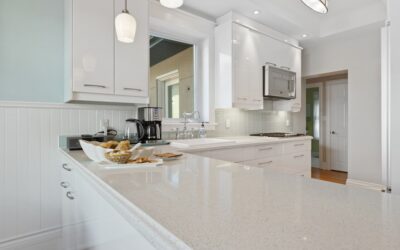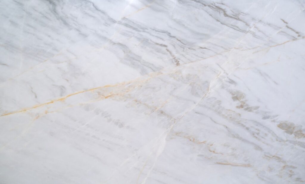
Most people picture pure white when they imagine marble, yet the stone comes in a surprising spectrum that runs from soft gray to deep green and near-black. Choosing among the many marble countertop colors is less about picking a favorite swatch and more about matching the veining, undertone, and finish to the light and cabinetry in your own kitchen. Marble is a natural stone, so no two slabs are identical, and the color you approve in a showroom is the exact piece that will live in your home for decades. This guide walks through the major color families, what drives their price, and how to choose a shade you will still love in ten years.
Part of our Countertops guide — explore the full guide →
- The Classic Whites and Grays
- Warm Tones: Cream, Beige, and Gold
- Dramatic Darks: Black and Charcoal Marble
- Green, Blue, and Statement Marbles
- How Finish Changes the Color
- Matching Marble Colors to Your Kitchen
- Price Differences Across Colors
- Using Marble Beyond the Kitchen Counter
- Living With Your Color Choice
The Classic Whites and Grays
White marble remains the anchor of the category, prized for the way it brightens a room and reflects natural light. Within that family there is real variety. Carrara, quarried in Italy, reads as a warm soft white with fine, feathery gray veining, and it is the most affordable and widely stocked option. Calacatta is whiter and more dramatic, with bolder, more spaced-out veins that often carry gold or taupe undertones. Statuario sits between the two, offering a bright background with striking gray movement.
Gray-dominant marbles like Bardiglio push the palette cooler and moodier. These work beautifully in contemporary kitchens where you want the stone to feel architectural rather than delicate. If your cabinets lean cool white or your floors are a gray-washed wood, a grayer marble ties the room together more naturally than a stark bright white.
Warm Tones: Cream, Beige, and Gold
Not every marble is icy. Crema Marfil from Spain delivers a warm beige field with subtle, cloudy veining, and it pairs effortlessly with cherry, walnut, and honey-toned cabinetry. Botticino offers a similar creamy warmth. These colors hide crumbs and water spots better than pure white, which is a quiet practical advantage in a busy kitchen. Calacatta Gold, with its buttery veins running through a white base, bridges the warm and bright worlds and has become a designer favorite for that reason.
Warm marbles also flatter warm lighting. If your kitchen relies on incandescent or 2700K LED bulbs, a cream marble will glow rather than look yellowed, which can happen when cool white stone sits under warm light.
Dramatic Darks: Black and Charcoal Marble
Dark marble makes a bold statement and has surged in popularity for islands and accent surfaces. Nero Marquina is the standout: a deep, saturated black shot through with crisp white veining that looks almost graphic. Black marble reads as luxurious and modern, but it demands attention to maintenance because water rings, etching, and dust all show more readily on a dark polished surface.
A common design move is to use a dark marble on the island and a lighter marble or quartz on the perimeter counters. This gives you the drama of black stone without committing your entire kitchen to a high-maintenance, light-absorbing surface.
Green, Blue, and Statement Marbles
For homeowners who want something unexpected, colored marbles open up a rich palette. Verde Alpi and other green marbles bring deep forest tones with white or gold veining, and they look stunning against brass hardware and warm wood. Blue marbles such as Azul Macaubas are rarer and command premium prices, but they turn a countertop into a genuine focal point. These statement stones work best in smaller applications, a bar top, a powder-room vanity, or a single island, where their intensity is an asset rather than an overload.
How Finish Changes the Color
The same slab can look like two different colors depending on how it is finished. A polished finish deepens and saturates the tone, sharpens the veining, and adds reflective shine, so a gray marble looks richer and a white marble looks crisper. A honed finish, which is matte and satin-smooth, lightens the overall appearance and mutes the veins for a softer, more casual look. Honed surfaces also hide etching better, which is why many designers recommend honed marble for kitchens that see heavy use. Leathered finishes add subtle texture and are more common on darker stones.
Matching Marble Colors to Your Kitchen
Choosing among marble countertop colors comes down to a few practical questions. Consider the undertone of your cabinets first, because fighting a mismatched undertone is the most common regret. Cool white or gray cabinets pair with cooler marbles, while warm woods and creams call for warm-toned stone.
- White shaker cabinets: Carrara or Calacatta for a timeless, bright look
- Navy or dark cabinets: Calacatta Gold or a white marble to create contrast
- Wood or cream cabinets: Crema Marfil or Botticino for warm harmony
- Modern flat-panel gray: Bardiglio or Nero Marquina for a sleek edge
Always view a full slab, not a small sample, before you commit. Veining patterns vary dramatically across a single quarry block, and the movement you see in a two-inch chip tells you almost nothing about how the finished counter will read.
Price Differences Across Colors
Color and rarity drive marble pricing as much as anything. Carrara is the budget entry point, often running $40 to $75 per square foot installed. Calacatta and Statuario climb to $100 to $200 per square foot because the bright background and bold veining are more sought after and less common. Exotic greens, blues, and premium golds can exceed $250 per square foot installed. Fabrication details, edge profiles, cutouts, and the number of slabs your layout requires all add to the total, so two kitchens in the same color can still land at very different prices.
Using Marble Beyond the Kitchen Counter
Marble’s color choices matter just as much in the other rooms where the stone shows up. On a bathroom vanity, a warm Crema Marfil or a soft Carrara reads as spa-like and calming, while a dramatic Nero Marquina turns a powder room into a jewel box. Fireplace surrounds are another popular spot, where a bold Calacatta with strong veining becomes a natural focal point above the mantel. For a waterfall island, book-matched slabs that mirror the veining across the seam create a striking, continuous flow of pattern that showroom photos rarely capture.
Color depth also affects how large or small a space feels. Light marbles bounce daylight around and make a compact kitchen or bath feel more open, while deep greens and blacks pull a room inward and cozy it up. If you are working with a small footprint, leaning toward the lighter end of the spectrum keeps the space from feeling heavy. In larger, light-filled rooms you have the freedom to go dramatic without overwhelming anything, which is why grand kitchens can carry a dark island that would swallow a galley layout.
Think about your fixtures too. Brass and gold hardware flatter warm creams and greens, while chrome and matte black sharpen the look of cool grays and whites. Coordinating the metal finish with the marble undertone ties the whole room together and makes even a modest slab look custom and considered.
Living With Your Color Choice
Whatever shade you choose, remember that marble is a calcium-based stone that etches when it meets acid, and lighter etch marks show more on dark polished surfaces while water spots show more on white. Sealing the stone every six to twelve months slows staining, and wiping spills promptly protects the finish. Many homeowners come to appreciate the way marble ages, developing a soft patina that reads as character rather than damage. If a pristine surface is non-negotiable for you, a honed finish or a warmer color will disguise everyday wear far better than a high-gloss white.
The right marble countertop colors are the ones that flatter your specific light, cabinetry, and tolerance for maintenance. Take slab samples home, look at them at different times of day, and trust the color that still looks right after a week on your counter. That patience is what separates a choice you tolerate from one you genuinely love.