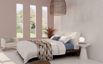
Pink got a bad rap in the 1980s when it covered every nursery and powder room in pastel disasters. Today, a properly chosen pink accent wall reads sophisticated, warm, and intentional — the difference between a designer-worthy moment and an unfortunate throwback comes down to undertone, paint sheen, and what’s around it. This guide covers exact paint codes, smart placement, and the pairings that make pink work in any room from nurseries to home offices.
- Why Pink Accent Walls Work in 2026
- The Best Pink Paint Codes by Undertone
- Best Rooms for a Pink Accent Wall
- Wall Selection Within the Room
- Pairing Pink with Other Colors
- What to Avoid Pairing With Pink
- Paint Sheen for Pink Walls
- Trim and Ceiling Pairings
- Furniture and Decor Strategies
- Pink Wall Mistakes to Avoid
- Cost to Paint a Pink Accent Wall
- Frequently Asked Questions
Why Pink Accent Walls Work in 2026
Pink is technically a tinted red, which means it carries warmth and energy without the boldness of full-saturation reds. As open-concept layouts and all-white interiors dominated the past decade, designers turned to muted pinks (Millennial Pink, Dusty Rose, Blush, Terracotta) to add warmth without commitment. A single accent wall lets you experiment with the trend at low cost and minimal future regret.
The Best Pink Paint Codes by Undertone
Cool Pinks (Blue Undertone)
- Benjamin Moore Pink Bliss 2093-70 — Soft, baby-like, best for bedrooms
- Sherwin-Williams Romance SW 6323 — Quiet, sophisticated
- Farrow & Ball Calamine No. 230 — Iconic, slightly chalky
Warm Pinks (Yellow/Orange Undertone)
- Benjamin Moore Pink Damask OC-72 — Creamy, warm, livable
- Sherwin-Williams Faint Coral SW 6329 — Salmon-leaning, energetic
- Farrow & Ball Setting Plaster No. 231 — Designer favorite, complex
Bold and Saturated Pinks
- Benjamin Moore Razzle Dazzle 1348 — High-energy, statement
- Sherwin-Williams Coral Reef SW 6606 — Bold coral with red lean
- Farrow & Ball Nancy’s Blushes No. 278 — Saturated, jewel-like
Earthy and Muted Pinks (Terracotta-leaning)
- Sherwin-Williams Cavern Clay SW 7701 — Earthy, contemporary
- Benjamin Moore Persimmon 2088-40 — Warm, sophisticated
- Farrow & Ball Sulking Room Pink No. 295 — Moody, low-saturation
Best Rooms for a Pink Accent Wall
Bedrooms
The classic location. Pink reduces visual stimulation compared to bright reds and supports rest. Place behind the bed for a built-in headboard effect. Pair with crisp white bedding and warm wood furniture.
Home Offices
Pink walls test surprisingly well on video calls — the slight warmth flatters skin tones and makes the room feel less corporate. Cavern Clay or Sulking Room Pink work especially well behind a desk.
Powder Rooms
Small spaces tolerate bold colors better than large ones because you don’t live in them long. A saturated pink powder room with brass hardware and a dramatic mirror reads jewel-box rather than overwhelming.
Nurseries and Children’s Rooms
The obvious use, but choose grown-up pinks (Pink Damask or Setting Plaster) rather than baby pinks so the room ages with the child rather than requiring repaint at age 6.
Kitchen and Dining Spaces
A terracotta pink wall behind a dining table adds warmth and stimulates conversation without overwhelming food presentation. Skip in kitchens unless paired with very neutral cabinetry.
Wall Selection Within the Room
The wall behind a bed, sofa, or dining table makes the strongest accent because it frames the focal furniture. Avoid the wall with the most windows — paint disappears around glass and the effect looks accidental. Skip the wall directly opposite the entry; you’ll see the pink before anything else and the room loses balance.
Pairing Pink with Other Colors
- White: Foolproof. Crisp white trim and ceiling let pink lead.
- Sage green: The current designer pairing. Both are tinted, both feel organic.
- Charcoal and black: Grounds saturated pinks, prevents juvenile reading.
- Brass and gold: Warm metal complements pink’s warmth.
- Navy: Cool, sophisticated counterpoint. Works for sophisticated bedrooms.
- Natural wood (oak, walnut): Adds visual warmth and textural variety.
What to Avoid Pairing With Pink
- Bright primary red — competes for warmth, clashes.
- Cool gray with blue undertone — fights warm pink, reads off.
- Bright purple — too close in hue, creates visual mud.
- Avocado green or mustard yellow — dates the look toward 1970s.
Paint Sheen for Pink Walls
Eggshell is the safe default. It hides minor wall imperfections and offers light cleanability. Matte finishes maximize color depth and look more sophisticated but show every smudge. Skip semi-gloss and gloss on accent walls — they reflect light and can read juvenile in pink.
Trim and Ceiling Pairings
Crisp white trim (Benjamin Moore Chantilly Lace OC-65 or Sherwin-Williams Pure White SW 7005) creates the strongest contrast and lets the pink read intentional. For warmer pinks like Setting Plaster, switch to a creamy white trim like Benjamin Moore White Dove OC-17 to avoid jarring brightness contrast.
Keep ceilings traditional flat white unless the pink is muted enough that wrapping color overhead creates a cocoon effect — common in small powder rooms.
Furniture and Decor Strategies
Pink walls demand restraint elsewhere. Stick with two to three additional colors maximum. Natural wood furniture adds warmth without competing. Brass picture frames and lamps tie the warmth together. Avoid pink furniture in front of pink walls — too much pink reads juvenile and overwhelms the eye. Use pink as wall accent OR upholstery accent, rarely both.
Pink Wall Mistakes to Avoid
- Choosing baby pink in a north-facing room. The cool light pushes pink toward purple and looks sickly.
- Pairing pink walls with pink decor — too much pink reads themed, not designed.
- Going saturated in a small room with low ceilings. The color closes in.
- Skipping primer over old colors. Pink shows through everything beneath it.
- Forgetting natural light testing. Sample on the wall and view at multiple times of day.
Cost to Paint a Pink Accent Wall
- 1 quart of premium paint (covers 100 sq ft, two coats): $20 to $30
- Painter’s tape, drop cloth, brush, mini roller: $25 to $40
- Tinted primer (if covering darker wall): $20 to $30
- Total DIY: $65 to $100 for a typical accent wall
Frequently Asked Questions
What’s the most timeless pink for an accent wall?
Benjamin Moore Pink Damask OC-72 and Farrow & Ball Setting Plaster No. 231 are both creamy, sophisticated pinks that age well across design trends.
Can a pink accent wall work in a masculine space?
Yes. Earthy terracottas like SW Cavern Clay or muted F&B Sulking Room Pink read warm and grounded, not feminine.
Will a pink accent wall date my home?
Saturated bubblegum pinks date quickly. Muted, complex pinks (terracotta, blush, dusty rose) have remained on-trend for years and likely will continue.
How much paint do I need for one accent wall?
One quart covers a typical 8 by 12 ft accent wall in two coats. Buy a gallon if your wall exceeds 100 sq ft or you’re going from dark to light.