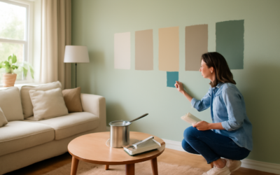
The living room is the hardest-working room in most homes, and its wall color sets the tone for everything that happens there — quiet mornings, movie nights, and every guest who walks in. Choosing among the most popular living room paint colors isn’t about chasing whatever’s trending on social media this season; it’s about picking a shade that flatters your light, complements your furniture, and still feels right three years from now. The colors that stay popular do so because they’re versatile and forgiving. This guide covers the shades homeowners reach for again and again, plus the undertone and finish knowledge that makes any of them look intentional.
Part of our Paint & Walls guide — explore the full guide →
The Most Popular Living Room Paint Colors
Certain colors earn their popularity by working in nearly any home. These are the reliable performers that designers and homeowners return to year after year.
- Warm greige — the perfect gray-beige hybrid that pairs with wood, cool grays, and warm whites alike. Sherwin-Williams Agreeable Gray and Benjamin Moore Revere Pewter are the classics.
- Soft warm white — a creamy off-white like Benjamin Moore White Dove keeps a room bright without feeling stark or clinical.
- Muted sage green — earthy and calming, sage brings nature indoors and suits both traditional and modern rooms.
- Deep moody blue — a navy or slate blue like Hale Navy creates a cozy, sophisticated accent wall or an enveloping whole-room look.
- Warm taupe and mushroom — richer than beige, these grounded neutrals feel current and hide wear.
- Soft charcoal and greige-gray — for those who love a darker, dramatic living room without going full black.
If you want the single safest choice for resale and flexibility, a warm greige is nearly impossible to get wrong. If you want personality, sage green and deep blue lead the pack right now.
Understanding Undertones
The reason a color that looks perfect on a chip turns disappointing on the wall is almost always undertones — the subtle secondary color hiding inside the main one. A gray can lean blue, green, or purple; a white can lean yellow, pink, or gray. In a north-facing room with cool light, a paint with cool undertones can turn drab and lifeless, while a warm undertone counteracts the chill. In a bright south-facing room, warm colors intensify and can feel yellow.
The practical rule: match the undertone to your light and your fixed elements. If your floors are warm oak and your trim is cream, choose colors with warm undertones so nothing clashes. Hold a paint chip against your floor and furniture, not just the wall, to see how the undertones interact before you commit.
Matching Color to Your Light
Natural light changes a paint color more than any other factor. The same gallon looks like three different colors across a single day and across rooms that face different directions.
- North-facing rooms receive cool, indirect light that can gray out colors — lean warm to compensate.
- South-facing rooms get abundant warm light that intensifies everything, so even bold colors stay balanced.
- East-facing rooms are warm in the morning and cooler by afternoon.
- West-facing rooms turn golden and warm in the late day.
Always test your top choices on the actual walls and observe them at the times you use the room most — a color chosen for evening movie nights should be judged under your evening lamp light, not the midday sun.
Coordinating With Furniture and Flooring
Your walls are the backdrop, not the star, so let your existing furniture and floors guide the palette. Pull an undertone from something you’re keeping — the warmth of a leather sofa, the gray of a rug, the honey of the floor — and echo it in the wall color for a cohesive room. A common mistake is choosing a wall color in isolation, then fighting to make the furniture work with it.
A useful framework is the 60-30-10 rule: about 60 percent of the room in the dominant wall color, 30 percent in a secondary tone through large furniture, and 10 percent in accent color via pillows, art, and decor. Keep the 60 percent versatile and you can refresh the room’s whole feel by swapping inexpensive accents.
Choosing the Right Finish
Sheen affects both durability and how the color reads. For living room walls, eggshell or matte is the standard — enough sheen to wipe clean without highlighting every drywall imperfection under raking light. Flat finishes give the richest, most velvety color and hide flaws best, but they’re harder to clean, so they suit low-traffic living rooms or adults-only households. Save satin for trim, doors, and window casings, where a slightly higher sheen looks crisp and stands up to scuffs. In a busy family room, an eggshell in a quality scrubbable paint like Sherwin-Williams Emerald or Benjamin Moore Regal Select is the practical sweet spot.
Accent Walls and Two-Tone Ideas
If a whole room of bold color feels risky, an accent wall gives you drama with a fraction of the commitment. Paint the wall behind the sofa or the fireplace surround in a deep blue or charcoal while keeping the other three walls light. Color drenching — painting walls, trim, and ceiling all in one soft shade — is another popular approach that makes a room feel larger and more enveloping. For a subtler effect, paint the lower two-thirds of the wall in a grounding color with a picture-rail break, keeping the upper portion light and airy.
Testing and Buying
Never commit to two gallons off a two-inch chip. Buy sample pots for $5 to $8 each and paint large squares — at least two feet — on multiple walls. Peel-and-stick sample sheets are a tidy alternative if you’d rather not paint directly. Live with the samples for two or three days, checking them morning, afternoon, and night. A typical living room needs two gallons for two coats, running $60 to $120 in quality paint. Buy all your paint in one batch with matching lot numbers, and box the gallons together in a single bucket so the color stays perfectly consistent wall to wall.
Popular Colors for Open-Concept Spaces
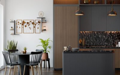
Open floor plans complicate color choice because the living room flows visually into the kitchen, dining area, and entry with no walls to separate the palettes. The solution most designers use is a single unifying wall color throughout the connected spaces, with variation introduced through furniture, cabinetry, and accents rather than different wall colors that clash at every sightline. A versatile warm greige or soft white carries the whole open area gracefully, letting each zone develop its own character through decor.
If you want more distinction between areas, use color drenching in one zone — painting a defined nook or the dining area in a deeper shade from the same family — so it reads as intentional rather than accidental. The key in open concept is restraint: two or three coordinated colors across the whole space look calm and cohesive, while five competing wall colors make an open plan feel chaotic and smaller than it is.
Colors to Approach With Caution
Some shades look stunning in magazines but disappoint in a real living room, and knowing the risky ones saves you a costly repaint. A few categories deserve extra testing before you commit.
- Cool gray — the defining color of the 2010s, it can now read dated and, in north-facing rooms, cold and lifeless. If you love gray, choose a warm greige instead.
- Bright, saturated colors — a vivid red or intense teal that energizes a small accent overwhelms across four walls and is exhausting to live with daily.
- Pure bright white — it can feel stark and clinical in a living room; a soft, warm white reads far cozier.
- Trendy niche colors — a color chosen purely because it’s the season’s “it” shade often feels dated fastest. Prioritize timelessness for a room you repaint infrequently.
None of these are forbidden — a deep jewel tone can make a spectacular library-style living room — but they demand careful testing and a clear sense of how you’ll live with them before you buy two gallons.
Final Thoughts
The most popular living room paint colors stay popular because they’re forgiving, versatile, and easy to live with — warm greige, soft white, sage green, and deep blue lead the list for good reason. Match the undertone to your light and your furnishings, test generously before you buy, and choose an eggshell finish for durability. Get those fundamentals right and you’ll land on a color that feels welcoming today and still looks intentional years down the road.