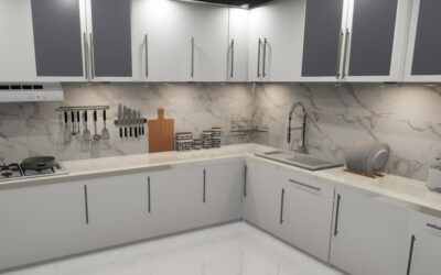
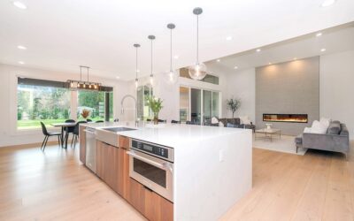
The single biggest advantage engineered stone has over natural slab is choice: quartz countertops colors and patterns span everything from gallery-white minimalism to convincing Calacatta marble to near-black industrial concrete, and unlike granite, the sample you approve is the surface you get. I’ve walked hundreds of clients through slab yards over the years, and the same lessons come up every time — pattern drives price more than color does, scale reads differently on a full island than on a 4-inch chip, and the safest choices are safe for reasons worth understanding. This is the full tour, organized the way designers and fabricators actually think about it.
Part of our Countertops guide — explore the full guide →
How Quartz Gets Its Look
Quick manufacturing context, because it explains the price ladder. Quartz slabs are about 90 percent ground natural quartz in pigmented polymer resin, pressed and cured. Solid colors and uniform speckles are the easiest to make: one pigment batch, consistent mix. Veined patterns require injecting or layering contrasting pigment through the mix as the slab forms — and realistic, full-depth marble veining demands the most sophisticated production lines in the industry. That’s the whole pricing story in one paragraph: the more the slab pretends to be Italian marble, the more it costs. Solid and speckled colors run $30 to $60 per square foot installed at the value tier; convincing Calacatta-style veining runs $70 to $150.
The Color Families
Whites: Still Half the Market
White quartz is the best-selling countertop surface in America, and the range within “white” is bigger than outsiders expect.
- Pure/absolute white: uniform, bright, no pattern. The modernist choice; unforgiving of crumbs, spectacular with flat-panel cabinets. Usually a brand’s cheapest color.
- Warm whites and creams: ivory, alabaster, and oat tones that flatter cream cabinetry and warmer wood floors. The current design cycle has swung noticeably warm.
- Whites with movement: the Carrara-inspired soft gray veining (Caesarstone’s and Silestone’s takes are everywhere) and the bolder Calacatta looks with dramatic gray-gold veins. This family — white with gray/gold veining — is the defining countertop look of the last decade and still the volume leader.
Grays and Greiges
From pale fog to charcoal, gray quartz pairs with the white-cabinet and two-tone kitchens that dominate US remodels. Greige — the gray-beige hybrid — is the diplomat that works with both cool and warm palettes and is my standing recommendation when a client can’t decide. Concrete-look grays with subtle mottling and a matte finish carry the industrial and transitional looks.
Darks: Black, Charcoal, Espresso
Dramatic and back in fashion, especially matte black and marble-look black with white veining (think Silestone Eternal Marquina-style patterns). Real-world note from someone who cleans up after installs: polished dark quartz shows fingerprints, water spots, and dust more than anything else in the showroom. Matte/honed finishes fix most of that and are the way I steer dark-counter clients.
Beiges, Browns, and Earth Tones
The granite-look speckled beiges that dominated the 2000s still exist and still serve traditional kitchens, but they’ve fallen far out of fashion. They’re often deeply discounted — a genuine value play if your kitchen leans classic Tuscan or you’re doing a rental.
Bold Colors
Blues, greens, even terracotta exist — Silestone in particular has never been shy. Deep green and navy quartz on an island against white perimeter counters is a current designer move. Bold color on every surface is a resale gamble; bold color on the island is a manageable one.
The Pattern Vocabulary
| Pattern Type | Look | Typical Price Tier | Hides Mess? |
|---|---|---|---|
| Solid/uniform | One flat color | $ | Poorly |
| Fine speckle (salt-and-pepper) | Small even flecks | $ | Very well |
| Coarse aggregate | Visible quartz chunks, granite-adjacent | $$ | Very well |
| Subtle veining (Carrara-style) | Soft thin gray veins | $$–$$$ | Well |
| Dramatic veining (Calacatta-style) | Bold sweeping veins, high contrast | $$$–$$$$ | Moderately |
| Concrete/industrial | Mottled matte cloudiness | $$–$$$ | Well |
Two practitioner notes on veined product. First, scale: a vein pattern that looks delicate on a 4-inch sample can be a monsoon across a 9-foot island. Always view a full slab, and ask the fabricator to lay out where your cuts fall on it — good shops will photograph the slab and superimpose your countertop outline so you approve exactly which veins land where. Second, seams: high-contrast veining makes seams harder to disguise, because veins have to visually “continue” across the joint. Budget lines with printed-surface veining (pattern only on the top face) also reveal plain cores at exposed edges and sink cutouts — full-body veined product costs more precisely because the pattern runs through the slab. Ask which type you’re buying; edge appearance is where cheap veining gets exposed.
Finish: The Third Dimension Everyone Forgets
The same color reads completely differently across finishes, and finish affects daily life more than most color decisions.
- Polished: the glossy default. Deepest color saturation, easiest to wipe clean, shows smudges on dark tones.
- Matte/honed: soft, contemporary, hides fingerprints on darks — but on some colors it shows hand oils as temporary darker patches and asks for slightly more deliberate cleaning. Ask to touch a honed sample greasy-fingered before committing; the good brands have largely solved this, the cheap ones haven’t.
- Textured/rough (suede, volcano, leathered-style): tactile, dramatic, best reserved for low-mess zones like islands and baths.
Matching Colors to the Room: Field Rules That Hold Up
- Pick counters and cabinets together, floors third. The counter-cabinet pairing is the kitchen’s dominant relationship. White-veined quartz over navy or green cabinets, warm white over white, charcoal over light oak — these pairings work because contrast lives in one place at a time.
- One hero per kitchen. If the counter has dramatic veining, calm the backsplash and floor. Two loud patterns fight; three is a food court.
- Undertones beat colors. A cool blue-gray quartz against cream cabinets looks accidentally mismatched no matter how nice each piece is. Hold samples together in the actual room, in daylight and under your bulbs — quartz shifts noticeably between 3000K warm light and northern daylight.
- Busy hides, plain shows. Households with kids and real cooking are happier with speckle or soft veining than with absolute white or jet black. This is the most-thanked advice I give.
- Resale logic: white-with-gray-veining and warm off-whites are the broadest-appeal choices and have been for years. Personality goes on the island, the paint, and the hardware — things cheaper to change than slabs.
Color-by-Brand Cheat Sheet
Every major brand covers every family now, but each has centers of gravity. Cambria owns the luxury dramatic-veining space (all made in Minnesota, lifetime warranty, priced accordingly). Caesarstone built the modern concrete and minimalist palette. Silestone has the deepest color catalog including the bold hues and sueded finishes. MSI Q and the import value lines cover the greatest-hits colors — their Calacatta interpretations are the volume sellers of the entire industry — at the friendliest prices. LG Viatera and Corian Quartz sit competently in the middle. My honest guidance: choose the pattern first, then buy it from whichever tier your budget likes, because every popular look now exists at three price points.
What Pattern Costs You at the Seam and the Sink
One last practical wrinkle before the decision framework: your pattern choice quietly changes the fabrication bill. Solid and speckled slabs seam invisibly and cut anywhere, so fabricators quote them at base labor. Dramatic veining adds real shop time — vein-matching a seam or wrapping a waterfall edge so the pattern flows down the side means careful slab layout, more waste, and sometimes an extra slab, and shops price accordingly; a vein-matched waterfall island can add $500 to $1,500 over the same island in a speckled color. If the budget pinches, remember the hierarchy: pattern drives slab price, veining drives fabrication price, and color itself is nearly free. A quiet warm white costs less at every line of the quote than the Calacatta look — worth knowing before you fall in love at the yard.
How to Decide Without Regret
Take home large samples — most brands sell or loan 4-by-4-inch minimum, and fabricators will often cut you a bigger offcut of a contender. Live with them on the actual counter for a week: set coffee cups on them, crumb them, see them at breakfast and under evening lights. Then go approve the full slab in person, ask for the cut layout on veined material, and choose the finish with your fingertips as well as your eyes. Quartz is a 20-year decision that cannot be repainted; the extra ten days of diligence costs nothing. And if you’re still torn at the end, buy the quieter slab — in my experience nobody has ever regretted the calmer counter, and the people who chose the loudest slab in the yard occasionally have.