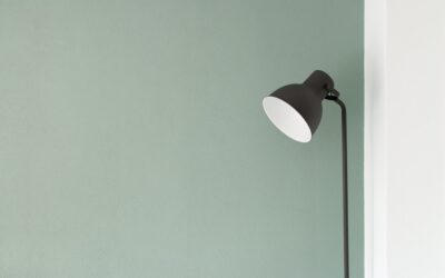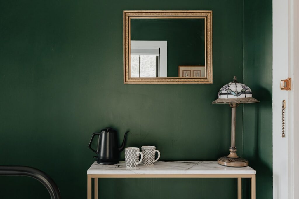
Sage green wall paint has quietly become one of the most requested colors in American homes, and for good reason. It reads as calm and grounded without the coldness of gray or the heaviness of forest green. Yet plenty of homeowners buy a gallon of sage green wall paint, roll it on, and discover it looks muddy, minty, or oddly gray on their walls. The difference between a sage that sings and one that sinks almost always comes down to undertone, sheen, and lighting, not the swatch on the paint chip.
Part of our Paint & Walls guide — explore the full guide →
- What Actually Makes a Green "Sage"
- The Best Sage Green Paint Colors to Consider
- How Lighting Changes Sage on Your Walls
- Choosing the Right Sheen
- Colors That Pair Beautifully With Sage
- Where Sage Green Works Best in the Home
- Prep, Primer, and Application Tips
- Common Mistakes to Avoid
- Sage as an Accent Versus a Whole Room
What Actually Makes a Green “Sage”
Sage is a gray-green that mimics the dusty, silvery leaves of the culinary herb. Technically, most sage paints sit around a low-chroma green with a light reflectance value (LRV) between roughly 45 and 60, which puts them in the mid-tone range. That LRV number matters more than the name on the can. A sage with an LRV near 60 will feel airy and neutral, while one closer to 40 leans darker and moodier, closer to a true olive.
Undertone is where sage colors diverge sharply. Some sages carry a gray base that keeps them muted and sophisticated. Others hide a yellow undertone that can flash almost lime-like in bright afternoon sun, and a few lean blue, which pushes them toward eucalyptus. When you compare two chips that both say “sage,” hold them against a sheet of white printer paper. The yellow-based one will look warmer and slightly muddy; the gray-based one will look cleaner and cooler by comparison.
The Best Sage Green Paint Colors to Consider
A handful of shades have earned their reputation because they behave predictably across different rooms. Farrow & Ball’s Card Room Green and Green Smoke run darker and dramatic, ideal for a study or a moody powder room. For a lighter, more versatile sage, Sherwin-Williams Evergreen Fog (their 2022 Color of the Year, LRV 30) actually leans more into a gray-green greige and works beautifully on cabinetry.
If you want a true, soft sage for main walls, look at Benjamin Moore October Mist (LRV 60) and Sherwin-Williams Softened Green (LRV 51). Behr Back to Nature and Magnolia Home Rescued River both deliver an approachable, warm sage in the $35 to $50 per gallon range. For a cleaner, cooler take, Benjamin Moore Saybrook Sage carries a subtle blue-gray note that reads crisp in north-facing rooms. Buy a sample pot, never a full gallon, before committing.
How Lighting Changes Sage on Your Walls
Nothing wrecks a sage paint job faster than ignoring light. North-facing rooms receive cool, indirect light that amplifies any gray or blue undertone, so a muted sage can slide toward dull and flat. In those rooms, choose a sage with a touch of warmth or slightly higher LRV to keep it from feeling gloomy. South-facing rooms flood with warm light for most of the day, which can push a yellow-based sage into lime territory around 2 p.m.
Test your color the honest way. Paint two coats on a 2-by-2-foot poster board, then tape it to different walls and look at it at 8 a.m., noon, and 7 p.m. under your actual bulbs. Warm 2700K LED bulbs will deepen and yellow a sage, while daylight 5000K bulbs make it look cooler and grayer. If you paint directly on the wall, do it in a low-traffic corner so you can cover it later.
Choosing the Right Sheen
Sheen affects both durability and how the color reads. Flat and matte finishes absorb light and make sage look soft and velvety, which flatters the color but shows scuffs and resists scrubbing. Eggshell is the sweet spot for most living rooms and bedrooms because it offers a subtle glow with reasonable washability. For a kitchen, bathroom, or hallway that takes abuse, step up to satin, which cleans easily but will reflect more light and slightly intensify the green.
On trim, doors, and cabinets, use a semi-gloss or a cabinet-grade enamel like Benjamin Moore Advance. That extra sheen creates crisp contrast against matte sage walls and handles fingerprints far better. Avoid high-gloss on large wall areas, as it exaggerates every roller mark and drywall imperfection.
Colors That Pair Beautifully With Sage
Sage is remarkably social because it is a muted mid-tone that plays well with warm neutrals, natural materials, and earthy accents. Creamy off-whites like Benjamin Moore White Dove or Swiss Coffee soften the pairing and keep trim from looking stark. Warm woods, from white oak to walnut, feel almost engineered to sit next to sage, which is why the color works so well in kitchens with natural wood cabinets or oak flooring.
For contrast, terracotta, rust, and warm brass hardware add energy without fighting the green. Black accents in cabinet pulls, picture frames, or window mullions ground the room and add a modern edge. If you want a tonal, layered look, pair sage with soft clay, oatmeal, and taupe for a nature-inspired palette. Avoid cool grays with blue undertones next to a warm sage, since the mismatch can make the green look dirty.
Where Sage Green Works Best in the Home
Bedrooms are a natural fit because sage’s low saturation promotes rest and reads as restful rather than stimulating. In a primary bedroom, a soft sage on all four walls with white bedding and wood nightstands creates a spa-like calm. Kitchens have embraced sage in a big way, particularly on lower cabinets or a full island paired with white uppers and a natural stone or butcher-block counter.
Home offices benefit from sage because it is focus-friendly and less fatiguing than a stark white box. Bathrooms take well to sage on the vanity or walls, especially with brass fixtures and white subway tile. Even exteriors work; a sage front door or shutters against a warm white or cream siding is a timeless combination that boosts curb appeal without shouting.
Prep, Primer, and Application Tips
Because sage is a mid-tone with a gray base, coverage over a dark or bold wall is easier with a tinted primer. Ask the paint counter to tint your primer gray, which helps a sage reach full color in two coats instead of three. Over a clean, previously painted light wall, a quality self-priming paint like Sherwin-Williams Emerald or Benjamin Moore Regal Select usually covers in two coats.
Cut in the edges with a 2.5-inch angled sash brush and roll the field with a 3/8-inch nap roller for smooth drywall. Maintain a wet edge and roll in overlapping W patterns to avoid lap marks, which show more on mid-tone colors than on very light or very dark ones. Let the first coat dry at least four hours before recoating, and expect the true color to settle in as it fully cures over two to three weeks. Budget roughly one gallon per 350 to 400 square feet per coat, so a standard 12-by-12 room typically needs two gallons for two coats.
Common Mistakes to Avoid
The biggest error is skipping the sample stage and trusting the store chip, which is printed under lighting nothing like your home. The second is choosing a sheen too glossy for a large wall, which magnifies imperfections and intensifies the color beyond what you expected. Homeowners also frequently pair a warm sage with cool blue-gray trim, then wonder why the room feels off; matching undertones across your palette solves that instantly.
Finally, resist going too dark in a small, low-light room unless you want a cozy, enveloping effect on purpose. A deep sage can be stunning in a windowless powder room but oppressive in a cramped bedroom. Get the undertone, sheen, and lighting right, and sage rewards you with a color that feels fresh in year one and just as relevant a decade later.
Sage as an Accent Versus a Whole Room
You do not have to commit all four walls to sage to enjoy it. An accent wall behind a bed or sofa introduces the color in a controlled dose, letting you test how it lives in your space before going all in. Sage also works beautifully on built-ins, a fireplace surround, or the back of open shelving, where it frames objects without dominating the room. On kitchen or bath cabinetry, a sage lower with white or natural-wood uppers has become one of the most enduring looks of the decade.
If you want the color everywhere without heaviness, keep the ceiling and trim in a warm white to bounce light and prevent the room from feeling closed in. In a larger, brighter room you can push toward a deeper sage on all walls for a cocooning effect, while a small or dim room usually reads better with sage on a single wall and lighter neutrals elsewhere. Either approach keeps the color feeling intentional rather than overwhelming, which is ultimately what makes sage feel timeless instead of trendy.