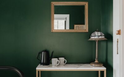
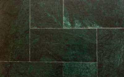
Few hues have staying power like sage. Soft, grayed, and rooted in nature, sage green paint colors read as calm without going cold, which is exactly why designers keep reaching for them on kitchen cabinets, bedroom walls, and front doors alike. Unlike bolder greens that dominate a space, sage acts almost like a neutral, quietly complementing wood tones, brass, and warm whites.
Part of our Paint & Walls guide — explore the full guide →
The trick is choosing the right sage for your light and your goals. A shade that looks serene in a bright kitchen can turn muddy in a north-facing den. This guide walks through the best-selling sages, their undertones, and how to pair them so your rooms feel intentional rather than dated.
- What Makes a Green "Sage"
- Best Sage Green Paint Colors to Consider
- How Light Changes Your Sage
- Where Sage Works Best
- Colors That Pair Beautifully with Sage
- Finish and Application Tips
- Common Mistakes to Avoid
- Is Sage Green Here to Stay?
- Sage on Kitchen Cabinets: A Closer Look
- Sage in Small Rooms and Powder Baths
- Sample the Right Way
What Makes a Green “Sage”
Sage sits in the muted, gray-green family named after the herb. Paint chemists build it by softening a base green with gray and a touch of yellow, which knocks down the saturation and gives it that dusty, earthy quality. That gray content is what lets sage behave as a chameleon neutral.
Watch the undertones closely. Warmer sages lean yellow or olive and feel cozy, while cooler sages carry blue or gray and feel crisp. The exact balance shifts dramatically with your lighting, so a swatch that looks perfect in the store may surprise you at home.
Best Sage Green Paint Colors to Consider
These shades tend to work well in real homes across different light conditions. Prices run roughly $50 to $75 per gallon for premium interior lines.
- Sherwin-Williams Evergreen Fog (SW 9130): A 2022 Color of the Year, this gray-green-with-a-whisper-of-taupe is the crowd favorite for cabinets and accent walls. It reads sophisticated and never juvenile.
- Benjamin Moore October Mist (1495): A silvery, gentle sage that feels almost like a green-tinted greige. Excellent for whole-room walls where you want serenity.
- Sherwin-Williams Softened Green (SW 6177): A restful, spa-like sage that shines in bathrooms and bedrooms.
- Benjamin Moore Saybrook Sage (HC-114): A deeper, slightly earthier sage that suits exteriors, shutters, and libraries.
- Farrow & Ball Card Room Green (No. 79): A rich, dramatic sage for those who want more depth on cabinetry or a study.
How Light Changes Your Sage
Orientation matters more with sage than with almost any other color. North-facing rooms get cool, indirect light that pushes green toward gray and can flatten a muted sage into something dreary. In those spaces, choose a warmer, slightly more saturated sage like Evergreen Fog to keep it alive.
South-facing rooms flood with warm light that intensifies yellow undertones, so a warm sage may turn unexpectedly olive. Cooler picks such as October Mist balance that out. East light is bright and blue in the morning, while west light glows amber in the afternoon, so always test on multiple walls and check at different times of day.
Where Sage Works Best
This color earns its keep in more places than you might expect. Kitchen cabinets are the runaway trend, where sage lowers on the base cabinets with a warm white on top delivers a fresh two-tone look that ages gracefully.
- Bedrooms: Sage lowers the visual temperature and encourages rest, making it a natural choice for a primary suite.
- Bathrooms: Pair a soft sage with white subway tile and brushed brass for a quiet, spa feel.
- Home offices: Green is easy on the eyes during long screen sessions and reads focused rather than sleepy.
- Front doors and shutters: A deeper sage like Saybrook Sage adds curb appeal against brick or white siding.
Colors That Pair Beautifully with Sage
Because sage is essentially a soft neutral, it plays well with a wide palette. Warm whites keep it from feeling stark; think Benjamin Moore White Dove or Sherwin-Williams Alabaster on trim and ceilings. Natural wood tones, from white oak flooring to walnut furniture, warm the whole scheme.
For metals, brushed brass and aged bronze flatter sage far better than chrome. Add cream, terracotta, or blush for a warm, organic room, or lean into black hardware and marble for something more tailored. Sage even holds its own next to navy and charcoal when you want contrast with restraint.
Finish and Application Tips
Sheen affects how a muted color reads, so choose deliberately. On walls, a matte or eggshell finish keeps the color soft and hides minor imperfections. For cabinets and trim, step up to a satin or semi-gloss so the surface wipes clean and reflects a little light.
A few practical steps make the job go smoothly:
- Buy sample pots and paint large poster boards, then move them around the room over two full days.
- Prime cabinets with a bonding primer so the sage adheres and resists chipping.
- Apply two coats minimum; grayed greens can look patchy in a single pass.
- Check the color against your existing flooring and countertops, not just the wall, before committing.
Common Mistakes to Avoid
The biggest error is skipping the sample stage and trusting a chip under fluorescent store lighting. Sage is too sensitive to light for that gamble. Another pitfall is pairing it with cool, blue-white trim, which can make a warm sage look dirty; match your white’s undertone to the sage’s.
Finally, resist the urge to sage every surface. Used everywhere at once, even a beautiful muted green can feel heavy. Anchor it with generous whites and wood so it stays fresh and airy.
Is Sage Green Here to Stay?
Trends come and go, but grayed, nature-derived colors tend to endure because they connect a home to the outdoors and flatter almost any furnishing. Sage had a major moment when Evergreen Fog and October Mist landed as color-of-the-year picks, yet its roots in traditional and farmhouse interiors go back decades. That combination of on-trend and time-tested makes it a low-risk choice.
Sage on Kitchen Cabinets: A Closer Look
Cabinets are where sage has made its biggest splash, and for good reason. A grayed green reads as both fresh and grounded, and it hides the fingerprints and minor wear that show up fast on stark white doors. The most popular approach is a two-tone kitchen: sage on the lower cabinets and island, warm white on the uppers, which keeps the room bright while adding color where it grounds the space.
If you go this route, prep matters more than color. Clean the doors thoroughly, sand to scuff the existing finish, and use a quality bonding primer like Zinsser BIN or STIX before two coats of a durable cabinet enamel. Sherwin-Williams Emerald Urethane and Benjamin Moore Advance both level beautifully and cure hard enough to survive daily kitchen use. Pair the sage with brushed brass or matte black hardware and a warm white quartz counter for a look that photographs well and ages slowly.
Sage in Small Rooms and Powder Baths
Do not shy away from sage in a small space. Because it behaves like a soft neutral, it can make a powder room or reading nook feel enveloping rather than cramped. Color-drenching, painting the walls, trim, and even the ceiling in the same soft sage, is a designer favorite for small rooms because it erases visual boundaries and makes the space feel intentional.
In a windowless powder bath, choose a warmer, slightly more saturated sage so the color does not flatten under artificial light, and add a warm-toned bulb around 2700K. A single sage wall behind a floating vanity, paired with a large mirror and brass sconces, is another low-commitment way to test the color before you sage an entire room.
Sample the Right Way
Because sage shifts so dramatically with light, a disciplined sample process saves money and regret. Buy peel-and-stick samples or paint two coats on white poster board rather than directly on the wall, so you can move the swatch around the room and hold it against your fixed finishes.
- Test at least two or three sages side by side; they read differently in comparison than alone.
- Check each in morning, midday, and evening light over two full days.
- Hold the samples against your flooring, countertop, and cabinet hardware.
- View the color on more than one wall, since light hits each differently.
Whether you are refreshing a tired kitchen or repainting a bedroom, the best sage green paint colors reward a little homework on undertones and light. Sample generously, pair with warm whites and natural materials, and you will land a space that feels calm, current, and genuinely livable for years to come.