Sage has quietly become the most-specified green in American interior design over the past five years, replacing the gray-beige “greige” era that dominated 2015 through 2020. The right sage paint color reads calm and organic without veering into mint or drifting toward avocado, and the difference between a great sage and a regrettable one comes down to undertone. Warm sages lean yellow-olive; cool sages pull toward gray-blue; balanced sages sit right in the middle and flatter the widest range of fixtures and floors. Picking the correct side of that spectrum for your light, finishes, and mood is what separates magazine-ready walls from the “why does this look gray?” repaint.
What Defines a True Sage
Sage paints typically sit in a Light Reflectance Value (LRV) window of 35 to 60, meaning they are medium-light neutrals rather than bold greens. Undertones commonly include olive, gray, or blue. A true sage has a muted, dusty quality because the pigment is desaturated with gray or yellow to avoid the primary-green cartoon effect of mint or forest.
Compare swatches against pure white and against a sample of Kelly green. A good sage reads distinctly green next to white but looks gray-green next to saturated green. That middle position is what makes it feel earthy rather than kid-bedroom.
Top Sage Paint Picks for 2026
Seven sages that consistently perform in real rooms with varied light:
- Benjamin Moore Saybrook Sage (HC-114): LRV 43.85. Classic historical sage with balanced undertones. Top designer pick.
- Sherwin-Williams Evergreen Fog (SW 9130): LRV 30. Sherwin’s 2022 Color of the Year, dusty green-gray.
- Benjamin Moore October Mist (1495): LRV 45.28. BM’s 2022 Color of the Year, softer silvery sage.
- Sherwin-Williams Clary Sage (SW 6178): LRV 41. Warmer sage with yellow undertones, farmhouse favorite.
- Sherwin-Williams Sagey (SW 9647): LRV 58. Lighter sage with clear green read.
- Farrow & Ball Mizzle (No. 266): LRV 42. English gray-green with rainy-day softness.
- Benjamin Moore High Park (467): LRV 50. Clean, slightly cool sage with minimal yellow.
Warm vs Cool Sage: Which Fits Your Space
Warm sages like Clary Sage and Saybrook Sage thrive in north-facing rooms and spaces with warm white trim, brass fixtures, and wood-toned floors. The yellow underpinning counteracts cool natural light and harmonizes with beige and cream materials.
Cool sages like Evergreen Fog and October Mist work better with cool white trim, chrome or matte black hardware, and gray or cool-toned flooring. In south and west-facing rooms with abundant warm light, cool sages hold their green character rather than veering yellow.
Where Sage Works Best
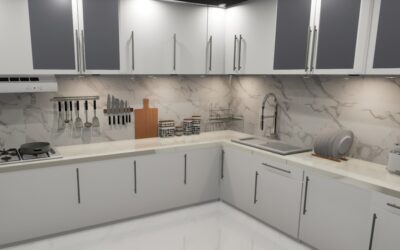
Three rooms consistently show sage at its best. Bedrooms benefit from sage’s restorative feel; the color lowers perceived heart rate in color studies and pairs with white linens for a clean, spa-like look. Kitchens embrace sage on cabinets or islands, especially with white or creamy countertops and brass or unlacquered brass hardware.
Bathrooms with white subway tile, brass fixtures, and natural stone handle sage beautifully. The color’s softness prevents the sterility that pure white bathrooms often feel.
Less ideal: rooms already dominated by cool gray finishes (stark gray wood-look LVP, cool gray quartz, chrome fixtures). Sage can feel washed out or sickly in that context. A warmer complementary neutral works better.
Sage on Cabinets and Trim
Painted sage cabinets are one of the biggest kitchen trends of 2025-2026. Evergreen Fog, Saybrook Sage, and High Park are the most-specified cabinet sages. Satin or semi-gloss finish (Sherwin-Williams Emerald Urethane Trim Enamel, $95/gallon) gives the most durable result on doors and drawers. Limit to base cabinets plus islands for a two-tone look; full-coverage sage cabinets can feel heavy in smaller kitchens.
Sage trim is less common but striking in traditional homes. It works especially well in libraries and studies where darker, more saturated sage reads as an accent rather than a dominant color.
Pairing Sage with Other Colors
Sage’s muted character makes it flexible. Proven combinations:
- Sage + warm white + brass: Classic English country look.
- Sage + cream + natural oak: Scandinavian and Japandi.
- Sage + black + matte gold: Modern transitional.
- Sage + terracotta + linen: Mediterranean and southwest warmth.
- Sage + soft pink blush: Feminine bedroom palette.
Avoid sage with primary red or cool burgundy. The color temperatures fight each other and the overall look reads Christmas-themed rather than sophisticated.
Sampling and Testing
Sage reads extremely differently under different lighting. Always sample before buying a gallon. Order at least three shades from Samplize ($6 per peel-and-stick) or paint quart pots. Tape large swatches, 12 x 12 inches minimum, to two walls: one near a window, one on an interior wall. Observe at morning, midday, evening, and at night with artificial light on.
Look especially for yellow shift in warm bulbs and gray shift in cool bulbs. LED bulbs in the 2700K to 3000K range give the most flattering rendering of sage. Avoid 4000K or higher; they wash out the green character.
Finish, Sheen, and Common Mistakes
Matte or eggshell finish suits most sage wall applications; the subtle texture enhances the dusty quality of the color. Semi-gloss on trim and cabinets. Expect two coats over a gray or beige primer for even coverage.
The three biggest sage mistakes: picking a chip that looks good in the store under fluorescent light without sampling at home (fluorescents distort green dramatically), using too-cool white LED bulbs that turn sage gray, and pairing sage with finishes that compete for attention. Sage is a quiet color and performs best when surrounding elements stay restrained. One loud accent (a brass light fixture, a rust-colored sofa) reads as intentional; four competing finishes look chaotic.