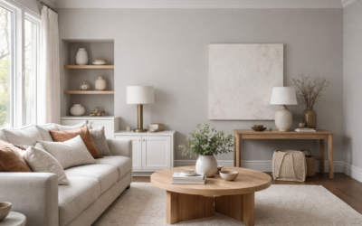
Light gray paint has a reputation for turning beige in one room and blue in the next, which is exactly why Sherwin Williams Big Chill gets so much attention. SW 7648 Big Chill is a light, clean gray that sits close to true neutral, with a crisp, slightly cool feel in most lighting. It avoids the greige warmth of the most popular builder grays, so it suits homes that want a fresh, modern backdrop without stepping into icy blue.
Sherwin-Williams lists Big Chill with a light reflectance value (LRV) of 61.713, which rounds to about 62. That places it on the lighter side of mid-tone: light enough to keep most rooms bright, but with enough body that it reads as a real gray on walls rather than an off-white. The manufacturer lists it for interior and exterior use and files it in its White color family, which tells you it was designed to stay light and airy.
- Sherwin Williams Big Chill Specs at a Glance
- What Undertone Does Big Chill Have?
- Best Rooms and Uses for Big Chill
- Coordinating Colors and Pairings
- Big Chill Compared With Nearby Sherwin-Williams Grays
- How to Test Big Chill Before You Commit
- Finish, Coverage and Cost
- Troubleshooting Common Issues
- When to Hire a Painter
- Frequently Asked Questions
If you want a quick summary: Big Chill is a good pick for kitchens, bathrooms, offices and bedrooms with decent light, and it pairs naturally with bright whites, natural wood, black hardware and marble-look surfaces. In a dim, north-facing room it can lean cooler and grayer than the chip, so sample it first.
Sherwin Williams Big Chill Specs at a Glance
These values come from the Sherwin-Williams color page for SW 7648. Paint makers occasionally update their data, so check the current listing before ordering large quantities.
| Spec | Value | What it means |
|---|---|---|
| Color number | SW 7648 | Use this code at the counter to avoid mix-ups with similar names |
| LRV | 61.713 (about 62) | Light gray; reflects a bit more than half of the light that hits it |
| Hex | #D0CEC9 | Digital approximation only; screens shift color |
| RGB | 208, 206, 201 | Values sit close together, so the gray is near neutral |
| Color family | White | Positioned as a light, airy color rather than a deep gray |
| Use | Interior and exterior | Works on walls, trim accents and siding with the right product |
| Coordinating colors (manufacturer) | Extra White SW 7006, Blonde SW 6128, Tin Lizzie SW 9163 | A bright white, a soft warm tan and a deeper accent |
What Undertone Does Big Chill Have?
Sherwin-Williams describes Big Chill as a cool white hue with a gray undertone and calls it a great companion for marble countertops. The RGB values of Big Chill are within a few points of each other, which is the signature of a nearly neutral gray. In practice, most people describe it as a clean gray that leans slightly cool, and that matches what you will usually see on a sample board.
The cool feel comes mostly from context. Next to warm wood floors or creamy trim, Big Chill can look crisper and a touch blue-gray. Next to bright, stark white trim, it looks more like a soft true gray. It does not carry the obvious beige or taupe warmth found in greige colors, and it does not have the strong green cast that some grays pick up from landscaping outside the window.
How lighting changes it
- North-facing rooms: Cool, indirect light pulls Big Chill grayer and cooler. It can look a shade darker than the chip, which is common for any color in the low 60s for LRV.
- South-facing rooms: Warm daylight softens it into a gentle, airy gray that sits close to neutral.
- East and west rooms: Expect a shift through the day, cooler in the morning on east walls and warmer later on west walls.
- Artificial light: Warm white bulbs (around 2700K) soften the coolness; daylight bulbs (5000K and up) push it crisper and more blue-gray.
Best Rooms and Uses for Big Chill
With an LRV near 62, Big Chill keeps rooms bright without washing out. It is versatile enough for whole-house use, but certain spaces show it off best.
Kitchens
Big Chill works well on kitchen walls behind white cabinets, giving them definition without heavy contrast. It also pairs with stainless steel, gray-veined quartz and marble-look countertops, and matte black fixtures. On cabinets themselves it gives a soft gray that reads modern but not trendy.
Bathrooms
Cool, clean colors suit bathrooms with white tile and chrome or nickel fixtures. Use a bath-rated finish such as satin or semi-gloss for moisture resistance.
Bedrooms and offices
The near-neutral tone is calm and uncluttered. In an office, it keeps the space bright for screen work. In a bedroom with good light, it reads restful; in a dark bedroom, consider a lighter color.
Exteriors
Because the manufacturer rates it for exterior use, Big Chill can work as a light gray body color on siding, paired with white trim and a black or deep accent door. Outdoors, sunlight washes colors out, so it will look lighter on the house than on the chip.
Coordinating Colors and Pairings
Sherwin-Williams suggests three coordinating colors on the Big Chill page. Extra White SW 7006 (LRV 85.861 on its color page) is a crisp, bright white for trim, ceilings and doors that keeps the gray reading clean. Blonde SW 6128 adds a soft warm tone for an adjoining room or accent wall. Tin Lizzie SW 9163, a near-neutral medium gray (LRV 29.757), provides a deeper contrast for an accent, island or front door.
Beyond those, Big Chill pairs naturally with:
- Natural white oak or light maple floors, which warm the room up
- Black, matte nickel or chrome hardware
- Navy, charcoal or deep green as accent colors
- White or light gray tile, and marble-look surfaces with gray veining
Avoid pairing it with very yellow creams or heavily warm beige trim, which can make Big Chill look colder and slightly blue by contrast.
Big Chill Compared With Nearby Sherwin-Williams Grays
Big Chill sits in a crowded neighborhood. These comparisons use LRVs from each color’s Sherwin-Williams page.
| Color | LRV | How it compares |
|---|---|---|
| Big Chill SW 7648 | 61.713 | Clean, near-neutral light gray with a slightly cool feel |
| Agreeable Gray SW 7029 | 60.386 | Slightly darker; warmer greige with more beige character |
| Passive SW 7064 | 59.885 | A touch darker; a cooler gray that can read blue-gray in north light |
| Repose Gray SW 7015 | 58.22 | Noticeably darker; warm-leaning gray with a soft greige quality |
If you like greige warmth, Agreeable Gray or Repose Gray will feel cozier. If you want a crisper, more modern gray, Big Chill and Passive are closer. Between those two, Big Chill is slightly lighter, which can help in rooms with average light.
How to Test Big Chill Before You Commit
- Use large samples. Paint sample peel-and-stick swatches or a painted poster board are far more accurate than tiny chips. Aim for at least 12 by 12 inches.
- Place samples on multiple walls. Light changes from wall to wall, especially in corner rooms.
- Check at different times. Look in morning, midday, evening and under your lamps at night.
- Compare against your fixed elements. Hold samples next to flooring, countertops, tile and trim.
- Test a white alongside. Putting Big Chill next to your planned trim white shows how the two read together.
Finish, Coverage and Cost
Finish affects how Big Chill reads. Flat or matte hides wall imperfections and gives a softer look. Eggshell is a common choice for living areas because it cleans more easily. Satin is better for kitchens, baths and kids’ rooms, and semi-gloss works on trim and doors.
Most interior wall paint covers roughly 350 to 400 sq ft per gallon per coat. A light gray like Big Chill typically needs two coats for an even finish, especially over a darker color, and a primer helps when covering strong colors. General price ranges for quality interior paint run about $40 to $90 per gallon depending on product line. Professional interior painting often falls in a broad range of about $2 to $6 per square foot of wall area, depending on prep and region.
Troubleshooting Common Issues
It looks too blue. Cool light or daylight bulbs exaggerate the cool side. Switch to warmer bulbs or consider a warmer gray like Agreeable Gray.
It looks darker than expected. Colors in the low 60s for LRV can feel heavier in dim rooms. Try a lighter color, or paint the ceiling a bright white to bounce light.
Patchy or uneven color. This usually means one coat or skipped primer over patches. Spot-prime repairs and apply a full second coat.
Trim looks dingy. A yellowed or creamy trim next to a clean gray looks dirty. Repaint trim in a cleaner white such as Extra White.
When to Hire a Painter
A pro is worth it for high ceilings, stairwells, cabinet painting (which requires careful prep and a durable finish) and exterior siding work that involves ladders. Painters can also help you test colors and choose the right product line for high-moisture rooms.
Frequently Asked Questions
Is Sherwin Williams Big Chill warm or cool?
It is close to neutral with a slightly cool feel. Sherwin-Williams describes it as a cool white with a gray undertone, its RGB values are nearly balanced, and it lacks the beige warmth of greige colors.
What is the LRV of Big Chill?
Sherwin-Williams lists Big Chill SW 7648 at an LRV of 61.713, which is about 62. That is a light gray that keeps rooms bright.
What white trim goes with Big Chill?
Extra White SW 7006 is one of the manufacturer’s suggested coordinating colors and keeps the gray looking crisp. Very creamy whites can make it look cooler.
Is Big Chill lighter than Repose Gray?
Yes. Repose Gray is listed at an LRV of 58.22, so Big Chill is lighter and also less warm.
Can Big Chill be used outside?
Yes. The manufacturer lists it for interior and exterior use. Outdoors it will look lighter than the chip in full sun.