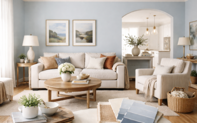
Moody Blue from Sherwin-Williams is a muted, grayed blue with a noticeable green lean, the kind of color that looks like a stormy sea rather than a clear sky. SW 6221 sits in the manufacturer’s Blue family with a Light Reflectance Value (LRV) of 26.5, which puts it in mid-to-dark territory: deep enough to feel rich, light enough to use on full walls in a well-lit room.
Its published hex value is #7A9192. The red channel is well below green and blue, and green and blue are nearly equal, which is why many people see a touch of teal in it. It is rated for interior and exterior use, and it works especially well on accent walls, cabinetry, bathrooms, and front doors.
- Moody Blue Sherwin Williams Specs at a Glance
- Understanding the Undertone
- How to Sample and Paint Moody Blue
- Best Rooms and Uses
- Using Moody Blue in Open Floor Plans
- Coordinating Colors and Pairings
- Moody Blue vs Similar Sherwin-Williams Blues
- Troubleshooting Common Issues
- Cost and When to Hire a Pro
- Frequently Asked Questions
If you want a blue that feels calm and grown-up instead of bright, Moody Blue is worth sampling. If you want a true navy or a pure, clear blue, it will probably feel too gray and green.
Moody Blue Sherwin Williams Specs at a Glance
These figures come from the manufacturer’s color page. Always confirm with a physical sample, since screens shift blues more than most colors.
| Spec | Value | What it means |
|---|---|---|
| Color number | SW 6221 | Order by number to avoid mix-ups with similarly named colors from other makers |
| LRV | About 27 | Medium-dark; absorbs most light, so it needs a bright room for full walls |
| Hex / RGB | #7A9192 / 122, 145, 146 | Gray-blue with a teal lean |
| Color family | Blue | Reads as blue, but heavily grayed |
| Undertone | Gray with a green cast | Looks more teal in warm light, more slate in cool light |
| Interior / exterior | Both | Works on doors, shutters and siding as well as walls |
| Best uses | Accent walls, cabinets, bathrooms, dining rooms, front doors | Places where a moody, saturated look is welcome |
| Suggested sheens | Matte or eggshell for walls; satin or semi-gloss for cabinets and doors | Higher sheens make the color look slightly lighter and richer |
Understanding the Undertone
The name says blue, but the undertone is what decides how it feels in a room. Moody Blue has a lot of gray in it, so it never looks bright, and the green and blue channels sit nearly level in its published RGB values. That balance is what gives it a teal or blue-green cast next to purer blues.
- North-facing rooms: cool light emphasizes the gray and blue, so it reads like slate. It can feel dark here if the room is small.
- South-facing rooms: warm, bright light brings out the green, so it looks closer to a soft teal.
- East and west rooms: expect it to swing between slate and teal over the day.
- Artificial light: warm bulbs push it greener; cool daylight bulbs make it read bluer and grayer.
Next to a pure navy, Moody Blue looks green. Next to a sage or olive, it looks distinctly blue. That chameleon quality is the main reason to sample it on your own walls.
How to Sample and Paint Moody Blue
- Use a large sample. Paint or stick a 12 by 12 inch or larger swatch on at least two walls.
- Look next to your fixed finishes. Flooring, countertops and cabinet colors will change how it reads.
- Check day and night. A medium-dark color can look very different under lamps.
- Prime when going from light to dark. A tinted gray primer helps deeper colors cover in two coats instead of three.
- Cut in carefully. Darker colors show wobbles at the ceiling line. Use an angled sash brush and take your time.
- Roll in sections. Keep a wet edge and roll floor to ceiling in one pass to avoid lap marks, which show more on deep colors.
A standard paint roller kit with a 3/8-inch nap roller suits smooth drywall. For cabinets and doors, a fine foam or microfiber roller gives a smoother finish with satin or semi-gloss paint.
Best Rooms and Uses
Accent walls and dining rooms
Moody Blue makes a strong accent wall behind a bed, sofa or dining table. In dining rooms, where you often want a more intimate feel, it can go on all four walls if there is good natural light.
Kitchen cabinets and islands
It is a popular choice for a painted island against white perimeter cabinets. Brushed brass, matte black or nickel hardware all work. Use a cabinet-grade enamel in satin or semi-gloss for durability.
Bathrooms
With white tile and marble-look counters, Moody Blue gives a spa-like, coastal feel. Choose a moisture-resistant finish and make sure the room has a working exhaust fan.
Front doors and exteriors
On a front door against white, gray or cream siding, it reads as a sophisticated blue-green. On whole-house siding it will look lighter and more gray in full sun, so test a large patch outside first.
Using Moody Blue in Open Floor Plans
Medium-dark colors need a plan in open layouts, where one wall color flows into the next room. Moody Blue Sherwin Williams fans often use it to define a zone rather than painting the whole open space. A dining area, a reading nook or the wall behind a kitchen island can carry the color while the surrounding walls stay in a light neutral.
Look for natural stopping points: an outside corner, a change in ceiling height, a doorway or a run of trim. Ending the color there looks deliberate, while stopping in the middle of a flat wall usually looks unfinished. If the space is long and narrow, painting the far short wall in the color pulls it visually closer and makes the room feel better proportioned.
Repeat the color at least once elsewhere in the space so it feels connected, such as on an island, a painted bookcase, throw pillows or artwork with the same gray-green blue. That repetition ties the zone into the rest of the home.
Coordinating Colors and Pairings
The manufacturer suggests three coordinating colors:
- Topsail (SW 6217): a much lighter coordinating color, good for adjoining rooms or ceilings.
- Restful White (SW 7563): a soft white for trim and ceilings that keeps contrast gentle.
- Ecru (SW 6135): a neutral that balances the cool blue with some warmth.
Moody Blue also pairs well with warm wood tones, cognac leather, brass, white oak floors, and textiles in rust, mustard or blush, which bring out its depth by contrast.
Moody Blue vs Similar Sherwin-Williams Blues
Three colors come up often when people compare grayed blues. The figures here are from each color’s manufacturer page.
| Color | LRV | Hex | How it compares |
|---|---|---|---|
| Moody Blue (SW 6221) | About 27 | #7A9192 | Grayed blue with a teal lean |
| Bracing Blue (SW 6242) | About 25 | #768B9A | Similar depth but bluer and cooler, with less green |
| Distance (SW 6243) | About 15 | #5D6F7F | Noticeably darker slate blue; one step deeper than Bracing Blue |
| Indigo Batik (SW 7602) | About 8 | #3E5063 | A deep, inky blue that reads close to navy |
Choose Moody Blue if you like the blue-green, coastal feel. Choose Bracing Blue for nearly the same depth with a cleaner, cooler blue. Move to Distance or Indigo Batik when you want a dramatic, dark blue for cabinets, a library or a front door.
Troubleshooting Common Issues
It looks too green: warm light and nearby yellow or green finishes exaggerate the green. Try cooler bulbs or switch to Bracing Blue for a bluer reading.
It looks too dark: an LRV near 27 absorbs a lot of light. Use it on one wall, lighten the ceiling and trim, or add more lighting.
Streaks and lap marks: deep colors show roller marks. Keep a wet edge, use a quality roller cover and avoid going back over drying paint.
Patchy coverage: prime with a tinted gray primer and plan on two full coats.
Touch-ups flash: sheen mismatches show on dark colors. Touch up with the same batch and sheen, and roll rather than brush if possible.
Cost and When to Hire a Pro
An accent wall usually needs a quart to a gallon, while a full medium bedroom needs about two gallons for two coats. Premium interior paint commonly falls in the range of $50 to $90 per gallon, and samples are inexpensive. Cabinet painting is more involved: removing doors, degreasing, sanding and priming add time, so professional cabinet refinishing often runs into the thousands of dollars for a full kitchen.
Hire a painter for tall stairwells, exterior siding above the first floor, or cabinets if you want a sprayed factory-like finish. A pro also makes sense when walls need significant patching, since flaws show more under darker colors.
Frequently Asked Questions
Is Moody Blue blue or green?
It is a grayed blue with a green lean. The manufacturer places it in the Blue family, but in warm light or next to navy it can read as a soft teal.
What is the LRV of Moody Blue?
The manufacturer lists an LRV of 26.5, which is a medium-dark value. It absorbs most light, so it works best in rooms with good natural light or as an accent.
Is Moody Blue good for kitchen cabinets?
Yes. It is a popular island and cabinet color, especially against white perimeter cabinets and warm wood. Use a durable enamel in satin or semi-gloss.
What white goes with Moody Blue?
The manufacturer suggests Restful White (SW 7563) as a coordinating color. Soft whites keep the contrast gentle, while a crisp bright white gives a cleaner, more coastal look.
Can I use Moody Blue on a front door?
Yes. It is rated for exterior use and looks good against white, gray or cream siding. Use an exterior-grade door paint in satin or semi-gloss.