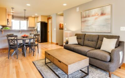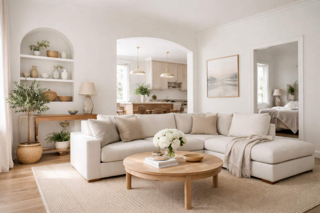
Plenty of people buy a gallon of white expecting crisp gallery walls and end up with a room that looks faintly gray by 4 p.m. If you are considering nebulous white sherwin williams paint, that shift is exactly what you are signing up for, and it can be a good thing. Nebulous White (SW 7063) is a soft, quiet off-white with a light gray cast that keeps it from glaring in bright rooms and from going yellow under warm bulbs.
On the manufacturer’s color page it carries a Light Reflectance Value (LRV) of 73.7, sits in the White and Pastel family, and is rated for both interior and exterior use. In plain terms, it is light enough to brighten a room but has enough body to show off white trim. It reads as a nearly neutral gray-white with a faint cool blue undertone, rather than any pink, peach or creamy yellow.
Best rooms for it: bedrooms, open living areas with good daylight, bathrooms with white tile, and kitchens where you want walls that recede behind cabinets. It is a less natural fit for dim, north-facing rooms if you want a white that stays bright, because low cool light pushes its gray side forward.
Nebulous White Sherwin Williams at a Glance
The quick-reference specs come from the Sherwin-Williams color page for SW 7063. Screens vary, so treat the hex and RGB values as approximations for design software, not as a substitute for a real sample on your wall.
| Spec | Value | What it means |
|---|---|---|
| Color number | SW 7063 | Use this code when ordering so the store mixes the right formula |
| LRV | 73.7 | Light; reflects a bit under three quarters of the light that hits it |
| Hex / RGB | #DEDFDC / 222, 223, 220 | Nearly balanced channels: a near-neutral gray-white |
| Color family | White and Pastel | Grouped with off-whites rather than with true grays |
| Undertone | Cool, with a faint blue undertone | No creamy, pink or beige cast |
| Interior / exterior | Both | Works on walls, trim, cabinets and siding |
| Best sheens | Flat or matte walls, eggshell for busy rooms, satin or semi-gloss trim | Higher sheen reads slightly brighter and shows more surface flaws |
| Best rooms | Bright bedrooms, living rooms, baths, kitchens | Strong daylight keeps it reading white instead of gray |
The manufacturer also lists the color strip location as 257-C5 and names three coordinating colors: Pure White (SW 7005), Greek Villa (SW 7551) and Svelte Sage (SW 6164). Those pairings tell you a lot about how the company sees the shade: a soft neutral that sits comfortably next to warmer whites and muted greens.
Understanding the Undertone
An LRV in the low 70s puts Nebulous White in “off-white” territory. Most bright, clean whites sit in the 80s or higher, so this color will never look stark. What makes it distinctive is how even its color channels are. Red, green and blue values are within a few points of each other, which is why designers often describe it as one of the more neutral whites in the fan deck.
Neutral does not mean flat, though. Next to a warm cream it looks cool and slightly gray. Next to a bright, clean white trim it looks like a pale gray. In a room with leafy views it can pick up a gentle green-gray cast. Expect those shifts and test with your own trim color and flooring in the room, because the surfaces around a wall color change how you see it more than any number on a chip.
How light direction changes it
- South-facing rooms: warm, strong light makes it read as a soft, clean white. This is where it looks its best.
- North-facing rooms: cooler, indirect light emphasizes the gray. It can look like a very pale gray rather than a white.
- East and west rooms: it shifts through the day, brighter during the sunny half and grayer in the shadowed half.
- Artificial light: warm bulbs (around 2700K) soften it toward a cozy off-white; daylight bulbs (5000K) push it cooler and grayer.
Best Rooms and Sheens
Because it balances light and depth, the color handles most rooms without much drama. A few guidelines help it look intentional rather than accidental.
Living rooms and open plans
For connected spaces, a single soft white on every wall makes the layout feel calm and larger. Nebulous White is gray enough to hide scuffs better than a bright white and light enough to keep a big room from feeling heavy. Pair it with oak, walnut or mid-tone vinyl plank flooring; the slight coolness balances warm wood nicely.
Bedrooms
Matte or flat finish on bedroom walls gives a soft, chalky look and hides minor wall waves. If the room faces north and you want it to feel warmer, add warm bedding, wood furniture and 2700K bulbs rather than switching to a creamier paint.
Kitchens and bathrooms
Use a scrubbable eggshell or satin in kitchens and baths. It sits well beside white subway tile, marble-look porcelain and chrome or matte black fixtures. With cream or almond tile it can look a bit gray and cold, so test there before committing.
Cabinets and trim
On cabinets, it reads as a soft gray-white that hides fingerprints better than bright white. Use a cabinet-grade enamel in satin or semi-gloss. As a trim color, it works on a whole-house neutral scheme, though most people prefer a brighter white trim to frame it.
Exteriors
Outdoors, strong sunlight bleaches colors, so Nebulous White will look lighter and whiter on siding than on the chip. It suits farmhouse and modern styles with black or charcoal windows. Use an exterior-grade formula in flat or satin.
Coordinating Colors and Pairings
Start with the three colors the manufacturer pairs with it, then build outward. If you are searching for nebulous white sherwin williams pairings, these are the official starting points.
- Pure White (SW 7005): a soft, brighter white for trim, ceilings and doors. It frames Nebulous White without the harsh contrast of a stark white.
- Greek Villa (SW 7551): a warmer white. Use it on trim or in adjoining rooms when you want a touch more warmth.
- Svelte Sage (SW 6164): a muted green for an accent wall, island, or bedroom. Svelte Sage has a cool gray undertone, which ties the two together.
Beyond those, it plays well with charcoal and black (window frames, doors, hardware), warm wood tones, navy cabinets, terracotta and leather accents. Avoid pairing it with strongly yellow creams on adjacent walls, which can make it look dingy by comparison.
Nebulous White vs Similar Sherwin-Williams Whites
Shoppers usually narrow down to a handful of soft whites. The LRVs here come from each color’s Sherwin-Williams page.
| Color | LRV | How it compares |
|---|---|---|
| Ice Cube (SW 6252) | 77.5 | Slightly lighter and very similar in tone; a touch brighter on the wall |
| Nebulous White (SW 7063) | 73.7 | Soft, near-neutral gray-white |
| Eider White (SW 7014) | 73.2 | Nearly the same lightness, with a gray undertone and slightly redder values, so it looks a touch softer side by side |
| Reflection (SW 7661) | 66.1 | Noticeably deeper; reads as a light gray rather than an off-white |
Ice Cube is the closest match. If Nebulous White looks too gray in your room, Ice Cube gives you a step brighter without changing the character much. Eider White is the one to choose if you like the depth but want a softer, less blue look; the maker describes it as a cool white with a gray undertone. Reflection suits people who actually want pale gray walls with clear contrast against white trim.
How to Test and Apply It
Paint chips are tiny and printed swatches are approximate, so sampling is worth the small effort.
- Get large samples. Use peel-and-stick sheets or paint two coats on poster board, at least 12 by 12 inches.
- Place them in several spots. Put one near a window, one on the darkest wall, and one next to your trim and floor.
- Look at them over a full day. Check morning, afternoon and evening, with lights on and off.
- Compare with a rival. Hang Ice Cube or Eider White beside it to see the difference in your light.
- Prep the walls. Patch holes, sand smooth, wipe down, and spot-prime repairs or stains.
- Cut in and roll. A quality roller kit with a 3/8 inch nap cover handles most smooth drywall; use 1/2 inch for light texture.
- Apply two coats. Light colors over darker ones may need a primer first. Keep a wet edge to avoid lap marks.
How much paint you need
A gallon generally covers about 350 to 400 square feet per coat on smooth, primed drywall. A typical 12 by 14 foot bedroom with 8 foot ceilings has roughly 400 square feet of wall area, so plan on about 2 gallons for two coats, plus extra for touch-ups. Premium interior paint typically runs in the mid range per gallon; costs rise with higher-grade lines and sales cycles vary.
Troubleshooting Common Complaints
- “It looks gray, not white.” Usually a north-facing room or cool bulbs. Switch to 2700K or 3000K bulbs, add warm textiles, or step up to Ice Cube.
- “It looks green.” Strong green reflections from trees, lawn or green tile can tint it. Test in the specific room; if it bothers you, a warmer option like Eider White resists that.
- “The trim disappears.” If you used the same color on walls and trim at the same sheen, change the trim to semi-gloss or to a brighter white like Pure White.
- “It looks dingy next to my cream tile.” Cool whites clash with yellow-based fixed finishes. Choose a warmer white for that room.
- Flashing or patchy sheen. Spot-prime patches before painting and apply full, even second coats.
When to Hire a Painter
Most homeowners can handle a bedroom or bath. Consider a professional painter for two-story foyers or stairwells, exterior siding above one story, cabinet refinishing (spray finishes look far better), or homes built before 1978 where existing paint may contain lead and sanding needs lead-safe practices. Professional interior painting costs vary widely by region, wall condition and trim detail, so get two or three written quotes that list prep, coats and paint grade.
Nebulous White is a smart pick if you want a soft, near-neutral white with a gentle gray cast and an LRV around 74. Sample it in your own light, pair it with a slightly brighter trim, and choose the sheen for each room’s traffic level.
Frequently Asked Questions
Is Nebulous White warm or cool?
It leans cool to neutral. The color has nearly equal red, green and blue values, so it has no creamy or pink cast, and it shows a soft gray side in cool or dim light.
What is the LRV of Nebulous White?
The manufacturer lists it at 73.7, which places it in the light range. It reflects plenty of light but is softer than bright whites, which usually sit in the 80s.
Does Nebulous White look gray?
In north-facing rooms and under daylight bulbs it can read as a very pale gray. In sunny, south-facing rooms it looks like a soft white.
What trim color goes with Nebulous White?
Pure White (SW 7005) is a manufacturer-listed coordinating color and a common trim choice. Greek Villa (SW 7551) gives a warmer frame.
Can you use Nebulous White on cabinets?
Yes. It is listed for interior and exterior use and works on cabinets in a satin or semi-gloss enamel, where its soft gray cast hides fingerprints better than a stark white.
What is the closest alternative to Nebulous White?
Ice Cube (SW 6252) is very similar but slightly lighter, with an LRV of about 77.5. Eider White (SW 7014) matches its lightness with a gray rather than blue undertone.