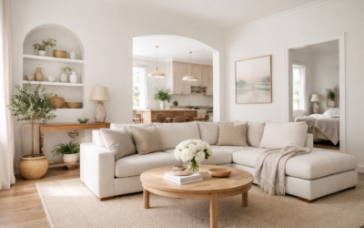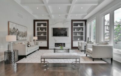
Fleur de Sel Sherwin Williams (SW 7666) is a pale, airy gray white: too much color to read as a pure white, too light to read as a true gray. The manufacturer lists its light reflectance value (LRV) at 72.132 and places it in the White & Pastel color family. On the wall it looks like a whisper of soft gray, the kind of color that makes a room feel fresh and calm without the starkness of a bright white.
Its undertone is close to neutral with a slightly cool lean. The hex value, #DCDDD8, shows the green channel sitting just a hair above red and blue, which explains why some people catch a faint gray-green or silvery cast in north light. In warm light, it settles into a gentle off-white. That flexibility is the reason it gets used for whole-house color in homes that want a modern, light look.
- Fleur de Sel Sherwin Williams at a Glance
- How the Undertones Show Up in Different Light
- Best Rooms and Sheens for Fleur de Sel
- Fleur de Sel vs Nebulous White, Repose Gray and Silverpointe
- Coordinating Colors and Trim
- How to Test and Apply It
- Troubleshooting
- Cost and When to Hire a Painter
- Frequently Asked Questions
The main questions people have are how gray it actually looks, where it works, which trim white to use, and how it differs from nearby favorites like Nebulous White, Repose Gray and Silverpointe. Each one gets a direct answer here.
Fleur de Sel Sherwin Williams at a Glance
All values come from the manufacturer’s color page for SW 7666. Anything not listed there is described in general terms rather than guessed.
| Spec | Value | What it means |
|---|---|---|
| Color number | SW 7666 | Order by this number so the right formula is tinted |
| LRV | 72.132 (light) | Bright enough for small and dim rooms; visibly deeper than a true white |
| Color family | White & Pastel | Used as an off-white or very light gray background color |
| Hex / RGB | #DCDDD8 / 220, 221, 216 | Channels sit close together, so it reads as a near-neutral light gray |
| Undertone | Neutral with a slight cool, gray-green lean | Silvery in north light, soft off-white in warm light |
| Locator | Strip 258, position C3 | Where to find the chip in the in-store fan deck |
| Use | Interior and exterior | Suitable for walls, trim, cabinets and siding |
| Maker’s coordinating colors | Extra White SW 7006, March Wind SW 7668, Carley’s Rose SW 9002 | A bright trim white, a deeper gray and a deep dusty rose accent |
Any sheen in the paint line you choose can be tinted to SW 7666. Pick the finish based on the room and how much cleaning the surface needs.
How the Undertones Show Up in Different Light
Fleur de Sel is named after a delicate sea salt, and that is a fair description: a pale, slightly gray white with no obvious warmth. Even so, lighting changes it noticeably.
- North-facing rooms: the cool light brings out the gray and the faint green lean. It can read as a soft silver gray. If you want warmth in a north room, test it next to a warmer option first.
- South-facing rooms: warm sun neutralizes the coolness and it looks like a clean, soft off-white.
- East and west rooms: cooler and grayer for half the day, softer and lighter in the warmer half.
- Bulbs: 3000K to 3500K bulbs keep it close to the chip. Very cool daylight bulbs push it toward gray; very warm bulbs can make it look slightly beige.
With an LRV of about 72, it is light enough that you mostly notice its color in corners and where walls meet bright white trim. That contrast is what tells the eye it is a gray white rather than a white.
Best Rooms and Sheens for Fleur de Sel
Living and dining rooms
It gives open-plan spaces a calm, light backdrop and works with both modern and transitional furniture. Eggshell is the usual choice for walls in living areas.
Bedrooms
The quiet gray is restful. Matte or flat finishes give the softest look; eggshell is easier to wipe in kids’ rooms.
Kitchens
Fleur de Sel suits white or gray cabinets, white quartz and marble-look counters, and stainless steel. It also works as a cabinet color for a subtle, not-quite-white look. Use satin on walls and satin or semi-gloss on cabinets.
Bathrooms
It pairs naturally with white tile, gray marble, chrome and polished nickel. Satin or a bath-specific formula handles moisture best.
Exteriors
The maker rates SW 7666 for exterior use. Outdoors it looks lighter and closer to white because of strong daylight, which makes it a good choice for siding when you want a white house that is softer than bright white. Black or charcoal shutters and a gray roof suit it well.
Fleur de Sel vs Nebulous White, Repose Gray and Silverpointe
All LRVs come from the manufacturer’s color pages.
| Color | LRV | How it compares to Fleur de Sel |
|---|---|---|
| Fleur de Sel SW 7666 | 72.132 | Light gray white, near neutral with a faint cool lean |
| Nebulous White SW 7063 | 73.715 | Very close in depth and also cool; a hair lighter and slightly crisper |
| Silverpointe SW 7653 | 63.937 | Noticeably deeper; reads as a true light gray rather than a gray white |
| Repose Gray SW 7015 | 58.22 | Deeper still and slightly warmer, a light greige-gray |
Fleur de Sel vs Nebulous White
These two are close cousins. Both are light, cool gray whites with LRVs in the low 70s, and many people struggle to tell them apart on a small chip. On a full wall, Nebulous White tends to look a touch brighter and cleaner, while Fleur de Sel feels a bit softer. If you like one, sample the other next to it.
Fleur de Sel vs Silverpointe
Silverpointe is about eight LRV points darker, enough that it reads as a definite light gray. Choose Silverpointe if you want visible gray on the walls, and Fleur de Sel if you want a white-adjacent color that just hints at gray.
Fleur de Sel vs Repose Gray
Repose Gray is one of the most widely used light grays, but at an LRV of about 58 it is much deeper than Fleur de Sel and carries a little more warmth. If Repose Gray looks too heavy in your room, Fleur de Sel is a natural lighter step.
Coordinating Colors and Trim
The maker pairs Fleur de Sel with Extra White, a bright trim white that makes the walls read as a soft gray; March Wind, a deeper gray for accent walls, doors or lower cabinets; and Carley’s Rose, a deep dusty rose (LRV about 22) for a richer accent. Beyond that list:
- Trim: a clean, bright white sharpens the look. A creamy trim white can make Fleur de Sel look cooler and grayer by contrast.
- Accents: navy, charcoal, deep green and dusty blue all pair well.
- Floors: it works with gray-washed and natural oak, light maple, and cool-toned vinyl plank or tile. Very orange wood can look heavy against it.
- Metals: chrome, nickel and matte black suit it best; aged brass adds welcome warmth.
How to Test and Apply It
A good roller kit, a quality angled brush and a few large sample boards will carry the project. Follow these steps:
- Sample large. Paint two coats on a board at least 2 feet square and move it between walls.
- Compare against white. Hold a sheet of white paper to the sample so you can see how gray it reads in your light.
- Check it day and night. Look in morning, midday and evening light, and under your own bulbs.
- Prep the surface. Clean, patch and sand. Spot-prime patches, and fully prime over dark or strongly colored walls.
- Cut in and roll. Use a 3/8-inch nap on smooth walls. Keep a wet edge and work one wall at a time.
- Two coats. Light grays usually need two coats for even, solid color.
Troubleshooting
- Looks too cold or green: usually north light or cool bulbs. Warmer bulbs help, or try a warmer neighbor such as a light greige.
- Looks like plain white: it is surrounded by too much natural light or matched with a creamy trim. Use a brighter white trim to make the gray visible.
- Uneven patches: add a second coat, and do not roll back into drying areas.
- Shiny spots over repairs: unprimed patch compound. Spot-prime and repaint the full wall.
Cost and When to Hire a Painter
The color itself does not change the price; the paint line and sheen do. DIY costs come down to paint plus basic supplies. Professional interior painting typically ranges from a few hundred dollars for a small room to several thousand for a full floor, depending on wall height, repairs and trim. Hire a pro for tall stairwells and vaulted ceilings that need scaffolding, for exteriors, and for cabinets where a sprayed finish looks best. In homes built before 1978, test old paint for lead before sanding and follow lead-safe practices.
Frequently Asked Questions
Is Fleur de Sel Sherwin Williams gray or white?
It sits between the two. It is in the maker’s White & Pastel family but reads as a very light gray white, especially next to bright white trim.
What is the LRV of Fleur de Sel?
The manufacturer lists SW 7666 at an LRV of 72.132, which places it in the light range.
Does Fleur de Sel have green undertones?
Yes, faintly. Sherwin-Williams describes it as a white with a barely-there undertone of green, and that cast shows most in north light or under cool bulbs.
What trim color goes with Fleur de Sel?
The maker suggests Extra White, a bright white that makes the walls read as soft gray. Clean, bright whites generally work best.
Is Fleur de Sel lighter than Repose Gray?
Yes, by a wide margin. Fleur de Sel has an LRV of about 72, while Repose Gray is about 58 and reads as a true light gray.
Can Fleur de Sel be used outside?
Yes. The maker rates it for interior and exterior use. On siding it looks lighter and closer to a soft white in full sun.