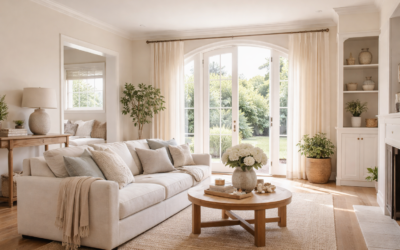
Plenty of beige paints look great on a chip and turn muddy or pink on the wall. Sherwin Williams Natural Linen (SW 9109) is popular because it usually does neither: it reads as a soft, warm, light neutral that sits between a cream and a true beige, with enough color to warm a room without making it feel yellow.
Here are the confirmed facts from Sherwin-Williams’ own color page. Natural Linen has a light reflectance value (LRV) of about 66, a hex value of #DFD3C3 (RGB 223, 211, 195), sits at fan-deck location 205-C1 and is rated for both interior and exterior use. Sherwin-Williams files it in its yellow color family, which tells you its undertone leans warm and golden rather than gray or green.
- Sherwin Williams Natural Linen at a Glance
- Natural Linen Undertones Explained
- Coordinating Trim and Cabinet Colors
- How Natural Linen Compares to Lighter and Darker Neutrals
- Best Rooms and Sheen Choices
- How to Test Natural Linen Before You Commit
- Painting Tips and Troubleshooting
- Cost Ranges and When to Hire a Painter
- Frequently Asked Questions
In short, it is a light warm neutral that works on walls in living rooms, bedrooms and hallways, pairs best with warm whites and wood tones, and looks its best in rooms with north or east light where cooler beiges can go flat.
Sherwin Williams Natural Linen at a Glance
| Spec | Value | What it means |
|---|---|---|
| Color number | SW 9109 | Use this number when ordering to avoid look-alike names |
| LRV | About 66 (66.3 on the maker’s page) | Light; reflects about two-thirds of the light hitting it |
| Hex / RGB | #DFD3C3 / 223, 211, 195 | Red and green slightly above blue: a warm neutral |
| Color family | Yellow (per Sherwin-Williams) | Warm, golden-leaning undertone |
| Fan-deck location | 205-C1 | Find the chip and its strip-mates in store displays |
| Use | Interior and exterior | Can be mixed in exterior products as well as wall paint |
| Maker’s coordinating colors | Divine White SW 6105, Antler Velvet SW 9111, Gris Morado SW 9156 | Suggested trim, accent and contrast partners |
An LRV in the mid-60s places Natural Linen in the comfortable middle of “light” colors: light enough to keep a room bright, dark enough that white trim shows a visible, crisp contrast. Paints in the 80s and 90s read as whites; paints in the 50s start to feel like a true mid-tone.
Natural Linen Undertones Explained
Undertone is the hidden color that shows up next to other colors and in different light. Because Sherwin-Williams places SW 9109 in the yellow family and its RGB values show a small lift in red and green over blue, Natural Linen leans warm: think soft golden beige with a faint peachy note in warm light. It does not have the green cast of many greige paints or the strong pink of some older beiges.
How It Shifts by Room Light
- North-facing rooms: cool, indirect light mutes the warmth, so it reads as a calm, slightly deeper beige. A good choice where gray paint would feel cold.
- South-facing rooms: strong warm light pushes the yellow undertone, and it can look closer to a creamy tan by midafternoon.
- East-facing rooms: bright and warm in the morning, softer and more neutral after noon.
- West-facing rooms: fairly neutral until late day, when golden sun intensifies the warmth.
- Artificial light: warm white bulbs (around 2700K) make it cozy; daylight bulbs (5000K) make it look cleaner and lighter.
Not the Same as Benjamin Moore Natural Linen
Benjamin Moore also sells a color called Natural Linen (966), a slightly deeper shade with an LRV near 60, and the two are different formulas from different makers. If a designer, contractor or online photo names “Natural Linen,” confirm which brand and color number they mean before you buy. Matching one maker’s color in the other maker’s base can come close, but undertones rarely line up perfectly.
Coordinating Trim and Cabinet Colors
Sherwin-Williams lists three coordinating colors for Natural Linen. Use them as a starting point, then test them next to your flooring and countertops.
| Where | Pairing | Why it works |
|---|---|---|
| Trim, doors, ceilings | Divine White SW 6105 | A warm off-white that keeps contrast soft instead of stark |
| Accent wall or lower cabinets | Antler Velvet SW 9111 | A deeper partner color that adds depth; view the chip beside the walls |
| Contrast accent, front door or powder room | Gris Morado SW 9156 | A muted contrast color suggested by the maker; sample it in your light |
| Kitchen cabinets with Natural Linen walls | Warm white or deep warm greige cabinets | Avoid stark blue-whites, which make the walls look yellow |
| Natural Linen on cabinets | Warm white walls, brushed brass or iron hardware | Gives a soft, cottage-style kitchen with gentle contrast |
| Floors | Mid-tone oak, walnut, warm gray LVP, terracotta tile | Warm floors pick up the golden undertone |
A useful rule: pair Natural Linen with whites that are also warm. Very cool whites with a blue base will make the wall look yellow by comparison. A trim color slightly warmer or equal in warmth keeps the scheme calm.
How Natural Linen Compares to Lighter and Darker Neutrals
Think of Natural Linen as a middle step on a warm neutral ladder. Step lighter, into the LRV 75 to 85 range, and you are in creamy off-white territory: brighter, but with less visible color, so the walls start to blend with white trim. Step darker, into the 50s, and you get a true mid-tone beige or taupe that feels cozy but can shrink a small room. At about 66, Natural Linen keeps a room bright while still showing a clear, soft color against white trim and ceilings.
That middle position is why it works well in open floor plans. Use it as the main wall color across connected spaces, then go one step darker on an accent wall, a dining room or lower cabinets, and one step lighter on ceilings. Staying in the same warm family keeps the transitions calm from room to room.
Best Rooms and Sheen Choices
- Living rooms and bedrooms: eggshell or matte for a soft, low-glare finish.
- Hallways and kids’ rooms: eggshell or satin for washability.
- Kitchens and baths: satin for moisture resistance and easy cleaning.
- Cabinets and trim in the same color: semi-gloss or a dedicated enamel for a hard, wipeable finish.
- Exteriors: satin or flat exterior paint on siding; the color will read lighter in full sun, so test outdoors.
Higher sheens reflect more light and can make the color look a touch lighter and cooler, so sample in the sheen you plan to use.
How to Test Natural Linen Before You Commit
- Start with paint sample cards or peel-and-stick samples. Large swatches give a better read than a small chip in a fan deck.
- Place samples on at least two walls, one that gets direct light and one in shade.
- Check them at three times of day: morning, midday and evening with lamps on.
- Hold them against fixed finishes: flooring, countertops, tile and large furniture. These drive undertone more than anything else.
- Compare against your trim white. If the trim makes the sample look dingy, choose a warmer white.
- Buy a sample quart and paint a 2 by 2 foot patch with two coats before ordering gallons.
Painting Tips and Troubleshooting
- Patchy coverage: light neutrals over darker or very different colors need a primer and two finish coats. Tint the primer toward the finish color if the store offers it.
- Looks too yellow: usually strong south or west light, warm bulbs or a cool white trim nearby. Try cooler-temperature bulbs or a warmer trim before repainting.
- Looks pink or peach: red-toned flooring or wood can bounce color onto walls. Large rugs or neutral textiles help.
- Flashing (shiny patches): touch-ups in a different sheen or over unprimed patches. Spot-prime repairs and roll the whole wall.
- Lap marks: keep a wet edge, roll top to bottom in sections and avoid going back over drying paint.
Cost Ranges and When to Hire a Painter
Premium interior paint costs a moderate amount per gallon, and an average bedroom takes 1 to 2 gallons for two coats. DIY painting a room is mostly the cost of paint, primer, rollers, brushes and tape. Professional interior painting is usually priced per room or per square foot of wall, with trim, ceilings and repairs adding to the quote.
Hire a pro for high stairwells, vaulted ceilings, extensive drywall repair or exterior work on a two-story house, where ladder work becomes risky. In homes built before 1978, test existing paint for lead before sanding or scraping. For most single rooms, sherwin williams natural linen is a straightforward DIY color: it covers well over light neutrals and forgives small imperfections better than a bright white.
Frequently Asked Questions
What is the LRV of Sherwin Williams Natural Linen?
Sherwin-Williams lists Natural Linen (SW 9109) at an LRV of about 66, which classifies it as a light color. It reflects roughly two-thirds of the light that hits it.
Is Natural Linen warm or cool?
Warm. Sherwin-Williams places it in the yellow color family, and it reads as a soft golden beige, especially in south and west light.
What white trim goes with Natural Linen?
Sherwin-Williams suggests Divine White (SW 6105), a warm off-white. Avoid stark blue-based whites, which can make Natural Linen look yellow.
Is Sherwin Williams Natural Linen the same as Benjamin Moore Natural Linen?
No. They are separate colors from different makers that happen to share a name. Always confirm the brand and color number before buying.
Can Natural Linen be used outside?
Yes. Sherwin-Williams lists it for both interior and exterior use. Expect it to look lighter and more neutral in full sun, so test it on the house first.
Does natural linen sherwin williams work in a north-facing room?
Usually yes. Its warmth offsets cool northern light, so it reads as a calm beige rather than a cold gray. Test samples on the darkest wall to be sure.