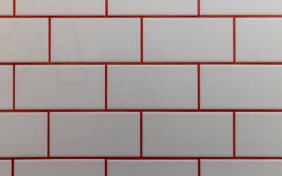
Choosing among the many subway tile colors available today is where a good backsplash or bathroom becomes a great one. The rectangular subway shape, born in New York City subway stations in 1904, is endlessly versatile, but the color you pick, and the grout you pair with it, does more to set the mood of a room than almost any other single decision. From crisp white to moody navy and warm terracotta, the palette has expanded far beyond the original glossy white, and understanding how each family of shades behaves will help you build a space that feels intentional rather than accidental.
Part of our Tile & Grout guide — explore the full guide →
Classic White and Off-White
White remains the best-selling subway tile color for good reason. It reflects light, makes small rooms feel larger, and never goes out of style. But white is not one shade. A true bright white reads clean and modern, while soft whites, creams, and antique whites bring warmth that pairs beautifully with wood cabinetry and brass fixtures. Glossy white bounces light for a fresh, energetic feel, while matte white is calmer and hides fingerprints and water spots better.
The secret with white subway tile is the grout. White grout with white tile creates a seamless, airy wall, while a gray or beige grout outlines each tile and delivers the trendy, defined look seen in modern farmhouse kitchens. That single grout decision can completely change the personality of the same white tile.
Gray and Greige Tones
Gray subway tiles bridge cool contemporary and soft transitional styles. Light dove grays feel serene and work in bathrooms where you want a spa-like calm. Deeper charcoal grays add drama and pair well with white counters and black hardware. Greige, the blend of gray and beige, is a chameleon that leans warm or cool depending on surrounding finishes, making it a safe choice for homeowners who cannot commit to a strong color.
Bold and Saturated Colors
For homeowners ready to make a statement, saturated subway tile colors have surged in popularity:
- Deep green, from sage to emerald and forest, brings a natural, timeless richness that suits both classic and modern kitchens.
- Navy and cobalt blue add depth and pair strikingly with brass or gold fixtures.
- Black subway tile creates high contrast and a sophisticated, graphic edge, especially with white grout.
- Terracotta, blush, and warm clay tones lend a handmade, Mediterranean warmth.
Bold colors work best when balanced by neutral counters, cabinets, and floors so the tile remains the star without overwhelming the room. A saturated backsplash behind simple white cabinets is a reliably beautiful formula.
Handmade and Variegated Looks
Beyond flat single colors, many subway tiles now feature subtle variation within each piece. Handmade and zellige-style tiles show tonal shifts, gentle waviness, and a glossy, uneven glaze that catches light differently across the wall. These variegated colors add depth and character that a perfectly uniform tile cannot, and they are especially popular in greens, blues, and warm neutrals. The trade-off is that the irregular edges require a slightly wider grout joint and a more patient installer.
How Finish Changes a Color
The same pigment looks different depending on the glaze finish. Glossy finishes deepen and brighten a color while reflecting light, making them ideal for darkening a small or north-facing room. Matte finishes mute and soften the same shade, reading more contemporary and understated, and they conceal water spots and smudges, which is handy behind a sink or stove. Satin sits in between. When you request samples, ask for the finish you actually intend to install, since a glossy sample can look noticeably different from its matte twin.
Pairing Grout With Your Tile Color
Grout is the frame around every tile, and its color dramatically alters the final look. Consider these approaches:
- Matching grout, close to the tile color, minimizes the grid and creates a smooth, monolithic surface.
- Contrasting grout, such as gray or charcoal with white tile, highlights the classic brick pattern and adds definition.
- Complementary grout, a shade slightly darker than a colored tile, keeps things cohesive while still showing the layout.
Darker grout also hides dirt and staining better than bright white, which is a practical advantage on floors and behind stovetops. Always test grout color against your chosen tile with a sample board before committing, because grout is difficult and messy to change later.
Choosing a Color for Your Room
Match the tile color to the job the room needs to do. Small, dark bathrooms benefit from light, glossy whites and pale grays that bounce light around. Large, bright kitchens can carry deeper greens, blues, and blacks without feeling closed in. Consider the fixed elements you already own, such as countertops, cabinets, and flooring, and pull a tile color that harmonizes rather than competes. Warm-toned rooms with wood and brass suit creams, greens, and terracottas, while cool rooms with stainless and gray flatter blues, charcoals, and true whites.
Warm Versus Cool Undertones
Every tile color carries an undertone that leans warm or cool, and getting this right is often more important than the color itself. A white can be a warm, creamy white or a cool, bluish white, and the wrong choice can clash with your counters and flooring. Warm undertones, with hints of yellow, red, or brown, pair naturally with wood, brass, and beige stone. Cool undertones, with blue, green, or gray notes, complement stainless steel, gray floors, and marble.
To identify undertones, hold your tile sample next to a pure white sheet of paper. Against true white, a warm tile will look slightly yellow or pink, while a cool tile will look faintly blue or gray. Doing this check with your countertop and flooring samples together prevents the common and frustrating result of a backsplash that technically matches but somehow feels off in the finished room.
How Lighting Affects Tile Color
The same subway tile can look dramatically different depending on the light in your room. North-facing rooms receive cool, indirect light that can make cool tiles feel sterile and mute warm tones, so warmer colors often balance these spaces better. South-facing rooms get abundant warm light that intensifies colors throughout the day. Artificial lighting matters too, as warm LED bulbs push colors toward yellow while cool daylight bulbs sharpen blues and grays.
This is precisely why living with a full-size sample on your actual wall for a few days is so valuable. Observe the tile in morning light, midday, and evening under your own fixtures before committing, because a color that looks perfect in a showroom’s bright, neutral lighting can read completely differently in your kitchen.
Timeless Versus Trendy
If you plan to sell soon or want a finish that lasts through decades of changing tastes, white and soft gray subway tile remain the safest, most broadly appealing choices. If this is your forever home and you want personality, a saturated green or navy backsplash can be a joyful, distinctive feature. A smart middle path is to keep expensive, hard-to-change surfaces neutral and express bolder subway tile colors in a smaller, easily updated area like a powder room or a coffee-bar niche. Whichever direction you choose, ordering full-size samples and living with them on your wall for a few days under real lighting is the single best way to be confident in your final color.
Prefer to explore on your own?
See how new flooring looks in your actual room in seconds — free, no signup.
Try the free Floor Studio →