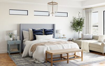
Most paint regrets do not come from a bad color. They come from colors that fight each other: a warm white trim beside a cool gray wall, or an accent that pulls a different undertone than the floor. A good behr color palette solves that by grouping a main wall color, an accent and a trim color that share undertones, so the whole house feels connected.
Behr already does part of the work. The brand publishes curated collections, such as its Designer Collection of 30 designer-favorite whites, neutrals and accents, plus collections for whites, grays and neutrals, and an annual Color of the Year with coordinating trend colors. You can build a palette straight from those groups or use simple color-wheel rules to combine colors from anywhere in the range.
- Behr Color Palette Ideas by Room and Style
- How Behr Color Schemes Are Built
- Using the Behr Color Wheel and Collections
- Building a Behr Dove Color Palette
- Matching a Palette to Your Flooring
- Step by Step: Picking Your Palette
- Tools for Testing a Palette
- Troubleshooting Common Palette Problems
- Costs and When to Call a Pro
- Frequently Asked Questions
The schemes that follow are starting points by room and style. Colors are named with their Behr codes so you can pull chips quickly, and every scheme should be tested on your own walls before you buy gallons.
Behr Color Palette Ideas by Room and Style
Each row lists a main color, an accent and a trim color that share an undertone family. Codes help you order the exact formula.
| Room or style | Main color | Accent | Trim |
|---|---|---|---|
| Modern farmhouse living room | Blank Canvas (DC-003) | Cracked Pepper (PPU18-01) on doors or window frames | Blank Canvas, in semi-gloss |
| Warm traditional dining room | Swiss Coffee (12) | Bitter Sage (N390-4) on lower walls or built-ins | Swiss Coffee, in semi-gloss |
| Calm bedroom | Bitter Sage (N390-4) | Natural wood and linen textures | Polar Bear (75) |
| Greige whole-house flow | Dove (HDC-MD-21) | Cracked Pepper (PPU18-01) on an island or front door | Polar Bear (75) |
| Rich, moody study or den | Hidden Gem (N430-6A) | Brass, walnut and leather | Swiss Coffee (12) |
| Bright kitchen | Polar Bear (75) | Hidden Gem (N430-6A) on the island | Polar Bear, in semi-gloss |
| Classic exterior | Dove (HDC-MD-21) on siding | Cracked Pepper (PPU18-01) on shutters and door | Swiss Coffee (12) |
Products and color availability can change, and some colors are offered only in certain lines or bases. Check that each color is available in the interior or exterior product you plan to buy.
How Behr Color Schemes Are Built
Every reliable scheme follows three rules.
One undertone family
Whites, greiges and grays all carry an undertone: yellow, pink, green, blue or violet. Behr color schemes look polished when the main, accent and trim colors share or complement that undertone. A creamy white like Swiss Coffee pairs naturally with warm sages and greiges, while a crisper white suits cooler grays and blues.
Contrast in value, not just hue
Value is how light or dark a color is. A palette needs a light, a middle and a dark. In the Bitter Sage bedroom, for example, Polar Bear is the light, Bitter Sage is the middle, and dark wood furniture supplies the depth.
The 60-30-10 split
Designers often use about 60 percent main color (walls), 30 percent secondary (cabinets, furniture, floors) and 10 percent accent (doors, pillows, art). It keeps a palette balanced without needing a design degree.
Using the Behr Color Wheel and Collections
The phrase “behr color wheel” usually refers to the color tools on the brand’s website, where colors are grouped by family and each color page suggests coordinating colors. The underlying logic is the classic color wheel, and you can apply it directly:
- Monochromatic: several values of one hue, such as a pale sage wall, Bitter Sage cabinets and a deep green door. Calm and easy to get right.
- Analogous: neighbors on the wheel, like green, blue-green and blue. Soft and natural, good for bedrooms and baths.
- Complementary: opposites, like a sage green with a dusty plum. Adds energy; use the stronger color sparingly.
- Neutral plus one: a whole-house white or greige with one saturated accent repeated in a few places. The safest approach for open floor plans.
The Behr Designer Collection
The Behr Designer Collection is a curated set of 30 whites, neutrals and accent colors chosen from what professional designers recommend most, combining new colors with established bestsellers. Blank Canvas (DC-003) is one of its whites. Because the colors were selected to work together, picking your main, trim and accent from this group is a quick shortcut to a coordinated palette for interiors or exteriors.
The Color of the Year and trend palettes
Each year Behr names a Color of the Year and releases a related trend palette. Hidden Gem (N430-6A), a smoky jade with blue-green undertones, is the 2026 pick, and Cracked Pepper (PPU18-01), a soft black, was the 2024 pick. Trend palettes are useful for accents, but anchor the room with a timeless neutral so it does not date quickly.
Building a Behr Dove Color Palette
Dove (HDC-MD-21) is a soft, warm-leaning greige that works as a whole-house neutral. A Behr Dove color palette might include:
- Main walls: Dove (HDC-MD-21)
- Trim and ceilings: Polar Bear (75) or Swiss Coffee (12), depending on how warm you want the room
- Accent: Cracked Pepper (PPU18-01) on interior doors, a stair rail or the front door
- Color pop: Bitter Sage (N390-4) in a powder room, laundry room or on built-ins
Greiges can look gray in cool light and beige in warm light, so sample Dove in your darkest and brightest rooms before painting the whole house.
Matching a Palette to Your Flooring
Flooring is the biggest fixed color surface in most rooms, so let it guide the palette.
- Light white oak or natural oak: soft whites, warm greiges and muted sages such as Bitter Sage all look fresh.
- Orange or honey oak: greens and blue-greens balance the warmth; avoid pinkish beiges, which can look dated beside it.
- Dark walnut or espresso: lighter walls such as Polar Bear or Swiss Coffee keep the room from feeling closed in.
- Gray vinyl plank or gray tile: choose cool to neutral whites and grays, and add warmth with wood furniture and textiles.
- Patterned or multicolor tile: pull the palette from the quietest color in the tile and let the tile be the accent.
Lay a flooring sample on the floor beside your paint swatches and check them together in daylight. A palette that looks great on a chip card can clash with an orange-toned floor.
Step by Step: Picking Your Palette
- Start with fixed finishes. Flooring, countertops, tile, brick and roofing do not change easily. Note whether each leans warm or cool.
- Choose the trim white. Pick a white that flatters those fixed finishes. Use it throughout for continuity.
- Choose the main wall color. Select one or two neutrals that share the white’s undertone.
- Add an accent. Choose one or two deeper colors for doors, cabinets or a single room.
- Sample. Use peel-and-stick paint sample swatches or sample quarts, placed side by side on several walls.
- Live with it. View samples morning, noon and night for two to three days before buying.
- Choose sheens. Flat or matte for ceilings, eggshell or satin for walls, semi-gloss for trim, doors and cabinets.
Tools for Testing a Palette
- Peel-and-stick paint sample swatches, which avoid painting patches on walls you will repaint
- Sample quarts for large test boards on poster board or scrap drywall
- A white sheet of printer paper to see each color’s undertone clearly
- The flooring sample, cabinet door or countertop remnant you are coordinating with
- A notebook or phone notes to track color names, codes and which room each goes in
Troubleshooting Common Palette Problems
The trim looks dirty. A cool white beside warm walls (or the reverse) can make trim look dingy. Switch to a white with the same undertone as the walls.
Rooms feel disconnected. Too many unrelated colors in an open plan look choppy. Use one main neutral in shared spaces and save accents for closed rooms.
The accent looks loud. Reduce the area, choose a grayer version on the same color strip, or move it to a smaller surface like a door.
Colors look different from the chip. Light, sheen and surrounding colors all change appearance. Test large samples and evaluate them in place, never under store lighting.
Costs and When to Call a Pro
Samples are inexpensive, and testing several colors costs far less than repainting a room. Interior paint generally falls in a mid-range price per gallon depending on product line, and a typical room needs 1 to 2 gallons per coat. Professional painting runs from a few hundred dollars for a small room to several thousand for whole-house interiors. An in-home color consultation, offered by many designers and some paint retailers, can be worthwhile for open-plan homes or exteriors where a mistake is costly. Hire a pro for high ceilings, stairwells, cabinet refinishing and any pre-1978 home where existing paint must be tested for lead before sanding.
Frequently Asked Questions
What is a Behr color palette?
It is a group of Behr colors chosen to work together, usually a main wall color, a trim white and one or two accents that share undertones. Behr also publishes curated collections you can pull palettes from.
How many colors are in the Behr Designer Collection?
The Designer Collection contains 30 colors: whites, neutrals and accents selected from designer favorites and bestsellers.
Does Behr have a color wheel tool?
Behr’s website groups colors by family and suggests coordinating colors on each color page. Classic color wheel rules such as monochromatic, analogous and complementary schemes work with any of its colors.
What trim color goes with Behr Dove?
Soft whites such as Polar Bear or Swiss Coffee work well. Test both, since one may look better with your floors and lighting.
How many colors should a whole-house palette have?
Most homes look cohesive with one trim white, two or three wall neutrals and one or two accents repeated in small doses.