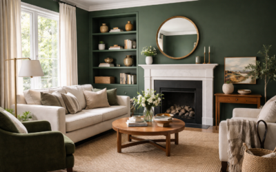
Benjamin Moore Cushing Green is color HC-125 in the Historical Colors collection, and the maker describes it as “a balanced dark green that can flatter a wide range of color schemes and styles.” Its light reflectance value (LRV) is 17.98, so it is a true dark color that will absorb most of the light in a room. On the wall it reads as a deep, muted green with an earthy, slightly olive softness rather than a bright emerald or a cold forest green.
That restraint is why designers reach for it on cabinets, libraries, dining rooms, front doors and whole-house exteriors. It looks rich without feeling loud, and it plays well with brass, wood and creamy whites. The sections that follow cover its specs, how its undertones change with light, the right sheens, the rooms where it shines, coordinating colors and the closest alternatives.
- Benjamin Moore Cushing Green Specs at a Glance
- Cushing Green Undertones in Real Light
- Choosing the Right Sheen
- Where Cushing Green Works Best
- Coordinating Colors for Benjamin Moore Cushing Green
- Similar Colors and Alternatives
- How to Test Cushing Green Before Painting
- Working With a Dark Color Like Cushing Green
- Troubleshooting and Cost Notes
- Frequently Asked Questions
Benjamin Moore Cushing Green Specs at a Glance
Figures come from Benjamin Moore’s own color page. Screens distort deep greens more than most colors, so test a physical sample before you buy.
| Spec | Value | What it means |
|---|---|---|
| Color number | HC-125 | Give this number at the paint counter |
| Collection | Historical Colors | Benjamin Moore’s group of traditional, period-inspired hues |
| LRV | 17.98 | Reflects under one fifth of light; a dark color that needs good lighting |
| Color family | Green | Reads clearly green, not gray, in most light |
| Undertone | Balanced, earthy | Neither strongly blue nor strongly yellow; a muted olive softness |
| Best wall sheens | Matte or eggshell | Low sheen deepens the color and hides flaws |
| Best trim, cabinet and door sheens | Satin or semi-gloss | Durable and wipeable; gloss adds richness on doors |
Cushing Green Undertones in Real Light
Benjamin Moore calls Cushing Green balanced, and that is a fair summary. It does not lean hard toward blue-green teal or toward yellow-green chartreuse. What you will notice instead is a gray, earthy quality that shifts with the light around it.
North-facing rooms
Cool, indirect light pulls Cushing Green toward a deep, smoky green that can look almost charcoal in the evening. That moody effect is often exactly what people want in a study or den. If you want it to stay clearly green, add warm lamps.
South and west-facing rooms
Warm sun brings out more olive and makes the color feel cozy and lively. It will look noticeably lighter on a sunny wall than on a shaded one across the room.
Exteriors
Outdoor light washes colors out, so Cushing Green will look lighter and greener on siding than on a chip held indoors. That makes it a strong choice for siding, shutters and doors where a darker interior color might otherwise look too heavy.
Choosing the Right Sheen
Dark colors show sheen differences more than light ones. Higher sheens reflect more light, which makes the color look slightly lighter and highlights surface flaws such as patches and roller marks.
- Walls in living spaces: matte or eggshell for a velvety depth. Matte shows scuffs more easily on dark colors, so choose a scrubbable matte product for busy rooms.
- Kitchens and baths: eggshell or satin for moisture and cleaning.
- Cabinets and built-ins: satin or semi-gloss in a cabinet-grade enamel that levels well and resists chipping.
- Front doors: semi-gloss or high gloss for a polished, traditional look.
- Exterior siding: low-luster or satin exterior paint.
Deep colors often need a tinted primer and two full topcoats to reach even coverage. Ask the paint counter to tint the primer toward the finish color.
Where Cushing Green Works Best
Kitchen cabinets and islands
Cushing Green is a natural pick for a painted island or lower cabinets, paired with lighter uppers or open wood shelves. Brass, bronze and aged nickel hardware all look good against it, and it flatters white marble and warm butcher block.
Libraries, offices and dens
Painting walls, trim and built-ins in one dark color (color drenching) makes small rooms feel enveloping and intentional. Cushing Green’s balanced undertone keeps that from feeling gloomy.
Dining rooms
In rooms used mostly in the evening, a dark green looks warm and flattering under candlelight and dimmed fixtures.
Bedrooms
A feature wall behind the bed or a fully painted room creates a calm, cocooned feeling. Balance it with light bedding and a warm white ceiling.
Exteriors and front doors
On siding, Cushing Green suits traditional, farmhouse and Craftsman homes with creamy white trim. On a front door, it gives a classic, heritage look on white, gray or brick houses.
Coordinating Colors for Benjamin Moore Cushing Green
Benjamin Moore suggests these coordinating colors on the Cushing Green page. They make an easy, cohesive whole-house palette.
| Coordinating color | Number | How to use it |
|---|---|---|
| Edgecomb Gray | HC-173 | Soft greige for adjoining rooms and hallways |
| Bennington Gray | HC-82 | Warmer mid-tone neutral for an adjoining space or exterior body |
| White Heron | OC-57 | Bright white with a slight cool cast for trim, ceilings and upper cabinets |
| Crystalline | AF-485 | Pale, airy companion for a bedroom or bath |
Beyond those, Cushing Green pairs well with creamy whites, warm taupes, terracotta, ochre, blush pink and natural materials like oak, walnut, leather, linen and rattan.
Similar Colors and Alternatives
Benjamin Moore lists these as similar to Cushing Green on its color page. Compare samples side by side, because small differences in depth and undertone become obvious on a full wall.
- Caldwell Green (HC-124, LRV 16.27): a fellow Historical Color, described as a hunter green with a subtle slate undertone, and a touch deeper.
- Rosepine (461, LRV 20.82): a forest green with hints of gray, a little lighter.
- Enchanted Forest (700, LRV 15.96): a dark green with a gray cast, slightly deeper.
- Cambridge Green (468, LRV 20.99): an earthy green shaded with gray tones, a little lighter.
All four sit within about three LRV points of Cushing Green, so the choice comes down to undertone. If Cushing Green feels too dark for a small room with limited windows, look for a mid-tone green with an LRV in the 25 to 40 range.
How to Test Cushing Green Before Painting
- Use a large sample. Paint a 2 by 2 foot board, or use peel and stick swatches, since dark colors look darker in large areas than on small chips.
- Test on several walls. Place samples near the window and in the darkest corner.
- View throughout the day. Check morning, afternoon and evening, with lamps on.
- Compare against finishes. Hold the sample next to floors, counters, tile and hardware.
- Test trim combinations. Put your trim white next to the sample to see whether it reads crisp or muddy.
Working With a Dark Color Like Cushing Green
An LRV under 20 means Cushing Green will change how a room feels, not just how it looks. Dark walls visually recede at the corners, which can make a small room feel cozier and, oddly, less boxy. They also make white trim, art and furniture stand out sharply. Plan your lighting before you paint: layered lamps, picture lights and warm under-cabinet lighting all help a deep green look intentional after dark.
Decide early whether to paint the ceiling. A white ceiling keeps the room brighter but creates a strong line where wall meets ceiling. Painting the ceiling a lighter green or the same color creates a wrapped, cocoon effect that suits dens, powder rooms and bedrooms. For trim, you can go white for contrast or match the walls for a more modern, tailored finish.
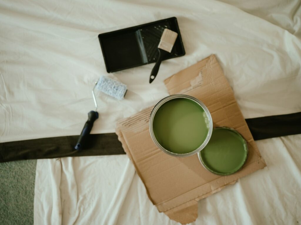
Dark colors also highlight drywall flaws. Fill dents, sand patches smooth and spot-prime them before your tinted primer coat, or the patches can flash through the finish. Use good-quality roller covers and keep a wet edge to avoid lap marks, which show more on deep greens than on pale colors.
Troubleshooting and Cost Notes
It looks almost black. The room lacks light. Add warm lamps, use a slightly higher sheen, or step to a lighter green.
Coverage looks patchy. Deep colors need a tinted primer and two coats. Keep a wet edge and roll full walls without stopping mid-wall.
Touch-ups show. Dark matte finishes flash when touched up. Repaint the full wall section from corner to corner instead of spot-patching.
Trim looks yellow. A very creamy white can look yellow beside dark green. Try a cleaner warm white.
Premium paints typically cost more per gallon than contractor grades, and a gallon generally covers roughly 350 to 400 square feet per coat, though deep colors may need the extra coat. Professional interior painting usually runs around $2 to $6 per square foot of wall area, and cabinet painting is priced separately and higher because of the prep. Product names and availability can change, so check current details with a Benjamin Moore retailer.
Walls are a fine DIY job. Hire a pro for cabinet spraying, stairwells, high ceilings and exteriors above one story.
Frequently Asked Questions
What is the LRV of Benjamin Moore Cushing Green?
Benjamin Moore lists Cushing Green (HC-125) with an LRV of 17.98, which places it firmly among dark colors.
Is Cushing Green warm or cool?
It is balanced. It reads as a muted, earthy green that leans slightly olive in warm light and smoky in cool light.
Is Cushing Green good for kitchen cabinets?
Yes. It is a popular island and lower-cabinet color that pairs well with brass hardware, wood and white counters.
What trim color goes with Cushing Green Benjamin Moore?
A clean white works well. Benjamin Moore suggests White Heron OC-57, a bright white with a slight cool cast, as a coordinating light color; a softer warm white also suits it.
Can Cushing Green be used on a house exterior?
Yes, in an exterior paint line. It will look lighter and greener outdoors than on an indoor chip, so test it on the house.
What colors are similar to Cushing Green?
Benjamin Moore lists Caldwell Green HC-124, Rosepine 461, Enchanted Forest 700 and Cambridge Green 468 as similar colors.