
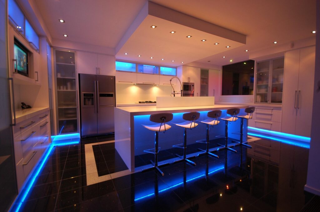
The fastest way to give a builder-grade kitchen personality is to paint the island a saturated color while leaving the perimeter cabinets neutral. A blue kitchen island has become the go-to choice for exactly that move, because blue reads as both classic and current, pairs with almost any countertop, and photographs beautifully. Whether you lean toward a moody navy or a soft coastal sky, the island becomes the anchor of the room. This guide covers shade selection, materials, hardware, and the practical steps to get a durable, professional-looking finish.
Part of our Kitchen Remodeling guide — explore the full guide →
Why Blue Works So Well on an Island
Color psychology aside, blue is simply the most forgiving bold color in a kitchen. It sits opposite warm wood tones on the color wheel, so it flatters oak floors and walnut shelving. It calms a busy space rather than energizing it the way red or orange would. And unlike trend-chasing colors, blue has been a kitchen staple for decades, which means a navy island is unlikely to feel dated in five years.
Confining the color to the island is the secret. Perimeter cabinets in white or greige keep the room feeling open, while the island delivers a concentrated punch of color at eye level. This two-tone approach also lowers the stakes; if you ever tire of the blue, repainting a single island is a weekend job, not a full kitchen overhaul.
Choosing the Right Shade of Blue
Not all blues behave the same under kitchen lighting. The undertone and depth you pick should respond to how much natural light the room gets and what mood you want.
Deep Navy and Indigo
Navy is the crowd favorite for good reason. Benjamin Moore Hale Navy and Sherwin-Williams Naval are near-black in low light and richly blue in sun, giving the island a grounded, almost furniture-like presence. Deep shades hide fingerprints and scuffs better than pastels, a real advantage on a high-traffic island.
Mid-Tone Blues
Colors like Farrow & Ball Stiffkey Blue or Behr Nocturne Blue land between navy and teal. They feel a touch more playful and work well in transitional kitchens that blend traditional and modern elements.
Soft and Coastal Blues
For cottage, farmhouse, or beach-house kitchens, powder and slate blues such as Sherwin-Williams Sea Salt-adjacent tones keep things airy. Light blues show grime faster, so reserve them for lower-traffic or second kitchens.
Countertop Pairings That Flatter Blue
The countertop is where a blue island either sings or clashes. White quartz with subtle gray veining, like Caesarstone Cloudburst Concrete or a Calacatta-look slab, is the safest and most popular pairing. The cool white cap keeps a navy base from feeling heavy.
- White or gray quartz: crisp, timeless, and hides seams well, roughly $55 to $100 per square foot installed.
- Butcher block: warm walnut or maple on a navy base delivers that beloved farmhouse contrast for $40 to $70 per square foot.
- Honed black granite or soapstone: a moody, high-end look that leans into the drama of a deep blue.
- Waterfall marble: for a luxury statement, a Carrara waterfall edge on navy cabinetry is a designer favorite.
Hardware and Finishing Touches
Metal finish is the jewelry of the island, and blue is a generous partner. Warm metals create the strongest contrast and the most current look. Unlacquered brass or champagne bronze pulls pop against navy and develop a lived-in patina over time. If your kitchen already leans cool and modern, matte black or polished nickel keeps things sleek.
Scale matters as much as finish. On a large island, oversized cup pulls or 6- to 8-inch bar pulls read as intentional, while tiny knobs look lost. Budget $4 to $12 per pull for solid hardware; cheap hollow pulls feel flimsy the moment you grab them. Pendant lights above the island in a coordinating metal tie the whole scheme together.
Painting Your Island the Right Way
A blue kitchen island lives or dies on prep. Cabinets take constant hand contact, so a rushed paint job peels within a year. Follow a real cabinet-grade process for a finish that lasts a decade.
- Remove doors, drawers, and hardware, and label everything so it goes back in the same spot.
- Clean every surface with a degreaser like TSP substitute to strip cooking film.
- Scuff-sand with 220-grit paper so primer bonds, then wipe with a tack cloth.
- Apply a bonding primer such as Zinsser BIN or STIX; this step is non-negotiable on slick factory finishes.
- Spray or brush two coats of a durable enamel like Benjamin Moore Advance or Sherwin-Williams Emerald Urethane, sanding lightly between coats.
- Let the enamel cure a full 7 to 14 days before heavy use; it feels dry in hours but hardens slowly.
Expect to spend $80 to $200 on quality paint and supplies for a DIY island, versus $400 to $900 to hire a cabinet painter. The enamel choice is where you should not economize, since urethane-based cabinet paints resist the chips and grease that ruin ordinary wall paint.
Styling and Keeping It Timeless
Once painted, resist the urge to over-decorate. A blue island already carries the room, so keep countertop clutter minimal: a wood cutting board, a bowl of citrus, maybe a stack of two cookbooks. Repeat the blue in one or two small accents elsewhere, a dish towel or a vase, so the color feels woven into the room rather than dropped in.
To keep the look fresh for years, choose classic shapes for stools and pendants rather than fad silhouettes. Woven counter stools with wood legs pair beautifully with navy and never feel dated. A well-executed blue kitchen island is one of the highest-impact, lowest-cost updates in home design, delivering the personality of a full remodel for the price of a few cans of enamel and a weekend of careful work.
Lighting the Island Right
Lighting can make or break a blue island, because color reads completely differently under warm versus cool bulbs. Navy and mid-tone blues look richest under warm-white light in the 2700K to 3000K range, which brings out the depth of the color; cooler daylight bulbs can make a deep blue look flat or slightly gray. Hang two or three pendants over a standard island, spaced evenly and centered on the island’s length, with the bottoms roughly 30 to 36 inches above the countertop.
The pendant finish is another chance to tie the scheme together. Brass or bronze pendants echo warm hardware and pop against navy, while black or glass fixtures keep a cooler, more modern feel. If the island includes a prep sink or serves as a homework spot, add a dimmer so you can shift from bright task lighting to soft ambient glow. Good lighting is what makes the blue you carefully chose actually look like the swatch you fell for.
Avoiding Common Mistakes
A few missteps trip up homeowners who paint an island blue. The most common is skipping primer or using ordinary wall paint, which peels off the high-touch surfaces within a year; cabinet-grade enamel over a bonding primer is non-negotiable. Another is testing the color only on a swatch card rather than painting a large sample board and living with it for a few days, since blue shifts dramatically between morning and evening light.
Watch the undertone against your existing finishes, too. A cool slate blue can clash with warm honey-oak floors, while a navy with a slight green undertone flatters them. Finally, resist matching the island blue to too many other elements; when the walls, backsplash, and island all echo the same blue, the effect turns heavy and dated. Let the island be the star and keep everything around it neutral. Nail those details and your blue island will look intentional and custom rather than like a trend you chased.


