Most failed gallery walls share one problem: too much randomness and not enough rhythm. A colorful gallery wall can transform a dull hallway or a flat living room into the most talked-about surface in your house, but only if the colors talk to each other instead of shouting over one another. The good news is that you do not need a designer’s eye. You need a repeating element, a sensible layout, and a level. Get those three right and almost any mix of bright art will look intentional.
Why Color Needs a System
Bright art reads as chaos when there is nothing tying the pieces together. The fix is a unifying thread that runs through the whole arrangement. That thread can be a shared frame color, a consistent mat width, or one accent hue that appears in every piece. Pick a single anchor and let the rest of the colors play freely around it.
A common approach is the “one repeated color” rule. Choose a punchy shade, such as mustard yellow or teal, and make sure it shows up at least once in every frame on the wall. Your eye then travels naturally from piece to piece, registering the arrangement as a connected composition rather than a pile of unrelated prints.
Choosing Your Palette
Before you buy a single frame, decide how loud you want the wall to be. There are three reliable palette strategies, and each delivers a different mood.
- Rainbow spectrum: Full saturation across the color wheel. High energy, best for playrooms, studios, and entryways where you want immediate impact.
- Analogous burst: Three or four neighboring colors, such as orange, coral, pink, and red. Vibrant but cohesive, and far easier to balance than a full rainbow.
- Brights on neutral: A handful of saturated pieces scattered among black-and-white prints. The neutrals act as visual rest stops so the color pops without overwhelming the room.
If you are nervous about commitment, start with brights on neutral. You can always swap in more color later, and a roughly 60-40 split of neutral to color keeps the wall lively without tipping into busy.
Frames: Match, Mix, or Both
Frames carry as much visual weight as the art inside them. You have three choices, and there is no wrong answer as long as you commit fully.
Matching frames, usually all white, black, or natural wood, create a clean grid feel and let the colorful art do all the work. Mixed frames in different finishes feel collected and eclectic, which suits a colorful wall beautifully, but they demand a stronger layout to avoid looking accidental. The hybrid approach, mixing frame colors while keeping one consistent material like wood, gives you variety with a built-in safeguard.
Planning the Layout
Never start hammering nails first. Lay everything out on the floor or trace each frame onto kraft paper and tape the templates to the wall. This dry run saves you from a wall full of unwanted holes.
Grid Layout
Equal-size frames in tidy rows and columns. Calm, modern, and forgiving. Keep a consistent gap of 2 to 3 inches between every frame for a crisp result.
Salon Style
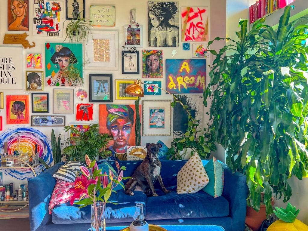
Mixed sizes packed densely with varied spacing. This is the classic gallery look and the most flattering for colorful collections. Anchor it with your largest piece slightly off-center, then build outward.
Horizontal Line
Frames aligned along a shared center line, ideal above a sofa or a console. Vary the heights of the frames but keep that imaginary midline locked at roughly 57 to 60 inches from the floor.
Spacing and Placement Rules
Tight, even spacing is the single biggest factor separating a polished wall from a messy one. Aim for 2 to 3 inches between frames and treat the whole cluster as one large rectangle or shape. The outer edge of that shape should sit about 6 to 10 inches above furniture.
Eye level matters more than ceiling height. Center the arrangement so its midpoint lands near 57 inches, the standard museum hanging height. In rooms where people are mostly seated, such as a dining room, drop that center a few inches lower.
Hanging It Right
With your paper templates taped up and approved, hanging becomes simple. Mark each nail point through the template, then hammer directly through the paper before tearing it away. Use the right hardware for the weight.
- Frames under 5 pounds: a single picture nail or adhesive strip is fine.
- Frames 5 to 20 pounds: use a sawtooth hanger or D-rings rated for the weight.
- Heavier or glass-fronted pieces: anchor into a stud or use a wall anchor rated above the frame’s weight.
Check every frame with a small bubble level as you go. A frame that hangs even a degree off will draw the eye in a wall otherwise full of color, so it is worth the extra thirty seconds per piece.
Adding Texture and Dimension
A colorful gallery wall does not have to be all flat prints. Break up the rhythm with a woven basket, a small mirror, a painted plate, or a shadow box holding a three-dimensional object. These elements catch light differently and keep the wall from reading like a catalog page.
Just keep the color story intact. If your accent hue is teal, slip a teal-glazed ceramic piece into the mix so the new texture still belongs to the family.
Common Mistakes to Avoid
The errors that sink most projects are easy to dodge once you know them.
- Hanging everything too high so the wall floats above the action.
- Leaving inconsistent gaps that make a tidy collection look careless.
- Using too many competing focal points instead of one clear anchor piece.
- Skipping the paper-template step and ending up with a constellation of patched holes.
Treat your gallery wall as a living arrangement. Start with a strong core of five to seven pieces, then add new finds over time. A colorful gallery wall that grows with you almost always looks better than one rushed into place in a single afternoon.