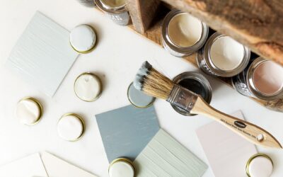
Most cottage homes look best in colors that seem slightly faded, as if the sun has been working on them for a decade. Picking cottage exterior paint colors is less about finding one perfect body shade and more about building a gentle three-part palette: a soft body color, a trim color that frames it, and one accent that gives the house its personality. Get those three right and even a small bungalow on a narrow lot reads as warm and intentional.
Part of our Paint & Walls guide — explore the full guide →
The short answer for most homeowners: choose a muted, gray-softened body color (sage, butter yellow, powder blue, warm white or a pale clay), pair it with a creamy white trim rather than a stark one, and save saturated color for the front door, shutters or window boxes. Then test every sample on the actual siding, in daylight, before committing to gallons.
- Choosing Cottage Exterior Paint Colors That Fit the House
- Classic Cottage Palettes and Why They Work
- Balancing Body, Trim, Shutters and Door
- How to Test Exterior Colors Before You Commit
- Prep, Application and Tools
- Ladder Safety on Cottage Exteriors
- Common Problems and How to Fix Them
- Cost Ranges and When to Hire a Painter
- Frequently Asked Questions
Choosing Cottage Exterior Paint Colors That Fit the House
Cottage style covers a lot of ground. A shingled coastal cottage, a brick English cottage with a steep gable, a Craftsman-leaning bungalow and a farmhouse with board-and-batten siding all claim the label. Each carries its own fixed elements that limit your palette, and those fixed elements matter more than any color trend.
Start by listing everything you are not going to change. Roof color is the big one: a charcoal asphalt roof pairs easily with nearly anything, while a brown or green roof narrows the field. Stone or brick foundations, a stained wood porch ceiling, existing gutters and even the color of a neighbor’s house all influence how a body shade will read from the street. Paint the house to agree with the roof and masonry, not to fight them.
Scale is the other consideration. Small houses can carry slightly richer body colors than large ones because there is less wall area to overwhelm the eye. A pale sage that looks timid on a two-story colonial can look perfectly balanced on a 900 sq ft cottage. Conversely, very dark body colors tend to make a small cottage recede and lose its charm, so most designers keep the body in the light-to-mid range.
Classic Cottage Palettes and Why They Work
Sage Green With Cream Trim
Sage is the workhorse of cottage color. Its gray undertone keeps it from looking minty, and it sits comfortably against gardens, mature trees and weathered fencing. Pair it with a warm cream trim and a front door in deep plum, brick red or a darker forest green. On houses with a lot of landscaping, sage practically disappears into the yard in the best possible way.
Butter Yellow With Bright White
Pale yellow is cheerful without shouting, but it needs restraint. Choose a yellow with a touch of gray or beige so it does not glow in afternoon sun. A clean white trim sharpens it, and a navy or black door adds weight. Avoid lemon or primrose shades on south- and west-facing walls; direct light can push them toward neon.
Soft Blue With Crisp White
Powder blue and gray-blue cottages feel coastal even far from the ocean. Blues shift dramatically with light, looking almost lavender at dusk and nearly white at noon, so test at several times of day. A soft blue body pairs well with white trim, a natural wood door or a coral or sunflower accent.
White Body With a Colored Door
A white cottage is timeless, but plain white can look flat or chilly. Pick a warm white with a slight cream or greige undertone, then let the door, shutters and window boxes carry color. Robin’s egg blue, tomato red, mustard and deep teal doors all work well against a white body. The trim can be the same white in a higher sheen, or a shade slightly lighter or darker for subtle definition.
Pale Clay, Blush and Mushroom
Warmer neutrals such as pale terra cotta, dusty blush and mushroom taupe suit brick-trimmed or stucco cottages and look especially good with copper or dark bronze fixtures. Keep the trim creamy and pick an accent in olive, slate blue or charcoal.
Balancing Body, Trim, Shutters and Door
A cottage palette lives or dies on contrast. Too little and the house looks washed out; too much and the details look busy. A simple framework helps:
- Body: the softest, most muted color, covering roughly 70 to 80 percent of the visible exterior.
- Trim: fascia, window casings, corner boards and porch railings. Usually a cream or warm white, sometimes a darker shade of the body color for a moodier look.
- Shutters: either a deeper version of the body color or the accent color. Matching shutters to the door is the most reliable choice.
- Door and small accents: the one place to go bold. Window boxes, a porch swing, house numbers and planters can echo it.
Limit yourself to three colors plus one optional neutral for the foundation or porch floor. Four or five competing hues is where cottages start to look like a gingerbread display. If your house has decorative gable trim or brackets, paint them in the trim color rather than a fourth shade; the detail will show up through shadow alone.
Sheen also adds contrast without adding color. Flat or low-sheen finishes on siding hide surface flaws, while satin or semi-gloss on trim and doors makes the details pop and wipes clean more easily.
How to Test Exterior Colors Before You Commit
Paint chips lie, especially outdoors. Sunlight washes colors out by a shade or two, while shadows under deep eaves can make them look a shade darker. Follow a simple testing routine:
- Narrow the field to two or three body candidates and one or two trim whites.
- Buy sample quarts and paint large swatches, at least 2 ft by 2 ft, on the siding itself or on primed boards you can move around.
- Place swatches on at least two sides of the house, one in direct sun and one in shade.
- Look at them in the morning, at midday and in the late afternoon, and from the street as well as up close.
- Hold the trim sample and the door color next to each body swatch so you judge the palette as a group.
- Live with the samples for several days before deciding. A color that looks perfect on day one sometimes grates by day four.
Many homeowners land one step lighter or grayer than their first instinct. That is normal: exterior colors read more saturated at full scale than on a small card.
Prep, Application and Tools
Good color depends on good prep. Wash the siding with a mild detergent solution and a soft brush or a low-pressure rinse, let it dry fully, scrape loose paint, sand rough edges, replace rotten boards and caulk gaps around trim. Spot-prime bare wood and any repairs. Plan for at least two finish coats on a color change, especially when going from a dark body to a pale cottage shade.
Typical tools and materials include:
- Exterior acrylic latex paint in low-sheen for siding and satin or semi-gloss for trim and doors
- Exterior primer suited to the substrate (wood, fiber cement, previously painted vinyl)
- Paintable exterior caulk, scrapers, sanding blocks and drop cloths
- Quality angled brushes for trim and a roller for flat areas
- Painter’s tape and plastic sheeting to protect windows, lights and plantings
On lap siding, shingles or board-and-batten, an exterior paint sprayer speeds the body coat considerably and gets paint into grooves that a roller misses. Back-brushing or back-rolling right after spraying pushes paint into the surface for better adhesion. Mask windows, doors and fixtures thoroughly, and do not spray on windy days, since overspray can drift onto cars and neighboring houses.
Weather matters too. Most exterior latex paints want surface and air temperatures roughly between 50°F and 90°F, low humidity and no rain for at least a day after application. Avoid painting walls in direct, hot sun; follow the shade around the house instead.
Ladder Safety on Cottage Exteriors
Even modest cottages have steep gables, dormers and porch roofs that put you well off the ground. Ladder falls are among the most common home-improvement injuries, so treat the work with care:
- Use an extension ladder rated for your weight plus tools, and set it at about a 1-to-4 angle (one foot out for every four feet of height).
- Place feet on firm, level ground; use levelers rather than stacking boards, and never set a ladder on soft soil or gravel without a stable base.
- Keep three points of contact, keep your belt buckle between the rails and move the ladder rather than leaning out.
- Look up for overhead power lines before raising any ladder and keep well clear of them.
- Have a helper foot the ladder and pass up supplies, and use a bucket hook so your hands stay free.
- For high gable peaks, consider a stabilizer arm, a ladder jack system or rented scaffolding.
For houses of two or more stories, steep roof pitches or tall gable ends, hire a professional painting crew. They carry the scaffolding, fall protection and insurance that make high work safe. If your cottage predates 1978, test existing paint for lead before scraping or sanding and use lead-safe work practices or a certified contractor.
Common Problems and How to Fix Them
The color looks too bright after the first wall. Stop and step back to the street. If it still feels loud, a paint store can usually tint the remaining gallons a few percent grayer. It is far easier to adjust after one wall than after the whole house.
The trim looks dingy next to the body. A white trim that is too warm can look yellowed beside a cool blue or gray body. Switch to a cleaner white with less cream in it.
The house feels flat. Add contrast through shutters, a darker porch floor or a deeper door color, or step the trim up to semi-gloss.
Paint is peeling within a year or two. This is nearly always prep or moisture: painting over chalky or dirty siding, painting in cold or damp conditions, or water getting behind boards from failed caulk or gutters. Fix the moisture source, scrape, prime and repaint.
Cost Ranges and When to Hire a Painter
DIY exterior painting for a small cottage often runs a few hundred to around 1,500 dollars in paint, primer, caulk and supplies, depending on house size, number of coats and paint quality. A sprayer rental or purchase adds to that. Professional exterior painting for a typical one-story cottage commonly falls in the range of a few thousand dollars up to around 8,000 dollars or more, driven by square footage, siding condition, trim complexity, lead-safe requirements and regional labor rates. Two-story homes and heavy repair work push costs higher.
Call a pro when the house is two stories or more, when there is extensive rot or peeling, when lead paint is present, or when you simply do not have several clear weekends. A good painter will also help you test colors at full scale and can often recommend palettes that have worked on similar homes in your neighborhood.
Thoughtful cottage exterior paint colors do not have to be daring. A soft body, a gentle trim and one confident accent will make a small house look loved, settled and welcoming for years.
Frequently Asked Questions
What is the most popular color for a cottage exterior?
Sage green, warm white, soft gray-blue and pale butter yellow are the most common choices. Each has a muted, slightly grayed quality that suits small homes, gardens and natural materials, and each pairs easily with cream trim and a colorful door.
Should cottage trim be white or a darker color?
Creamy or warm white trim is the classic choice because it frames windows and keeps the house light. A darker trim, such as a deeper shade of the body color, works well when you want a moodier, more modern look or when the body color is already very pale.
How many colors should a cottage exterior have?
Three is the sweet spot: a body color, a trim color and one accent for the door, shutters or window boxes. A fourth neutral for the foundation or porch floor is fine, but more than that tends to look busy on a small house.
Can I use a paint sprayer on a cottage exterior?
Yes. A sprayer is efficient on lap siding, shingles and board-and-batten, especially when you back-brush or back-roll right after spraying. Mask windows and fixtures carefully, avoid windy days and use brushes for crisp trim lines.
What colors make a small cottage look bigger?
Lighter, low-contrast body and trim colors make a small house read larger, while very dark bodies make it recede. Keeping shutters close in value to the body and saving contrast for the door also helps the house look broader and calmer.