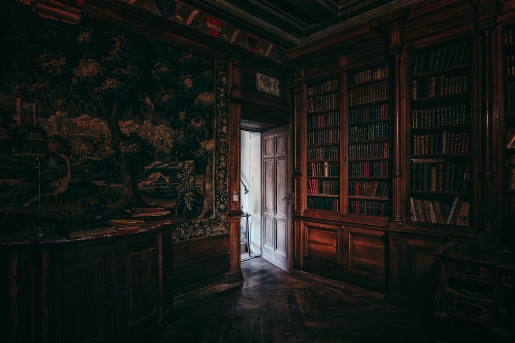
Picture a candlelit library lined with leather-bound books, worn wood, and walls the color of a forest at dusk. That vintage-scholarly mood has a name, and choosing the right dark academia paint colors is how you bring it home. This aesthetic leans on deep, saturated, slightly muted shades, forest greens, oxblood reds, chocolate browns, and inky blacks, that feel rich, intellectual, and enveloping rather than flashy. Done well, it turns a plain room into an atmospheric retreat. Done carelessly, it turns it into a dark cave. Here’s how to pick the shades and use them so the room feels layered and inviting, not gloomy.
Part of our Paint & Walls guide — explore the full guide →
- What Defines a Dark Academia Palette
- The Best Green Shades
- Browns and Warm Neutrals
- Reds, Burgundies, and Deep Accents
- Blacks and Near-Blacks
- How to Use Dark Colors Without Making a Cave
- Where the Look Works Best
- Pairing Colors With the Right Materials
- Building the Look on a Budget
- Rooms That Suit the Style Best
- Sheen and Finish
- Putting It Together
What Defines a Dark Academia Palette
The dark academia look is rooted in the colors of old universities, libraries, and gentlemen’s studies. The palette is deliberately moody and grounded in nature and antique materials. The core traits are deep saturation, muted (never neon) tones, and an emphasis on earthy, historic hues. Think of the colors you’d find in an old leather chair, a green banker’s lamp, aged brass, dark walnut shelving, and a burgundy Persian rug. Warmth and depth matter more than brightness, and a slightly aged, dusty quality keeps the colors from feeling harsh.
The Best Green Shades
Green is arguably the signature dark academia color, evoking library reading lamps and ivy-covered halls. The best picks are deep and muted rather than bright:
- Sherwin-Williams Pewter Green (SW 6208): A grayed, moody green that’s become a modern favorite for studies.
- Benjamin Moore Hunter Green (2041-10): A classic deep forest green, rich and traditional.
- Farrow & Ball Studio Green: An almost-black green with tremendous depth.
- Sherwin-Williams Rosemary (SW 6187): A softer, earthy green for a less intense take.
Green pairs beautifully with brass, dark wood, and cream, which is exactly the material palette dark academia loves.
Browns and Warm Neutrals
Chocolate and coffee browns bring the cozy, leather-and-wood warmth that defines the look:
- Sherwin-Williams Van Dyke Brown (SW 7041): A deep, rich brown named after the old master’s pigment. Perfect.
- Benjamin Moore Bittersweet Chocolate (2114-10): An enveloping dark brown for a den or library.
- Sherwin-Williams Urbane Bronze (SW 7048): A warm greige-brown that works as a softer, more livable dark academia neutral.
Browns are a great choice if full-saturation green or black feels like too much; they read warm and scholarly while being a touch more forgiving.
Reds, Burgundies, and Deep Accents
Oxblood and burgundy are the dramatic accent colors of the aesthetic, echoing leather books and wine:
- Sherwin-Williams Fireweed (SW 6328) or a deep Cordovan (SW 0100): Rich, brooding reds ideal for an accent wall or a study.
- Benjamin Moore Dinner Party (AF-300): A sophisticated deep wine tone.
Because reds are intense, they often work best on a single feature wall, in a small room like a powder room, or on built-in shelving rather than every wall.
Blacks and Near-Blacks
For the most dramatic version of the look, inky near-blacks create instant depth and sophistication:
- Sherwin-Williams Tricorn Black (SW 6258): A true, clean black.
- Sherwin-Williams Iron Ore (SW 7069): A softer off-black with warmth that’s more livable than pure black.
- Benjamin Moore Black Beauty (2128-10): A deep near-black with subtle depth.
How to Use Dark Colors Without Making a Cave
This is the make-or-break part. Dark walls can feel cozy and elegant or oppressive and gloomy, and the difference comes down to layering and light. Follow these principles:
- Layer in warm light. Dark rooms need generous, warm (2700K) lighting from multiple sources, table lamps, sconces, and a picture light over art, not one cold overhead fixture. Warm pools of light are the whole point.
- Add contrast with lighter elements. Cream or off-white ceilings, trim, bedding, or upholstery keep a dark room from closing in. The contrast is what makes the depth read as intentional.
- Bring in natural materials. Wood tones, leather, brass, aged bronze, and vintage textiles add the warmth and texture the aesthetic requires. Flat dark walls alone feel like a box; layered materials feel like a library.
- Use plenty of books and art. Framed vintage prints, botanical illustrations, and shelves of books are core to the look and break up the dark expanse.
Where the Look Works Best
Dark academia shines in rooms you want to feel intimate and focused: a home office or study, a library nook, a formal dining room, a bedroom, or a moody powder room. It’s less suited to a bright, casual kitchen or a room you want to feel airy and open. North-facing rooms with cool light take beautifully to the warm depth of these colors, while a small room can feel like a jewel box rather than a cave when done right. If you’re nervous about committing, start with a single dark accent wall, painted built-in bookshelves, or a small room to test the mood.
Pairing Colors With the Right Materials
Dark academia lives and dies by its materials, not just its wall color. The palette is inseparable from the textures it sits against: aged leather, dark walnut and mahogany, brass and aged bronze, worn brass hardware, velvet, wool, and old paper. A Pewter Green wall feels flat and cold on its own but comes alive next to a cognac leather chair, a brass floor lamp, and a stack of cloth-bound books. When planning a room, choose the wall color and the material palette together.
Wood tones are especially important. Warm mid-to-dark woods, walnut, oak with a dark stain, mahogany, reinforce the scholarly, antique mood better than pale modern woods like birch or light oak. If you have existing furniture in a light finish, you can bridge it with dark textiles, leather, and brass accents. Metals should skew warm and slightly aged; polished chrome and bright nickel feel too modern, while brass, bronze, and antique gold belong.
Building the Look on a Budget
You don’t need expensive antiques to achieve this aesthetic, which is part of its appeal. Thrift stores, estate sales, and secondhand shops are goldmines for the exact leather-bound books, brass lamps, framed vintage prints, and worn wood pieces the look calls for, often for a few dollars each. A can of dark paint on a plain bookshelf or an old side table instantly gives it the right depth.
Focus your budget where it counts: quality warm lighting and a good wall color do the heaviest lifting. From there, layer inexpensive finds, gilt-framed art from a thrift store, a stack of vintage books, a moody botanical print, a brass candlestick, to build the collected-over-time feel that defines the style. The goal is a room that looks like it was assembled by a lifelong scholar, and that impression comes from layered texture and warm light far more than from a big budget.
Rooms That Suit the Style Best
Some spaces take to dark academia more naturally than others. A home office or study is the quintessential setting, deep walls, a wall of books, warm task lighting, and a leather chair create the ideal focused, intellectual retreat. Bedrooms benefit from the cocooning, restful quality of deep colors, especially when balanced with cream bedding and warm lamps. Formal dining rooms feel intimate and dramatic in a deep green or burgundy under a warm chandelier, and even a small powder room becomes a jewel box in an inky green or near-black. The style suits rooms you want to feel enclosed and atmospheric more than bright, casual, everyday spaces.
Sheen and Finish
Sheen affects how dark colors read. A flat or matte finish gives the richest, most velvety, old-world look and hides wall imperfections, which is why it’s often the dark academia default. If you want a touch of drama and reflected candlelight, an eggshell adds subtle depth without going glossy. For trim, doors, and bookshelves, a satin or semi-gloss creates elegant contrast and stands up to handling. A high-gloss deep green or oxblood on a library door or panel is a classic, luxurious move.
Putting It Together
A foolproof dark academia scheme might be Pewter Green walls in a study, cream ceiling and trim for contrast, built-in shelves painted the same green in satin, warm brass lamps and library lights, a leather chair, and stacks of books. Swap in Van Dyke Brown or Iron Ore for a different mood, or add an oxblood accent wall for drama.
Choose dark academia paint colors from the deep, muted green, brown, burgundy, and near-black families, then make them sing by layering warm light, natural materials, and lighter contrasting accents. Get that balance right and the room won’t feel dark and heavy; it’ll feel like a scholarly, atmospheric retreat you never want to leave.