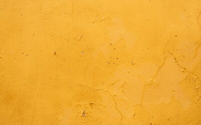
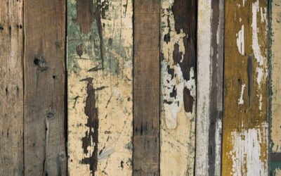
The color most homeowners pick when they Google “farmhouse white” is too cold and ends up looking like a dental office. Genuinely rustic paint colors are warmer, dustier, and have a quiet imperfection baked into the pigment. They look like they have been there for fifty years even when the paint is wet. This guide pulls together the palette professional designers actually use when a client asks for rustic without crossing into theme-park country.
Part of our Paint & Walls guide — explore the full guide →
What Makes a Color Rustic
Three qualities separate a rustic shade from a generic neutral. First, low chroma; the color is muted rather than saturated. Second, a warm undertone, usually leaning toward yellow, red, or brown rather than blue or violet. Third, a sense of having been mixed from natural pigments, the way old paints used iron oxide, lampblack, or chalk.
Modern paints replicate these qualities through carefully blended bases. Look for descriptors like “tea-stained,” “weathered,” “milk paint,” or “patina” in the name. Skip anything called “crisp,” “fresh,” or “modern.”
Whites and Off-Whites That Read Rustic
Pure white is wrong for rustic interiors. The whites below carry warmth without yellowing into cream.
- Benjamin Moore White Dove (OC-17): the most-used trim white in old farmhouses; soft, slightly creamy
- Sherwin-Williams Alabaster (SW 7008): 2016 Color of the Year for good reason; reads warm without going beige
- Farrow & Ball Pointing (No. 2003): the chalkiest white in the lineup; looks hand-mixed
- Behr Swiss Coffee (12): budget-friendly equivalent of White Dove
Test all four under your actual ceiling fixtures before committing. Whites shift dramatically between LED, halogen, and natural light.
Greens: The Heart of the Rustic Palette
Old farmhouses used a lot of green because oxidized copper and verdigris pigments were cheap. Modern renditions stay muted.
Sherwin-Williams Sage Green Light (SW 2851) is a dusty mid-tone perfect for kitchen cabinets. Benjamin Moore Saybrook Sage (HC-114) reads slightly more gray and works in low-light rooms. For a deeper, near-black green that still feels rustic, try Farrow & Ball Studio Green or Sherwin-Williams Rosemary (SW 6187).
Pair greens with unfinished oak, brass hardware, and warm whites. Avoid pairing with chrome or stainless, which fight the organic feel.
Reds, Clays, and Earth Tones
Barn red is the obvious choice and also the easiest to misuse. Skip fire-engine reds entirely. The reds that age well sit in the brown-red range.
- Benjamin Moore Cottage Red (HC-184): a true barn red with brown undertones
- Sherwin-Williams Rookwood Red (SW 2802): deeper, dustier, ideal for accent walls
- Farrow & Ball Picture Gallery Red: a moody library red
- Benjamin Moore Audubon Russet (HC-51): terracotta tones for stucco walls
For clay-based colors, try Sherwin-Williams Cavern Clay (SW 7701) or Behr Apricot Mousse. They read Southwestern but cross over to general rustic interiors easily.
Blues That Avoid Looking Coastal
Rustic blues are slate-toned and chalky, never bright. The trick is choosing blues with gray or green in the base rather than turquoise.
Benjamin Moore Hale Navy (HC-154) works on cabinets and exterior shutters. Sherwin-Williams Slate Tile (SW 7624) gives a softer, dustier finish. Farrow & Ball De Nimes No. 299 reads like old workwear and pairs beautifully with raw wood beams.
Browns and Almost-Blacks
For trim, doors, and built-ins, dark earthy tones add weight without the harshness of black.
Benjamin Moore Wrought Iron (2124-10) is the closest to true black that still feels organic. Sherwin-Williams Urbane Bronze (SW 7048) was the 2021 Color of the Year and remains a top choice for rustic kitchen islands. For coffee browns, Behr Cracked Pepper or Benjamin Moore Iron Mountain pull together rooms with mixed wood tones.
How to Apply These Colors
Rustic colors look best with imperfect application. Roll the wall, then dry-brush a slightly lighter shade over it for depth. Eggshell or matte finishes match the period feel; satin and semi-gloss read too modern. For an authentic limewash effect on plaster or brick, Romabio Classico Limewash and Portola Paints are worth the premium over rolled-on faux finishes.
Skip glossy trim. A matte or eggshell trim against eggshell walls is the move; the slight sheen difference defines edges without making everything look new.
Frequently Asked Questions
What hues work for a small dark room?
Lean toward warm whites like Alabaster or Swiss Coffee on walls, with a deeper accent like Hale Navy or Urbane Bronze on a single wall or built-in. Avoid mid-tone neutrals, which tend to feel muddy in low light.
Can I mix multiple rustic colors in one room?
Yes, but stay within one undertone family. A green-undertone white with a slate blue and a sage green will feel cohesive. Mixing yellow-undertone cream with cool gray creates visual tension.
Do rustic colors work in modern homes?
They can warm up a sterile open-plan space. Use them on a single feature wall, kitchen island, or built-in, paired with neutral upholstery. Going full rustic in a modern shell often looks like a costume.
What sheen works best on these finishes?
Matte or eggshell on walls and ceilings, eggshell or satin on trim and doors. Avoid semi-gloss anywhere unless you specifically want a polished, period-revival look.