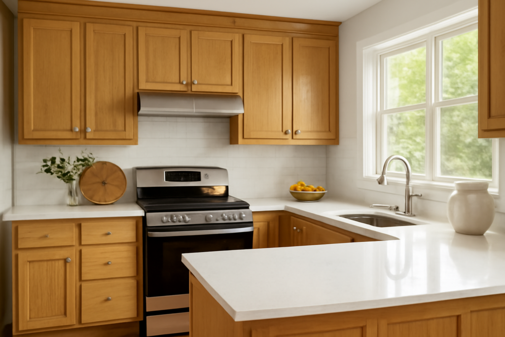
If your kitchen still has its 1990s golden oak cabinets, congratulations — you skipped two rounds of paint trends and wood tone is fashionable again. The renovation question I now field weekly is how to pair honey oak oak cabinets with quartz countertops: which quartz colors calm that golden-orange glow, which ones accidentally amplify it, and how to make original oak read “warm modern” instead of “unrenovated.” Having templated a lot of quartz over a lot of honey oak, I can tell you the pairing succeeds or fails on one thing — how the quartz’s undertone handles orange. Here’s the full playbook, with specific colors from the brands your fabricator actually stocks.
Part of our Countertops guide — explore the full guide →
- Understand What You're Working With: Orange
- The Winners: Quartz Colors That Flatter Honey Oak
- The Losers: What Makes Honey Oak Look Worse
- Quick Pairing Matrix
- Complete the Scheme: Backsplash, Walls, Floors, Hardware
- Budget and Process Notes
- Edge Profiles, Finishes, and Thickness
- When to Contrast on Purpose
Understand What You’re Working With: Orange
Honey oak isn’t really yellow, and it isn’t brown — it’s a desaturated orange, usually amplified by decades of ambering oil-based polyurethane. Everything else in the kitchen negotiates with that orange. Two color facts drive every recommendation below. First, orange’s complement is blue, so anything with blue undertones — stark white quartz, blue-gray veining, cool concrete grays — makes honey oak look more orange by contrast, which is precisely the “dated” effect people are trying to escape. Second, colors that share warmth — creams, warm whites, gold-flecked patterns, warm taupes and browns — blend the cabinets into a cohesive scheme, so the oak reads as an intentional wood tone rather than a leftover. Your quartz decision is really a decision about whether to harmonize with the orange (safe, warm, timeless) or to contrast it deliberately with deep contrast rather than cold contrast (bolder, still safe when done dark).
The Winners: Quartz Colors That Flatter Honey Oak
Warm whites with cream or gold movement — the top tier. A soft white quartz with warm gray-gold veining bridges oak and white beautifully. Standouts I’ve installed against honey oak: Cambria Brittanicca Warm and Ella (warm-veined whites), Caesarstone London Grey and Noble Grey used selectively (their veining leans warm despite the names — sample them), MSI Calacatta Idillio and Calacatta Gold looks, and Silestone Ethereal Glow. The warm veining picks up the oak’s gold so the two surfaces shake hands.
Creams and beiges. Solid or lightly patterned cream quartz — Caesarstone Buttermilk, Corian Quartz-type creams, MSI Crema-family tones — is the harmonizer’s choice: quiet, warm, forgiving of crumbs, and completely at peace with golden oak. This is the pairing that makes a 1994 kitchen look like a 2026 “warm minimalist” kitchen with nothing but counters, hardware, and paint.
Warm taupe and greige patterns. Mid-tone greige quartz with soft movement — think Cambria Berwyn-style warm patterns or Silestone’s taupe family — adds depth without cold. Excellent when the floor is light, so the kitchen doesn’t wash out.
Deep browns and warm charcoals. For contrast done right, go dark and warm rather than light and cold: chocolate-brown quartz with cream veining, warm-black colors like Caesarstone Piatra Grey (charcoal with warm veins), or a leathered warm-black look. Dark warm counters against honey oak reads rich and traditional — think library, not builder-grade.
The Losers: What Makes Honey Oak Look Worse
Three families to walk past in the slab yard. Stark blue-whites: pure arctic whites (the classic bright-white engineered slabs) sit against honey oak like a new phone on an old desk — the contrast is cold, and the oak’s orange doubles down. If you want white, it must be a warm white; hold the sample against the cabinet door and check for a blue cast. Cool gray and concrete looks: gray quartz was designed for white and gray kitchens; against orange oak, blue-gray slabs create the exact undertone war this article exists to prevent. A gray must have visible taupe/brown warmth to work here. Busy multicolor patterns with cool speckles: the older granite-look quartzes with gray-blue-black speckling fight oak’s strong grain — two busy warm-vs-cool patterns at once. Keep pattern scale calm because honey oak’s cathedral grain is already a pattern.
Quick Pairing Matrix
| Quartz Direction | Example Colors | Effect With Honey Oak | Verdict |
|---|---|---|---|
| Warm white w/ gold-gray veins | Brittanicca Warm, Calacatta Gold looks, Ethereal Glow | Brightens kitchen, blends oak in | Best all-around |
| Cream / beige solids | Buttermilk, crema tones | Seamless warmth, timeless | Safest |
| Warm greige movement | Taupe-veined patterns | Adds depth, modernizes | Strong |
| Dark warm brown/black | Piatra Grey, chocolate quartz, leathered warm black | Rich contrast, traditional-luxe | Strong (needs good light) |
| Stark blue-white | Bright arctic whites | Oak flares orange, looks unrenovated | Avoid |
| Cool concrete gray | Blue-gray solids | Undertone clash | Avoid |
| Busy cool speckle | Granite-look gray/blue flecks | Pattern war with oak grain | Avoid |
Complete the Scheme: Backsplash, Walls, Floors, Hardware
Quartz never works alone, and the supporting cast decides whether honey oak reads intentional. Backsplash: warm white ceramic — handmade-look 4x4s or picket in cream glaze — or a full-height splash of the same warm-veined quartz; avoid cool gray subway, which reintroduces the clash at eye level. Walls: green is honey oak’s best friend on the wheel — sage and olive (SW Evergreen Fog 9130, BM October Mist 1495) neutralize orange gorgeously; warm whites (SW Alabaster 7008) and quiet greiges (SW Accessible Beige 7036) also work; skip blue-grays. Floors: if you’re updating flooring too, a warm greige or driftwood tone separates enough from the cabinets to avoid the wood-on-wood-on-wood 1996 effect; never match the cabinet color underfoot. Hardware and fixtures: matte black instantly modernizes honey oak, aged brass leans into the warmth, brushed nickel is acceptable, polished chrome is the coldest option and the least flattering here. Swapping 30 knobs and pulls runs $100 to $300 and does a third of the visual renovation by itself.
Budget and Process Notes
Quartz over existing cabinets is the classic keep-the-boxes remodel, and the math is friendly: expect $55 to $100 per square foot installed for the mainstream brands and colors above, so a typical 40-square-foot kitchen lands between roughly $2,500 and $4,000 — versus $15,000-plus for the paint-everything-replace-everything route. Before templating, do two things. First, take a cabinet door to the slab yard; undertone matching from memory fails, and quartz samples look different beside real oak than they do in a white showroom. Second, if your counters are being replaced anyway, consider having the oak cleaned and de-yellowed (a deep clean with a wood-safe degreaser, or a light scuff-and-recoat with waterborne poly, roughly $500 to $1,500 professionally) — pulling ten years of ambered grease off the doors shifts them from “orange” back toward “warm oak” and widens your quartz options.
Edge Profiles, Finishes, and Thickness
The slab’s shape matters almost as much as its color against traditional oak doors. Honey oak cabinets usually carry raised panels and cathedral arches — ornate lines that pair best with simple counter edges: eased or a small quarter-round. A chunky ogee edge on top of ornate oak doubles the traditional signals and tips the kitchen backward a decade; a crisp eased edge pulls it forward. Thickness: standard 3 cm reads current; skip the built-up laminated edges that mimic 6 cm stone unless the kitchen is very large. Surface finish is the sleeper decision — polished quartz is the default, but a matte or “suede” finish on a cream or warm-white slab softens reflections and sits beautifully against oak’s low-sheen factory finish, especially in kitchens with strong window light. Most major brands offer their best-selling warm whites in both finishes now, so ask to see the same color both ways before you template.
When to Contrast on Purpose
One advanced play deserves mention: the two-tone kitchen. If you’re adding an island or replacing a run of lower cabinets, painting the new piece a deep green or warm black while keeping the honey oak perimeter — then running one warm-veined white quartz across everything — is the most current look available to an oak kitchen. The painted element gives the eye a rest from wood, the shared countertop unifies, and suddenly the honey oak reads like a design choice from this decade. SW Pewter Green on an island under Brittanicca Warm, honey oak around it: I’ve built that kitchen three times in two years and it photographs like a showroom.
The takeaway from the fabrication side of the counter: honey oak isn’t a problem to hide, it’s an undertone to respect. Choose quartz that’s warm where the oak is warm — creamy whites with golden veining, beiges, warm greiges, or deep warm darks — support it with green or warm-white walls and black or brass hardware, and audition every sample against an actual cabinet door in your own kitchen light. Do that and the wood everyone spent fifteen years painting over becomes the thing guests compliment first.