Open any 2026 design magazine and you’ll spot it on cabinets, walls, and front doors across the country. Light sage sits in the sweet spot between green and gray — calm enough for bedrooms, fresh enough for kitchens, and neutral enough to pair with almost any wood, metal, or stone. The trick to using it well is understanding the undertones and lighting conditions that make some sages glow and others go flat.
What Counts as a True Sage
The color sits in the muted green-gray family with a Light Reflectance Value (LRV) typically between 55 and 70 — bright enough to reflect light but soft enough not to read as bold. A true muted sage has a slight gray undertone that prevents it from feeling overly springlike. Compare it to mint, which leans more turquoise, or olive, which leans more yellow-brown. The desired tone is the in-between.
Top Paint Options Worth Testing
Color appearance varies dramatically by brand and by the light in your specific room. Always test 12×12 inch swatches on at least two walls and view them at morning, noon, and evening before committing to a gallon.
- Sherwin-Williams Evergreen Fog (SW 9130): their 2022 Color of the Year, slightly more gray, LRV 30 (closer to medium sage)
- Benjamin Moore Saybrook Sage (HC-114): classic, slightly cooler, LRV 60
- Farrow & Ball Mizzle (No. 266): elegant, complex undertones, LRV 56
- Behr Sage Gray (PPU11-15): budget-friendly, true to the muted family, LRV 65
- Magnolia Home Silo White meets Olivewood: Joanna Gaines’s airy take, LRV 68
Where the Color Works Best
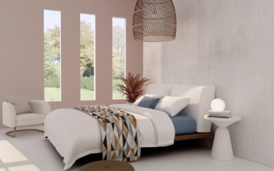
Bedrooms get the most universal benefit — the color promotes calm without going to sleepy beige. North-facing rooms with cool natural light keep the green crisp; south-facing rooms warm it slightly toward yellow-green. Bathrooms with white or marble surfaces let the muted hue soften an otherwise sterile palette.
Kitchen cabinets in this tone with white or cream walls create a fresh, slightly vintage look that holds up better than white-on-white over time. Lower cabinets in sage with white uppers and natural wood open shelving is a particularly forgiving combination.
Colors That Pair Beautifully
Warm whites — Benjamin Moore White Dove, Sherwin-Williams Alabaster, Farrow & Ball Wimborne White — keep the room feeling fresh without competing. Natural oak, walnut, and rattan pull out the warm undertones in sage and ground the look. For accent colors:
- Terracotta and rust: classic green-orange complementary pairing, warm and grounded
- Soft pinks and blush: unexpected, romantic, perfect for bedrooms
- Black and dark charcoal: modern contrast in hardware, frames, and lighting
- Cream and bone: serene monochromatic schemes
- Brushed brass: the metal that makes sage feel intentional and elevated
Light Sage in Tile and Backsplash
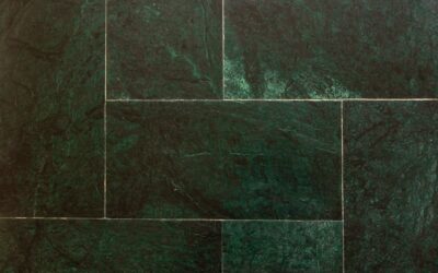
Zellige tile, hand-glazed Mexican tile, and ceramic subway tile all come in sage-family colors. The slight irregularities in zellige catch light differently across the surface and add depth that flat painted walls can’t match. Brands like Clé Tile, Riad Tile, and Bedrosians sell sage zellige between $20 and $35 per sq ft. For a kitchen backsplash or bathroom shower wall, sage tile reads as both timeless and current. Pair the tile with grout in a slightly warmer off-white to keep the install from feeling too cool, and avoid stark white grout that flattens the muted color depth. Choose grout joints between 1/16 inch and 1/8 inch — wider joints emphasize the irregular handmade edges of zellige and read more rustic.
Cabinets and Furniture in Sage
Painting kitchen cabinets in this color runs $300 to $800 in materials if you DIY, $3,000 to $7,000 for a professional cabinet refinisher. Use a cabinet-specific paint like Benjamin Moore Advance or Sherwin-Williams Emerald Urethane Trim Enamel for a hard, factory-like finish. For freestanding furniture, milk paint or chalk paint in sage gives a softer, slightly weathered look without primer. Strip and lightly sand existing finishes first; cabinet paint over slick laminate or factory poly without proper prep peels within 18 months.
For more on coordinating cabinet colors with flooring, see our kitchen flooring guide.
Avoiding Common Sage Mistakes
Don’t choose sage based on a 2×2 inch chip in a paint store — the color shifts dramatically at full scale and in your home’s specific lighting. Avoid pairing it with cool blue-grays unless you want a moody, slightly somber palette. Skip glossy finishes — sage looks best in eggshell, satin, or matte sheens that absorb rather than bounce light. Don’t combine three different sage tones in the same room; pick one and commit, with neutrals doing the supporting work.
Sage in Different Rooms
Living rooms with sage walls feel grown-up but unhurried. Pair with a cream linen sofa, a jute rug, and brass picture lights for a magazine-quality result. Home offices in sage promote focus without going to corporate gray. Nurseries in sage work for any gender and age out gracefully into a teen bedroom or guest room. Front doors painted sage offer instant curb appeal that doesn’t shout for attention.
Maintenance and Longevity
Sage hides scuffs and dust better than pure white but worse than darker colors. Plan to touch up high-traffic areas (around switches, doorways) every 18 to 24 months. Eggshell and satin finishes wipe clean with a damp microfiber; matte finishes need more careful spot cleaning to avoid burnishing. A quart of touch-up paint stored in the basement saves a $400 painter visit later. Light sage in particular benefits from this stash — color matching after the fact at a paint counter is notoriously inconsistent for muted greens.
The color earns its popularity because it’s flexible, restful, and quietly luxurious. Pick the right brand, test it in your specific light, and let warm wood and brass do the supporting work — and the result will outlast at least three trend cycles before it ever feels dated.