
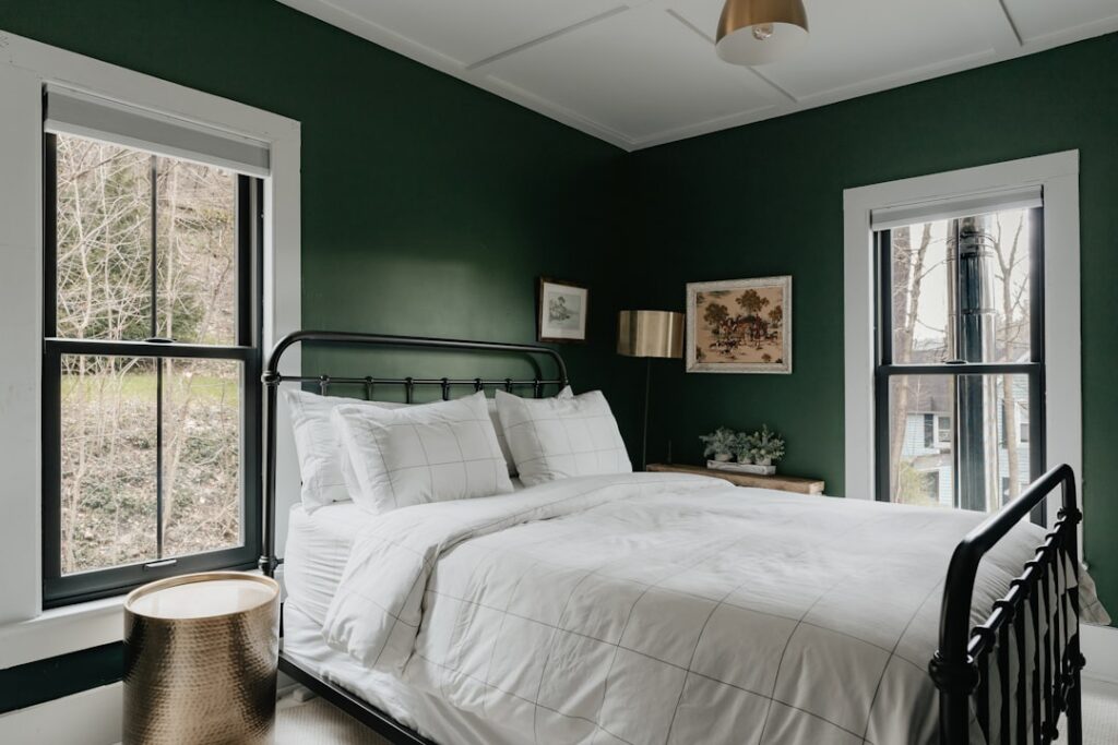
There is a reason designers keep reaching for dark, saturated green when a room feels flat and lifeless. Moody green paint colors wrap a space in instant coziness and sophistication, turning an ordinary dining room, home office, or powder bath into somewhere you actually want to linger. Unlike a trend that ages out, deep green reads as classic, drawing on the rich hunter and forest tones that have anchored libraries and studies for a century. I have painted plenty of these rooms, and the transformation from beige box to atmospheric retreat is always dramatic.
Part of our Paint & Walls guide — explore the full guide →
- What Makes a Green Feel Moody
- The Best Moody Green Paint Colors
- Where Moody Green Works Best
- How to Style It So It Feels Rich, Not Gloomy
- Sheen Matters More in Dark Colors
- Test Before You Commit
- The Bottom Line
- Undertones and How to Read Them
- Pairing Moody Green With Your Existing Palette
- Using Green on Cabinets and Built-Ins
What Makes a Green Feel Moody
A moody green is defined by two things: low light reflectance and complex, muted undertones. Where a fresh mint or sage bounces light and feels airy, a moody green absorbs light and feels enveloping. These colors carry gray, black, or blue in their base, which is what gives them depth rather than a flat, primary-green look.
The technical measure is Light Reflectance Value, or LRV. Moody greens generally fall below an LRV of 20, meaning they reflect very little light and read rich even in a bright room. That low LRV is the whole point; it is what creates the cocooning, dramatic effect.
The Best Moody Green Paint Colors
Here are the deep greens I return to again and again, each with a distinct personality.
- Sherwin-Williams Pewter Green (SW 6208): a gray-green that reads sophisticated and works in almost any room; the crowd-pleaser
- Benjamin Moore Hunter Green (2041-10): the timeless deep classic, rich and traditional
- Sherwin-Williams Rosemary (SW 6187): a slightly warmer, herbaceous deep green with gorgeous depth
- Benjamin Moore Forest Green / Essex Green (2047-10): nearly black-green, dramatic on cabinetry and libraries
- Farrow & Ball Studio Green (No. 93): an almost-black green that shifts with the light, a designer favorite
- Sherwin-Williams Jasper (SW 6216): a deep blue-green with real richness
Pewter Green is my most-recommended starting point because it flatters both warm and cool spaces and never feels overwhelming. For maximum drama, Essex Green and Studio Green go nearly black in low light.
Where Moody Green Works Best
Deep green rewards the rooms where you want atmosphere over brightness. It shines in spaces you use in the evening or want to feel intimate.
- Dining rooms: candlelight and deep green are a magical combination for entertaining
- Home offices and libraries: the classic scholarly backdrop that reads focused and rich
- Powder baths: a small windowless room is the perfect place to go bold with no risk
- Bedrooms: enveloping and restful, especially on an accent or full four walls
- Kitchen islands and cabinetry: deep green lowers on base cabinets is one of the most requested looks right now
Small, low-light rooms are actually where moody green performs best. Rather than fighting the darkness, it leans into it and turns a potential liability into a designed, intentional mood.
How to Style It So It Feels Rich, Not Gloomy
The line between cozy and cave-like comes down to what you pair with the green. Contrast and warm metals keep a dark room from feeling heavy.
Bring in warm brass or gold in lighting, hardware, and frames to make the green glow. Natural wood tones, from oak to walnut, warm the palette and add organic contrast. Crisp white or cream trim sharpens the edges and gives the eye somewhere to rest, while layered lighting, table lamps and sconces rather than one harsh overhead, is what makes a moody room feel inviting instead of dim.
Sheen Matters More in Dark Colors
Sheen choice has an outsized effect on deep colors, so choose deliberately. A matte or flat finish gives moody green a velvety, sophisticated depth and hides wall imperfections, which is why it is the designer default for these tones. An eggshell adds a touch of durability for higher-traffic walls. For real drama, a high-gloss or lacquered green on a dining room or library ceiling and walls is a showstopper, though it demands a smooth surface and skilled application because gloss reveals every flaw.
For most rooms, a quality matte or eggshell in a washable line like Sherwin-Williams Emerald or Benjamin Moore Aura gives you the velvety look with enough durability to live with.
Test Before You Commit
Dark colors shift more than any other family between daylight and lamplight, so testing is essential. Paint large samples, at least two feet square, on more than one wall, and view them in the morning, at midday, and at night under your actual lamps. A moody green can read gray-green by day and dramatically deeper by candlelight.
Peel-and-stick samples from a service like Samplize, around $6 each, let you move a true swatch around the room without priming over test patches later. Live with them for a couple of days before buying gallons.
The Bottom Line
Moody green paint colors are the fastest way to give a room soul: instant coziness, timeless sophistication, and a sense that the space was designed rather than merely painted. Start with a versatile pick like Pewter Green or go all-in with Essex Green, choose a matte finish, warm it with brass and wood, and test real samples in real light. Do that, and you will end up with a room that feels rich, intimate, and impossible to leave.
Undertones and How to Read Them
Every moody green leans in a direction, and identifying that undertone is the key to a color that works with your room. Some deep greens carry gray, which reads sophisticated and neutral. Others lean blue, giving a cooler, more dramatic feel, while warmer greens hold yellow or brown, reading earthy and organic. Pewter Green is famously gray-leaning, Jasper skews blue-green, and Rosemary carries an herbal warmth.
To read an undertone, hold the swatch next to a true neutral gray and a crisp white. The green’s bias will jump out against those references. Match the undertone to your fixed elements: a blue-leaning green pairs with cool grays and marble, while a warm green harmonizes with wood tones, brass, and terracotta. Ignore the undertone and a beautiful green can fight the flooring and finishes already in the room.
Pairing Moody Green With Your Existing Palette
Deep green is a team player, but it needs the right supporting colors to feel intentional. It pairs especially well with a handful of reliable partners that keep the room from reading heavy or one-note.
- Warm whites and creams: on trim and ceilings to sharpen the edges and lift the room
- Natural wood tones: oak, walnut, and rattan add organic warmth and contrast
- Brass and gold: in lighting and hardware to make the green glow
- Blush, rust, and terracotta: warm accents that flatter green beautifully in textiles
- Black: in small doses on window frames or a light fixture for grounding contrast
A common designer move is to carry the green onto the trim and even the ceiling for a fully enveloping, cocooning effect, then layer in wood and brass so the darkness feels rich rather than gloomy.
Using Green on Cabinets and Built-Ins
Some of the most striking applications of moody green are not on walls at all. Deep green kitchen islands and lower cabinets, paired with lighter uppers or open shelving, have become one of the most requested looks, and they wear beautifully because the darker color hides everyday scuffs near the floor.
Green built-in bookcases, a green vanity, or a green fireplace surround all bring the same enveloping richness in a smaller, lower-commitment dose. For cabinetry and built-ins, step up to a durable, scrubbable enamel like Benjamin Moore Advance or a cabinet-rated line, and choose a satin or semi-gloss so the surface cleans easily and reflects a subtle sheen. Applied to millwork, moody green paint colors deliver that same designer depth while standing up to the daily wear a busy kitchen or living room dishes out.


