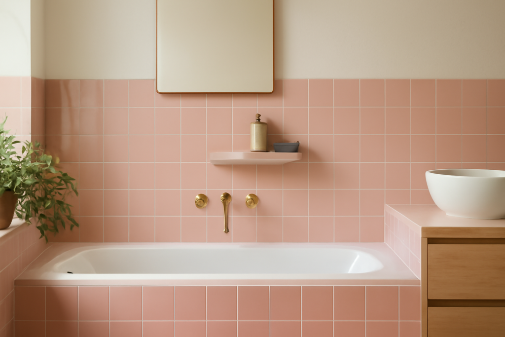
Once dismissed as a dated relic of mid-century bathrooms, pink has made a confident comeback in modern design. Pink tile now spans everything from barely-there blush to saturated rose and terracotta, working beautifully in bathrooms, kitchens, laundry rooms, and backsplashes. Used thoughtfully, it adds warmth and personality without overwhelming a space. This guide covers the range of shades, the materials available, design pairings that flatter pink, and how to use it so it feels current rather than kitschy.
Part of our Tile & Grout guide — explore the full guide →
- The Range of Pink Shades
- Materials and Formats
- Where Pink Tile Works Best
- Pairing Pink With Other Colors
- How to Use Pink Without It Feeling Dated
- Maintenance and Practical Notes
- Choosing the Right Shade for Your Space
- Layouts and Shapes That Modernize Pink
- Grout Choices That Make or Break Pink Tile
- Final Thoughts
The Range of Pink Shades
Pink is far from a single color, and the shade you choose sets the entire mood.
- Soft blush and pale pink read as neutral and sophisticated, ideal for a calm, airy space
- Dusty and muted rose bring a vintage-modern warmth that feels grounded
- Terracotta and clay pinks lean earthy and pair naturally with Mediterranean and southwestern styles
- Bold rose and coral make a confident statement for an accent wall or feature
For a look that ages well, many designers favor muted, dusty, or blush tones, which feel intentional and timeless rather than loud.
Materials and Formats
Pink tile is available across most tile types, so you can match the format to the room and your budget.
- Ceramic and porcelain are the most common and practical, durable and easy to clean
- Zellige and handmade tile offer glossy, slightly irregular pinks with artisan character
- Glass tile adds shine and works well for a luminous backsplash
- Natural stone like certain marbles carries soft pink undertones for an upscale look
Shapes range from classic subway and square tiles to trendy picket, fish-scale, and penny rounds, giving you plenty of ways to control the overall vibe. Expect roughly $5 to $25 per square foot depending on material and craftsmanship.
Where Pink Tile Works Best
Pink shines in spaces where a little warmth and character are welcome.
- Bathrooms, where a blush shower or vanity wall feels fresh and flattering
- Kitchen backsplashes, where dusty pink adds subtle personality behind neutral cabinets
- Powder rooms, the perfect low-risk spot for a bolder pink statement
- Laundry and mudrooms, where a cheerful tile lifts a utilitarian space
Because pink pairs so well with neutrals, even a small dose goes a long way in adding charm.
Pairing Pink With Other Colors
The colors you surround pink with determine whether it feels modern or dated. Some reliable combinations:
- White and cream keep blush pink feeling fresh, light, and clean
- Warm wood tones bring out the earthy warmth in terracotta and dusty pinks
- Black or charcoal accents add contrast and a contemporary edge that grounds the softness
- Brass and gold fixtures complement pink’s warmth for a refined look
- Sage or muted green creates a balanced, nature-inspired pairing
Avoiding too many competing bright colors keeps pink looking deliberate rather than chaotic.
How to Use Pink Without It Feeling Dated
The fear of a dated pink bathroom is understandable, but a few principles keep it current. Choose muted or sophisticated shades over the bubblegum tones of the past. Pair the tile with modern fixtures, clean grout, and contemporary hardware. Use pink as part of a considered palette rather than floor-to-ceiling everything. And lean on current shapes like picket, fish-scale, or large-format tile to signal that the choice is intentional. The same color reads completely differently with matte black faucets and warm wood than it did in a 1950s remodel.
Maintenance and Practical Notes
Pink tile cares like any tile of its material. Ceramic and porcelain wipe clean with mild cleaners and need only routine grout maintenance. If you choose natural stone or handmade zellige, follow the sealing and care those materials require. Lighter pinks hide water spots well, while glossy finishes show smudges more readily, so consider the finish for high-use areas. None of these are dealbreakers, just factors to weigh as you plan.
Choosing the Right Shade for Your Space
The shade of pink you pick should respond to the room’s light and size. North-facing rooms with cooler natural light benefit from warmer pinks like terracotta and dusty rose, which counteract the coolness. South-facing rooms flooded with warm light can carry cooler blush tones without feeling washed out. In small spaces like powder rooms, a deeper, saturated pink can feel cozy and intentional, since you are not committing a large area. In bigger rooms, softer blush keeps the color from overwhelming. Always test a few tiles on the wall and observe them at different times of day, since pink shifts noticeably under daylight versus artificial light.
Layouts and Shapes That Modernize Pink
The shape and layout of the tile do as much to set the tone as the color itself. Consider these approaches:
- Large-format pink tile reads sleek and contemporary with minimal grout lines
- Fish-scale and scallop shapes add a playful, current texture
- Vertical subway in a stacked layout feels modern rather than retro
- Picket and elongated hex bring geometric interest to a blush wall
- Penny round mosaics add charm to floors and shower niches
Pairing a fresh shape with a sophisticated shade is the surest way to make pink tile feel like a deliberate, on-trend choice rather than a holdover from decades past.
Grout Choices That Make or Break Pink Tile
The grout color you pair with pink tile has an outsized effect on how the finished wall reads, and it is an easy detail to overlook. A crisp white grout keeps blush and pale pink looking fresh and clean, emphasizing each tile and giving a bright, modern feel. A soft gray grout tones things down and hides everyday grime, which suits busier kitchen backsplashes and floors where stark white would show every splash.
For a more dramatic, contemporary statement, a charcoal or even black grout outlines each pink tile and leans into the bold, graphic look popular in current design. Matching the grout closely to the tile color, by contrast, makes the whole surface read as a seamless field, which flatters large-format pink tile. Whatever you choose, a quality grout sealer or a stain-resistant grout keeps light joints from yellowing over time, since discolored grout is what most often makes a pink installation look tired.
Final Thoughts
Pink tile has shed its dated reputation and earned a real place in modern interiors. With the right shade, thoughtful pairings, and contemporary fixtures, it brings warmth and personality that neutral tile cannot. Whether you want a whisper of blush behind a vanity or a bold rose powder room, pink tile offers a way to add character with confidence.
Prefer to explore on your own?
See how new flooring looks in your actual room in seconds — free, no signup.
Try the free Floor Studio →