
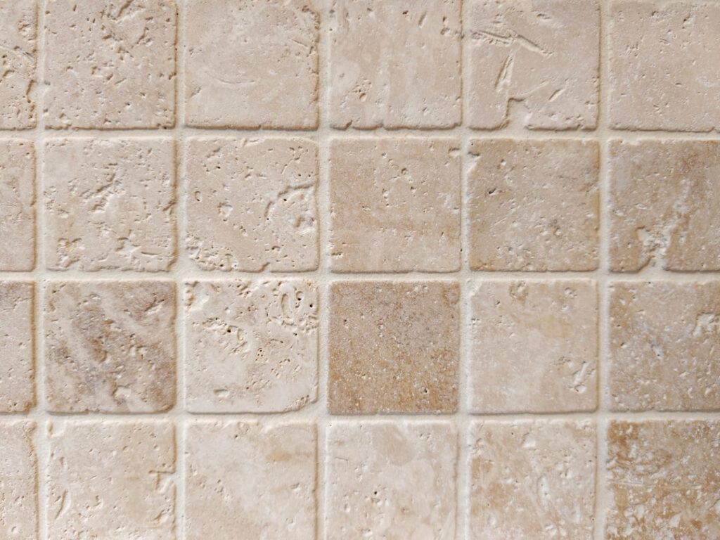
Ask any real estate agent what tile ages best and sells fastest, and the answer is almost always neutral tile. Beiges, greiges, soft grays, warm whites, and taupe never go out of style, work with any decor, and let you change a room’s whole feel just by swapping paint and accessories. But “neutral” is not the same as “boring” or “safe by default” — the wrong undertone can make a whole room feel cold, dingy, or dated. Choosing the right neutral is about matching undertone to light and adding interest through texture and format. Here is how to get it right.
Part of our Tile & Grout guide — explore the full guide →
Why Neutral Is the Smart Default
Tile is a long-term, expensive-to-change surface. Unlike paint you can redo in a weekend, a tile floor or backsplash typically stays for 15 to 30 years. That permanence is exactly why neutrals dominate: they outlast trends, adapt to changing decor, and appeal to the widest pool of buyers when it comes time to sell.
A neutral floor also acts as a calm backdrop. It lets your cabinets, furniture, rugs, and art be the stars, and it makes small rooms feel larger and more cohesive.
Warm vs Cool Neutrals
The most important decision is undertone. Every neutral leans warm or cool, and matching that to your space is what separates a great choice from a regret.
- Warm neutrals (beige, cream, taupe, warm greige): cozy, inviting, flatter warm wood and brass; best in north-facing or dim rooms
- Cool neutrals (gray, cool white, pale slate): crisp, modern, pair with chrome and cool woods; best in bright, sunny rooms
- Greige (gray-beige blend): the most versatile, bridges warm and cool decor
A cool gray in an already-cold north-facing room can feel clinical, while a warm beige in a bright southern room stays inviting. When unsure, greige is the safest middle ground and has been the dominant neutral of the past decade for exactly that reason.
Best Materials for Neutral Tile
Porcelain is the top pick for neutral floors — dense, durable, low-maintenance, and available in endless neutral tones including realistic wood-look and stone-look planks. It runs roughly $3 to $12 per square foot. Ceramic is cheaper for walls and backsplashes. Natural stone like travertine, limestone, and honed marble delivers gorgeous organic neutrals but needs sealing and more care.
Porcelain that mimics the look of natural stone or wood gives you the warm, textured neutral aesthetic with far less maintenance, which is why it is my most-recommended material for busy households.
Adding Interest Without Adding Color
The knock on neutrals is that they can read flat. The fix is texture, format, and pattern rather than bold color.
- Format: large-format tile feels modern; small hex or penny mosaics add detail
- Pattern: herringbone, chevron, and running bond create movement in a single color
- Texture: matte, honed, textured stone-look, or a subtle relief surface catches light
- Grout contrast: a slightly darker grout defines the pattern; matching grout keeps it seamless
A field of plain beige tile in a herringbone layout with a soft greige grout is far more compelling than the same tile stacked in a boring grid — same color, completely different energy.
Where Neutral Tile Works Best
Everywhere, honestly, which is the point. Neutral porcelain floors flow beautifully through open-concept kitchens, living areas, and hallways, making a home feel larger and more connected. In bathrooms, warm neutral tile creates a calm, spa-like feel. As a kitchen backsplash, a neutral subway or stone-look tile is the timeless choice that never fights your countertops or cabinets.
Because neutrals are so adaptable, they are the obvious pick for open floor plans where one flooring runs through many rooms and must coordinate with everything.
Cost and Value
Neutral tile does not cost more than colored tile — you pay for material grade, not the color. Budget-friendly ceramic starts around $1 to $3 per square foot, mid-range porcelain runs $3 to $8, and premium large-format or stone-look porcelain and natural stone climb to $10 to $20-plus. Installed, most neutral tile floors land between $7 and $20 per square foot including labor.
The real value is at resale. Neutral, current tile reads as move-in ready to buyers, while a bold or dated colored tile is often a renovation they mentally deduct from their offer.
Avoiding a Dated or Flat Look
A few pitfalls to sidestep. Very shiny, small, plain beige tiles in a stacked grid can read distinctly early-2000s. Overly cool gray, the defining look of the 2010s, is beginning to feel dated as warmer tones return. And a single flat neutral with no texture or pattern anywhere can feel lifeless.
Keep your neutral tile feeling current by leaning slightly warm, choosing matte or textured finishes over high gloss, using a modern format or pattern, and layering in warmth through wood, plants, and textiles. Neutral should be the calm foundation, not the entire story.
Pairing and Styling
The joy of neutral tile is how it plays with everything. Warm neutrals sing with wood tones, brass, and earthy textiles. Cool neutrals pair with white, black, and chrome for a crisp modern look. Because the tile stays put, you can completely restyle a room over the years — new paint, new rugs, new hardware — without ever touching the floor. That flexibility is the entire argument for going neutral.
Testing Undertones Before You Commit
The most expensive neutral tile mistake is discovering the undertone is wrong after it is installed. A beige that looked warm and creamy in the showroom can turn pink or yellow under your home’s lighting, and a gray that seemed neutral can go distinctly blue or purple. Because tile is permanent, testing beforehand is worth the small effort.
Bring home large samples — at least a few full tiles, not tiny chips — and set them on the actual floor or against the wall where they will live. Look at them at three times of day: morning, midday, and under your evening artificial lights, which are usually warm LED bulbs around 2700K to 3000K. Set the tile next to your cabinets, countertop, and paint so you can see how the undertones interact. A greige that reads perfectly against white cabinets might clash with a warm oak vanity.
Pay attention to what the tile does next to true white. If a “white” or “cream” tile suddenly looks dingy or yellow beside a bright white towel or trim, that tells you its undertone. This ten-minute test in your own light prevents the single most common regret with neutral tile.
Final Recommendation
If you want tile that looks good today, still looks good in fifteen years, and appeals to buyers whenever you sell, neutral is the reliable answer. Lean warm or choose greige for maximum versatility, pick porcelain for durability, and add interest through format, texture, and pattern rather than bold color. Done thoughtfully, a neutral tile installation is not the safe, boring choice — it is the smart, timeless foundation that everything else in the room gets to build on.
Prefer to explore on your own?
See how new flooring looks in your actual room in seconds — free, no signup.
Try the free Floor Studio →

