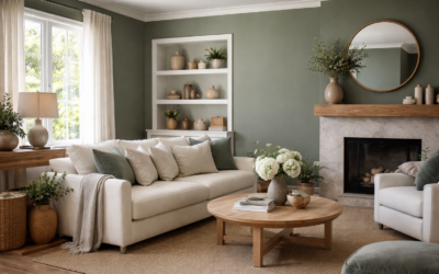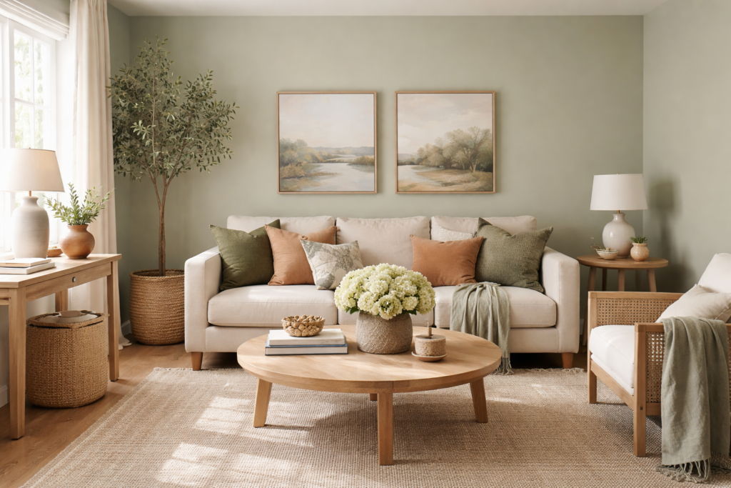
Some greens look like a statement the minute they hit the wall. Illusive Green from Sherwin-Williams (SW 9164) does the opposite: it is a muted, grayed green so restrained that the brand files it in its neutral family rather than with the greens. It carries a light reflectance value (LRV) of 29.272, which makes it a medium-depth color, dark enough to give walls weight and cozy enclosure, but nowhere near the drama of a deep forest or hunter green.
The quick answer for most rooms: Illusive Green reads as a soft, earthy sage-gray in good daylight and as a deeper gray-green with a faint olive cast in low light. It pairs naturally with warm whites, creamy beiges, wood, brass and natural textures. Because it sits at a medium LRV, plan for more light, or embrace a moody look, in rooms with small windows.
- Illusive Green Sherwin Williams at a Glance
- Understanding the Undertones
- Best Rooms and Sheen Choices
- Coordinating Colors
- Illusive Green vs Evergreen Fog, Retreat and Pewter Green
- Using It on Cabinets and Exteriors
- How to Test It Properly
- Troubleshooting Common Complaints
- When to Call a Pro
- Frequently Asked Questions
Searches for illusive green sherwin williams usually come from people torn between it and a handful of similar sage and gray-green shades. Those comparisons get their own section, along with the coordinating colors the maker suggests.
Illusive Green Sherwin Williams at a Glance
The values here come from the manufacturer’s color page. Confirm them on the current official listing before ordering, as published data can change.
| Spec | Value | What it means |
|---|---|---|
| Brand and code | Sherwin-Williams SW 9164 | Order by code; similar names exist from other brands |
| LRV | 29.272 (medium) | Reflects about 29 percent of light; noticeably deeper than a light sage |
| Hex / RGB | #92948D / 146, 148, 141 | Very close to gray, with green slightly ahead and blue slightly behind |
| Color family (official) | Neutral | Classed as a neutral even though most people see green |
| Undertone | Gray-green softened by cyan and gray undertones | Earthy and muted rather than minty or bright |
| Use | Interior and exterior | Walls, cabinets, doors and siding |
| Manufacturer pairings | Reserved White (SW 7056), Navajo White (SW 6126), Blonde (SW 6128) | Bright white with a hint of green, warm creamy white and a golden beige |
Understanding the Undertones
Look at the RGB numbers and you can see why this color is so easy to live with. Red, green and blue are all within a few points of each other, which means it is basically a mid gray with a small push toward green and a slight drop in blue. Sherwin-Williams describes its undertones as cyan and gray, so it reads as a soft, muted green rather than a warm olive or a cool, steely gray.
How that shows up in your space:
- North-facing rooms: cool light pulls it toward gray. It may look more like a greenish charcoal-gray than a sage.
- South- and west-facing rooms: warm light brings out the green and a slight olive hint.
- Next to crisp, cool whites: it looks greener and a bit warmer by contrast.
- Next to creamy whites and wood: it settles into a calm, organic gray-green.
- Under warm 2700K bulbs: it reads cozy and olive-leaning; under cooler bulbs it reads grayer.
Best Rooms and Sheen Choices
At a medium LRV, Illusive Green suits rooms where you want a grounded, enveloping feel. It also works in bright rooms that can absorb some depth without feeling dark.
| Room or surface | How it reads | Suggested sheen |
|---|---|---|
| Living room or den | Warm, earthy, relaxed | Matte or eggshell |
| Bedroom | Calm and cocooning | Matte or eggshell |
| Home office or library | Focused, a little moody | Matte or eggshell |
| Kitchen cabinets or island | Soft green-gray against white or wood counters | Satin or semi-gloss enamel |
| Bathroom vanity or walls | Spa-like with white tile and brass | Satin or bathroom-rated finish |
| Front door or exterior | Muted, natural, blends with landscape | Satin or semi-gloss exterior |
Flat and matte finishes show the color at its most velvety and true. Satin and semi-gloss reflect more light, which can make the green look a touch lighter and more saturated on cabinets and doors.
Coordinating Colors
Sherwin-Williams pairs Illusive Green with three lighter neutrals, and the trio tells you how the color wants to be used: with soft contrast rather than stark contrast.
- Reserved White (SW 7056): a bright white (LRV 74.1) with a hint of green, for trim and ceilings that will not look harsh next to the green.
- Navajo White (SW 6126): a creamy off-white for adjoining rooms or a gentle trim contrast.
- Blonde (SW 6128): a warm, light beige that adds a sunny, earthy accent.
Beyond those, Illusive Green looks at home with white oak and walnut floors, terracotta and zellige-style tile, linen and wool textiles, leather, aged brass and matte black. Deep accents such as charcoal or a darker forest green work for doors or lower cabinets if you want a layered tonal look.
Illusive Green vs Evergreen Fog, Retreat and Pewter Green
These Sherwin-Williams shades come up whenever people sample Illusive Green. LRVs are from each color’s official listing.
| Color | LRV | How it compares with Illusive Green |
|---|---|---|
| Illusive Green (SW 9164) | 29.272 | Baseline: muted gray-green, officially a neutral |
| Evergreen Fog (SW 9130) | 30.402 | Nearly the same depth; a bit greener and slightly warmer |
| Retreat (SW 6207) | 20.869 | Noticeably darker, with a deeper green-gray character |
| Pewter Green (SW 6208) | 11.826 | Much darker; a moody, deep gray-green for accents and cabinets |
Illusive Green vs Evergreen Fog
This is the closest comparison. The LRVs are only about one point apart, so depth is nearly identical. Evergreen Fog has a bit more green and yellow in it, giving it a more obvious sage look, while Illusive Green leans grayer and more neutral. If Evergreen Fog feels too green on your wall, Illusive Green is the natural step toward gray.
Illusive Green vs Retreat
Retreat is about eight LRV points darker. It feels more enveloping and suits rooms with good light or spaces where you want a cozy, darker envelope. Illusive Green is the more forgiving choice for whole-house use.
Illusive Green vs Pewter Green
Pewter Green is a deep, cool gray-green, best used on cabinets, doors, accent walls or exteriors. Many homeowners pair the two: Illusive Green on walls and Pewter Green on an island or built-ins.
Using It on Cabinets and Exteriors
Muted gray-greens became a favorite for kitchen cabinets because they add color without dating quickly. On cabinets, Illusive Green looks best with warm white or creamy counters, butcher block, or a warm-veined stone. Brass, bronze and matte black hardware all suit it. Keep the walls light, such as a warm white, so the cabinets anchor the room without darkening it.
Outside, the color reads lighter in full sun than on an indoor sample, which usually works in its favor. It suits cottages, bungalows and homes surrounded by trees and planting, where a muted green blends with the landscape. Pair it with warm white trim and a natural wood or deep-toned front door. Always test a large sample on the north and south sides of the house, since exterior light varies even more than interior light.
How to Test It Properly
- Roll out a large sample. A small paint roller kit and a sample pot let you paint a 2 x 2 foot board you can move around.
- Test on several walls. Medium-depth colors change a lot between window walls and shaded corners.
- Compare side by side. Put Illusive Green next to Evergreen Fog or Retreat so the differences are obvious.
- Check with your floors and counters. Wood tones and stone pull the green in different directions.
- Look at night. Turn on your actual bulbs; warm lighting shifts it toward olive.
- Judge after drying. Wait at least a day before deciding.
Troubleshooting Common Complaints
“It looks gray, not green.” Expected in north light or next to warm whites. If you want more green, try Evergreen Fog, or add warmer bulbs and wood accents.
“It looks too dark.” With an LRV near 29, small or shaded rooms will feel deep. Use it on lower cabinets, an accent wall or under a chair rail instead, or choose a lighter sage for the full room.
“Coverage is patchy.” Medium and deep colors can need a tinted primer and two full coats. Keep a wet edge and roll walls in one session.
“My trim looks dingy beside it.” Very cool, blue-white trim can clash with the earthy warmth. A warm white such as Reserved White usually fixes it.
When to Call a Pro
Painting walls in illusive green sherwin williams is a straightforward weekend job for most homeowners. A professional is worth it for cabinet refinishing, where degreasing, sanding, priming and a smooth enamel finish make or break the result, and for exterior siding, tall stairwells or whole-house repaints. Ask the painter to buy the color by its SW 9164 code so every gallon matches.
Frequently Asked Questions
What is the LRV of Sherwin-Williams Illusive Green?
Sherwin-Williams lists Illusive Green (SW 9164) with an LRV of 29.272, rated medium. It is deeper than a light sage but far from a dark green.
Is Illusive Green a green or a gray?
It sits between the two. Sherwin-Williams classes it in its neutral family, and its color values are close to a mid gray with a slight green push, so most people see a muted gray-green.
What colors go with Illusive Green?
The maker pairs it with Reserved White, Navajo White and Blonde. Warm whites, creamy beiges, natural wood and brass all suit it well.
Is Illusive Green darker than Evergreen Fog?
Very slightly. Illusive Green has an LRV of about 29.3 and Evergreen Fog about 30.4. The bigger difference is tone: Evergreen Fog looks greener, while Illusive Green looks grayer.
Can I use Illusive Green on kitchen cabinets?
Yes. It works well on cabinets and islands, especially with white or wood counters and brass hardware. Use a cabinet-grade enamel in satin or semi-gloss.