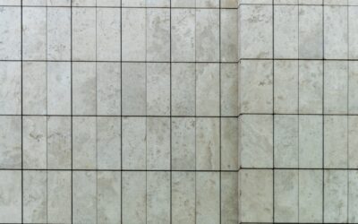
Same tile, same kitchen, wildly different rooms — that’s the magic of layout. I’ve installed the identical $3-per-square-foot white 3×6 in kitchens that read classic, modern, French bistro, and art deco, purely by changing the pattern. If you’re choosing between subway tile backsplash patterns, this is the comparison I sketch for clients on graph paper, with the honest notes on cost, cutting waste, and which layouts punish an amateur installer. All nine work with a standard rectangular tile; a few get better with specific proportions, which I’ll flag.
Part of our Kitchen Remodeling guide — explore the full guide →
- The Quick-Reference Table
- 1. Running Bond — The 130-Year Default
- 2. One-Third (33%) Offset
- 3. Horizontal Stacked
- 4. Vertical Stacked
- 5. Vertical Running Bond
- 6. Herringbone (45-Degree)
- 7. Straight (90-Degree) Herringbone
- 8. Crosshatch / Basketweave
- 9. Chevron
- How to Actually Choose
- Mixing Patterns in One Kitchen: The Rules
The Quick-Reference Table
| Pattern | Style Read | Waste | Difficulty | Labor Premium |
|---|---|---|---|---|
| 1. Running bond (50% offset) | Classic, traditional | ~10% | Easy | Baseline |
| 2. One-third offset | Softened classic, subtle stair-step | ~10% | Easy | None |
| 3. Horizontal stacked | Clean, modern, calm | ~10% | Easy but unforgiving | 0–10% |
| 4. Vertical stacked | Contemporary, adds height | ~10% | Easy but unforgiving | 0–10% |
| 5. Vertical running bond | Unexpected, elongating | ~10% | Moderate | 10% |
| 6. Herringbone (45°) | Dynamic, upscale | 15–20% | Hard | 25–50% |
| 7. Straight herringbone (90°) | Tailored, menswear-tweed | ~12–15% | Moderate-hard | 20–35% |
| 8. Crosshatch (basketweave) | Woven, detailed, artisanal | ~12% | Moderate-hard | 20–35% |
| 9. Chevron | Sharp, continuous zigzag | 15–20% | Hard (needs angled tile) | 25–50% |
Now the detail on each of these subway tile backsplash patterns — what each looks like from across the kitchen, and what it demands of your installer.
1. Running Bond — The 130-Year Default
Each row shifts half a tile over the row below, like brickwork. Horizontal joints line through; vertical joints alternate. This is what “subway tile” means to most eyes, and it’s the most forgiving layout in existence: the staggered joints camouflage small size variations and slightly wavy walls. If your kitchen leans traditional, transitional, or farmhouse — or if your installer is you — this is the answer. Zero design risk, zero labor premium.
2. One-Third (33%) Offset
Rows shift by a third of a tile instead of half, creating a subtle diagonal stair-step drift across the wall. It reads traditional-but-considered, and with longer tiles (3×12, 4×16) it’s actually the technically correct choice — long tiles bow slightly at their centers, and a 50 percent offset stacks each tile’s crown against its neighbor’s edge, telegraphing lippage. At backsplash scale with 3×6 this is aesthetic preference; with plank-proportion subway it’s my required spec.
3. Horizontal Stacked
Tiles align in a perfect grid, joints lining through vertically and horizontally. Minimalist, architectural, calm — the pattern of choice for modern and Scandinavian kitchens, especially with tight 1/16-inch matched-grout joints. The trap: a grid has no camouflage. Every wonky joint, every tile a millimeter off, every out-of-level counter is exposed on ruled lines. Demand rectified or well-calibrated tile and a patient setter with a laser. Cheap wavy-edged tile in a stack looks drunk.
4. Vertical Stacked
The same grid rotated: tiles standing on end, columns ruling upward. This one earns its popularity in kitchens with low upper cabinets or where you’re running tile to the ceiling behind a hood — the vertical lines add real perceived height. Same unforgiving-grid warning as horizontal stack. Looks strongest with slightly elongated tile (2×8, 3×12) and matched grout.
5. Vertical Running Bond
Brick offset turned 90 degrees — vertical tiles, each column shifted half a tile. Rarer than the stacked version, which is exactly its appeal: it reads custom without being busy, and it flatters awkward tall-narrow wall sections beside windows and hoods. Slightly fussier layout math at counters and cabinet lines than its horizontal cousin, since the “rows” are now columns and your level reference multiplies.
6. Herringbone (45-Degree)
Tiles set diagonally in interlocking L-pairs, the classic parquet-floor geometry climbing your wall. This is the pattern clients point at when they want the backsplash to be the feature, and it delivers — light hits the two tile directions differently, giving the wall texture even in one flat color. Costs: every wall edge, counter line, and cabinet line gets a 45-degree cut, so waste jumps to 15 to 20 percent and labor runs 25 to 50 percent over running bond ($200 to $500 more on a typical 30 to 40 square foot backsplash). Behind a range under a hood, a herringbone panel framed by pencil trim inside a running-bond field is the best-value version — all the drama, a quarter of the angled cuts.
7. Straight (90-Degree) Herringbone
The same L-interlock set square to the counter, so the zigzag runs in clean horizontal-vertical steps rather than diagonals. Reads tailored and slightly retro — tweed jacket rather than dance floor. Big practical advantage: perimeter cuts are square, not angled, so waste and labor land closer to 12 to 15 percent and 20 to 35 percent respectively. Works best with 1:3 proportion tiles (2×6, 3×9, 4×12); a true 1:2 tile makes the units read blocky.
8. Crosshatch / Basketweave
Pairs or trios of tiles alternate direction in square blocks — two horizontal, two vertical, repeating like woven fabric. With 3×6 tile, pairs form 6×6 squares; with 2×6 tile, trios form 6×6 squares. It reads artisanal and detailed up close while staying orderly at a distance, a lovely middle path between grid calm and herringbone drama. Layout requires attention (one flipped pair breaks the weave and your eye will find it from the doorway forever), but cuts stay square. A quiet favorite of mine for bistro-style kitchens with a pencil-trim frame.
9. Chevron
Often confused with herringbone, but different: chevron tiles are cut with angled ends (usually parallelograms) so each zigzag row meets in a continuous point, forming unbroken arrows across the wall. You generally must buy purpose-made chevron tile — standard rectangles can’t make true points. It’s the sharpest, most fashion-forward of the nine, popular in glossy elongated formats. Costs run highest of all: specialty tile ($8 to $20 per square foot), high waste, and precision demands at every course. Gorgeous as a hood-wall feature; ambitious as a full-perimeter backsplash.
How to Actually Choose
- Match energy to the kitchen. Busy counters (heavy-veined quartz, granite) want calm patterns — running bond, stacked. Quiet counters can host herringbone, crosshatch, or chevron without the room fighting itself.
- Respect your installer’s (or your own) skill ceiling. Patterns 1, 2, and 5 forgive; 3 and 4 expose; 6 through 9 require genuine chops. A wobbly herringbone is worse than a crisp running bond every single time.
- Grout decides the volume. Any of these patterns whispers with matched grout and shouts with contrast. High-contrast grout plus a complex pattern is usually one statement too many — pick which layer talks.
- Sample-board it. I lay out two square feet of the candidate pattern on plywood and stand it on the counter. Ten minutes and about $30 of tile has reversed more decisions than any photo ever has.
- Budget the delta honestly. On a typical 35-square-foot backsplash: patterns 1–5 install for $700–$1,400 labor; 6–9 run $900–$2,000, plus the extra box of tile for waste.
Mixing Patterns in One Kitchen: The Rules
Clients frequently ask whether they can combine two subway tile backsplash patterns — herringbone behind the range, running bond everywhere else, say. Yes, and it’s often the best-value design in this whole article, but three rules keep it composed. First, use the same tile throughout; the pattern change is the event, and changing tile and pattern simultaneously reads as two leftover jobs stitched together. Second, give the featured pattern a boundary — the natural bay between cabinets flanking the range, or a pencil-liner frame — so the transition looks architectural rather than accidental. Third, limit yourself to two patterns total: one field, one feature. I’ve also had good results rotating the same pattern rather than changing it — a running-bond field with the bond turned vertical inside the range bay is subtle, cheap, and sophisticated. Cost-wise, a framed herringbone panel of roughly 10 square feet adds only $150 to $350 to a standard running-bond backsplash job, which buys you the room’s focal point for the price of a faucet. That trade is the single most recommendable upgrade I offer at the estimate table.
My parting take after cutting several miles of these joints: the pattern is free character — same tile, same square footage, radically different kitchen — but character compounds with restraint. The kitchens that still look right in fifteen years pair one interesting choice with disciplined neighbors: herringbone with matched grout, or plain running bond with a confident contrast joint, never everything at once. Pick the pattern that fits your kitchen’s energy and your installer’s honest skill level, mock it up before you commit, and let the layout — not a busier tile — do the talking.
Prefer to explore on your own?
See how new flooring looks in your actual room in seconds — free, no signup.
Try the free Floor Studio →