Subway tile earned its name from the glossy 3-by-6-inch rectangles that lined New York’s early subway stations, and more than a century later it remains the most versatile tile in home design. What many homeowners don’t realize is that the same simple tile can look completely different depending on how it’s arranged. The subway tile layout patterns you choose determine whether a backsplash reads as traditional, modern, or boldly custom, all from the identical box of tile. This guide walks through eight popular layouts, where each works best, and how to pick the right one for your space.
Part of our Tile & Grout guide — explore the full guide →
- Why Layout Matters More Than the Tile
- 1. Running Bond (Classic Offset)
- 2. One-Third Offset
- 3. Stacked (Straight Set)
- 4. Vertical Stack
- 5. Vertical Offset (Vertical Brick)
- 6. Herringbone
- 7. Diagonal (Diagonal Offset)
- 8. Basketweave and Crosshatch
- How to Choose the Right Pattern
- Grout Choices Change Everything
- Common Mistakes to Avoid
- Planning Your Focal Point and Layout Lines
- Estimating Tile and Waste by Pattern
- Trim Pieces and Finishing Edges
Why Layout Matters More Than the Tile
Because subway tile itself is so plain, the arrangement does the design work. The same white gloss rectangle set in a classic offset feels timeless and understated, while set in a herringbone it becomes a striking focal point. Layout also affects the perceived size of a room: vertical arrangements draw the eye up and make ceilings feel taller, while horizontal ones widen a space. Before ordering tile, decide on the pattern, because some layouts use more tile and require more cuts, which changes how much you buy.
1. Running Bond (Classic Offset)
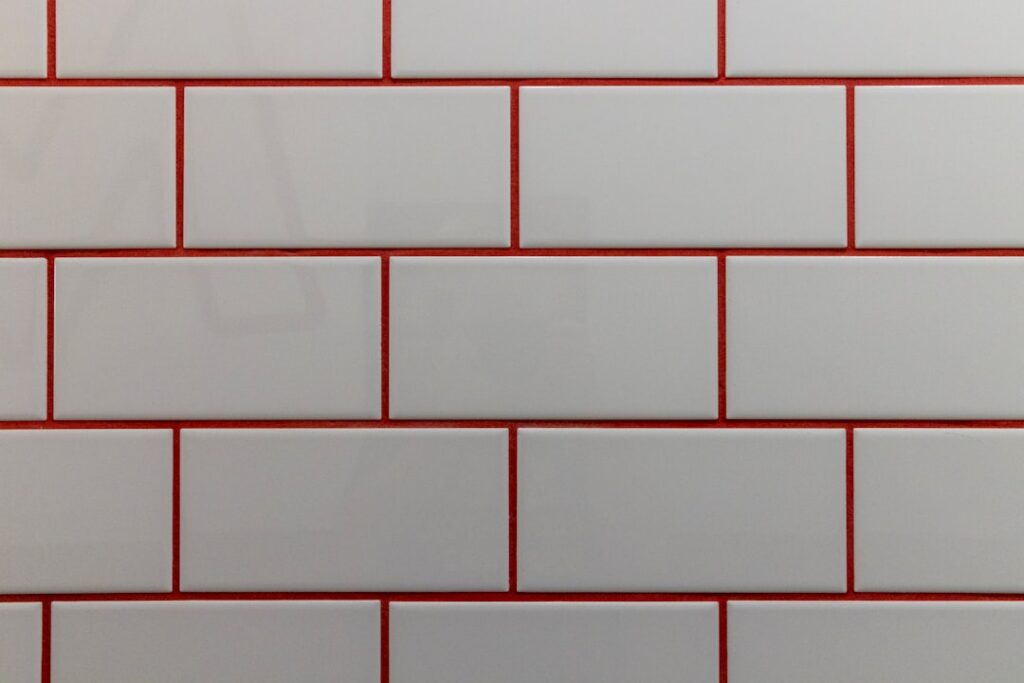
The default and most recognizable layout, running bond offsets each row by half a tile so the vertical grout lines land at the center of the tiles above and below. This 50 percent offset is the traditional subway look: clean, familiar, and forgiving of slightly imperfect walls because the staggered joints hide minor variation. It suits nearly any kitchen or bath and is the safest choice if you want enduring appeal. It also produces very little waste since the half-tile offset uses the cut pieces from one row to start the next.
2. One-Third Offset
A subtle modern update to running bond, the one-third offset staggers each row by a third of a tile rather than half. This creates a stair-stepping diagonal rhythm across the wall that feels a bit more contemporary and dynamic while keeping the relaxed look of an offset. It’s a great choice when you want something slightly different from the ubiquitous half-offset without going bold.
3. Stacked (Straight Set)
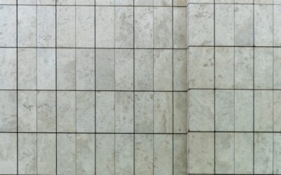
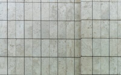
In a stacked layout, tiles align in perfect grids with grout lines running straight both horizontally and vertically. This crisp, geometric look reads distinctly modern and minimalist. It emphasizes clean lines and works beautifully in contemporary kitchens and baths, but it is unforgiving: any wall that is out of square or tile that varies in size will show immediately in the continuous grout lines. Precision installation is essential.
4. Vertical Stack
Turn the stacked layout 90 degrees so tiles stand on end in straight vertical columns. This draws the eye upward, making low ceilings feel taller and adding a fresh, current twist to a familiar tile. Vertical stack is popular in small bathrooms and behind ranges where you want to emphasize height. Like horizontal stacking, it demands square walls and consistent tile.
5. Vertical Offset (Vertical Brick)
Combine the height-enhancing vertical orientation with the forgiving offset of running bond. Tiles stand vertically but each column is staggered, giving you the taller feel of vertical stack with the imperfection-hiding staggered joints of a brick pattern. It’s a comfortable middle ground that feels updated without being stark.
6. Herringbone
Herringbone sets tiles at a 45-degree zigzag, each rectangle perpendicular to its neighbor, creating a rich, woven texture. It turns plain subway tile into a statement and adds a sense of movement and craftsmanship. Herringbone is spectacular on a backsplash or shower accent wall, but it is the most labor-intensive layout, requiring many angled cuts at edges and generating more waste, so buy extra tile, often 15 to 20 percent overage. The payoff is a high-end, custom look.
7. Diagonal (Diagonal Offset)
Running the offset pattern on a 45-degree diagonal creates energy and can make a small space feel larger by leading the eye along the angles. It’s less common and more of a design statement, and like herringbone it increases cutting and waste at the borders. Use it when you want something distinctive and are comfortable with a more involved install.
8. Basketweave and Crosshatch
Grouping tiles in pairs and alternating their orientation, or pairing them with small square accents, creates basketweave and crosshatch effects reminiscent of vintage tilework. These layouts add old-world character and are wonderful in period-style baths and mudrooms. They take planning and precise spacing but reward the effort with a genuinely custom appearance.
How to Choose the Right Pattern
Consider three things. First, style: offsets read traditional to transitional, stacks read modern, and herringbone or basketweave read custom and detailed. Second, the wall itself: if your walls are out of square or your tile has size variation, forgiving offset patterns hide it while straight stacks expose it. Third, budget and skill: running bond is easy and low-waste, while herringbone and diagonal demand more tile, more cuts, and more experience. Match the ambition of the pattern to your installation skill or your installer’s rate.
Grout Choices Change Everything
Whatever pattern you pick, grout color dramatically shifts the result. Matching white grout with white tile makes any layout soft and seamless, letting the pattern whisper. Contrasting dark grout outlines every tile and shouts the geometry, which flatters stacked and herringbone layouts especially. A mid-gray grout splits the difference and hides dirt better than bright white. Always view a sample board of your chosen tile, layout, and grout together before committing.
Common Mistakes to Avoid
- Ignoring wall squareness: Choosing a stacked layout on out-of-square walls guarantees visibly tapering grout lines.
- Underordering for complex patterns: Herringbone and diagonal waste more tile at edges; buy 15 to 20 percent extra.
- Skipping the dry layout: Lay out a section on the floor or dry-fit on the wall to check spacing and the focal point before spreading mortar.
- Mismatched grout expectations: Judge grout on a full sample, not a chip; it changes the whole look.
Planning Your Focal Point and Layout Lines
Before spreading any mortar, plan where the pattern centers and how it meets edges, because a thoughtless start leaves sliver cuts in the most visible spots. On a kitchen backsplash, many installers center the pattern on the range or the main window so the layout looks balanced around the room’s focal point. Snap level layout lines and check them, since starting off a crooked countertop or uneven cabinet throws the whole wall out. Dry-lay a row to see where cuts fall at the ends and at outlets, and shift the starting point so you avoid tiny, hard-to-cut slivers at corners. A little planning here separates a professional-looking installation from one that betrays its amateur origins with awkward cuts and drifting grout lines.
Estimating Tile and Waste by Pattern
How much tile to buy depends heavily on the layout. Simple running bond and stacked patterns generate little waste, so a standard 10 percent overage covers cuts and breakage. Herringbone and diagonal layouts, with their many angled edge cuts, waste far more, so order 15 to 20 percent extra. Always buy all your tile from the same production lot to avoid subtle shade differences between boxes, and keep a few spare tiles after the job for future repairs. Measure your area carefully, subtract large openings, and add the pattern-appropriate waste factor. Running short mid-project and having to reorder risks a lot mismatch, so it is always better to have a box left over than to come up short.
Trim Pieces and Finishing Edges
How you finish the exposed edges of a subway tile installation matters as much as the field pattern. Options include bullnose tile with a rounded finished edge, a metal or PVC edge trim profile such as Schluter, or a mitered tile edge for a seamless modern look. Bullnose is the traditional, forgiving choice and reads classic, while metal trim gives a crisp contemporary line and comes in finishes to match fixtures. Plan your edge treatment before ordering, since bullnose must be bought alongside the field tile in a matching color, and trim profiles must be sized to your tile thickness. A clean, deliberate edge finish is often what makes a backsplash look truly custom rather than simply tiled.
The beauty of subway tile is that a single affordable tile offers a whole vocabulary of looks depending on the layout. Whether you want the timeless calm of a classic offset, the modern crispness of a vertical stack, or the custom drama of herringbone, the right subway tile layout patterns let you tailor the same humble rectangle to your exact style. Decide the pattern first, buy the right quantity, and match your grout, and you’ll get a backsplash or shower that looks intentional and holds its appeal for years.
Prefer to explore on your own?
See how new flooring looks in your actual room in seconds — free, no signup.
Try the free Floor Studio →