The humble 3-by-6-inch white rectangle has anchored American kitchens and baths for over a century, but the tile itself is only half the story. The subway tile layout you choose determines whether your backsplash reads as timeless, modern, or utterly custom, all from the same box of tile. From the familiar half-offset brick pattern to bold herringbone and vertical stacks, the arrangement changes everything. This guide walks through the most popular layouts, how to plan them, and the details that separate a professional result from a DIY misfire.
Part of our Tile & Grout guide — explore the full guide →
- Why Layout Matters More Than the Tile
- The Classic Offset (Running Bond)
- The Third Offset (One-Third Brick)
- Vertical Stack and Vertical Offset
- Horizontal Stacked Bond
- Herringbone
- Other Layouts Worth Considering
- Planning Your Layout Before You Set a Single Tile
- Grout: The Detail That Defines the Look
- Matching the Layout to the Room
- Common Mistakes to Avoid
Why Layout Matters More Than the Tile
Subway tile is inexpensive and endlessly available, which is precisely why the layout carries the design weight. A classic 50 percent offset feels traditional and safe. Rotate those same tiles vertically and you draw the eye upward, making a low backsplash feel taller. Set them in herringbone and suddenly the wall has movement and craftsmanship. Because the tile is a blank slate, your pattern, grout color, and orientation do the talking. Deciding on the layout first also affects how much tile to buy, since angled patterns like herringbone generate more cut waste.
The Classic Offset (Running Bond)
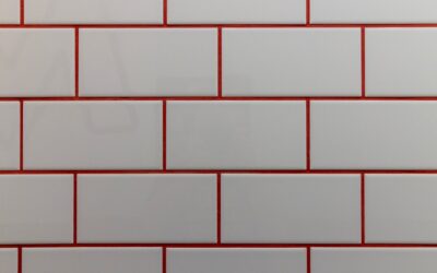
This is the layout most people picture: each row shifted so its joints land at the center of the tiles above and below, exactly like a brick wall. The traditional version uses a 50 percent offset, and it remains the most forgiving pattern for beginners because the staggered joints hide minor imperfections and slightly out-of-square walls. It suits nearly any style, from farmhouse to transitional, and reads as effortlessly classic. If you want a foolproof first tile project, start here.
The Third Offset (One-Third Brick)
A subtle but sophisticated variation shifts each row by only one-third rather than one-half. This staggered rhythm is especially recommended for longer tiles, such as 4-by-12 or 4-by-16 planks, where a 50 percent offset can create an unpleasant sagging illusion and lippage at the center of each tile. The one-third offset keeps the pattern feeling dynamic while minimizing that lippage problem. Designers increasingly favor this look for its slightly less predictable, more refined cadence.
Vertical Stack and Vertical Offset
Turning subway tiles on end changes the entire mood of a space. A vertical stacked bond, where tiles line up in clean columns with aligned grid joints, feels crisp, modern, and architectural. It draws the eye upward and can make a short backsplash or a small bathroom feel taller. Be warned: stacked layouts are unforgiving. Every joint lines up, so any variation in tile size or a wall that is out of plumb becomes glaringly obvious. Precision spacers and a laser level are essential. A vertical offset softens this by staggering the columns while keeping the upward orientation.
Horizontal Stacked Bond
The stacked bond laid horizontally arranges tiles in a perfect grid, joints aligned both vertically and horizontally. It is the most contemporary and minimalist of the common layouts, favored in modern kitchens and commercial-inspired spaces. Like the vertical stack, it demands dead-straight lines and consistent tile dimensions because there is nowhere to hide a wandering joint. Choose rectified tiles, which are machine-cut to a precise, uniform size, to pull this off cleanly.
Herringbone
Herringbone arranges tiles in an interlocking zigzag of 45- or 90-degree angles, and it is the layout that turns subway tile into a statement. It adds instant texture, movement, and a sense of custom craftsmanship. The trade-off is difficulty and waste: herringbone requires many angled cuts along the edges, generating 10 to 15 percent more waste than a straight layout, and it takes considerably more time and patience to set. The payoff is a backsplash or shower wall that looks anything but ordinary. A 90-degree herringbone is slightly easier than the 45-degree version, which must be laid off a precise diagonal reference line.
Other Layouts Worth Considering
- Vertical herringbone stands the classic zigzag on end for a tall, dramatic effect in showers and feature walls.
- Basketweave pairs tiles in alternating horizontal and vertical groupings for a woven, vintage look.
- Crosshatch or double herringbone uses pairs of tiles per direction for a bolder, larger-scale pattern.
- Stacked with contrasting grout keeps the layout simple but uses dark grout on white tile to emphasize the grid.
Planning Your Layout Before You Set a Single Tile
Great tile work is decided before the thinset comes out. Follow these planning steps:
- Find your center. Measure the wall and mark a vertical centerline so your pattern is balanced, with equal-size cut tiles at each end rather than a full tile on one side and a sliver on the other.
- Dry-lay a section. Set out a few rows on the counter to confirm the pattern and spacing before committing.
- Snap level reference lines. Never trust your countertop or ceiling to be level. Use a laser or chalk line to establish true horizontal and vertical guides.
- Buy 10 to 15 percent extra. Angled layouts need more overage for cuts and future repairs. Order all tile from the same lot to avoid color variation.
- Choose spacer size. Standard 1/16-inch spacers give the tight modern look; 1/8-inch reads more traditional.
Grout: The Detail That Defines the Look
Grout color is as much a design decision as the layout. White or light-gray grout on white tile creates a soft, seamless, monochromatic backsplash. Dark or contrasting grout turns every joint into a graphic line, dramatically emphasizing the pattern, an effect that works beautifully with stacked and offset layouts but can overwhelm a busy herringbone. For most kitchens, a mid-gray grout is the safe, popular middle ground because it hides everyday grime better than bright white. Use a quality sanded or unsanded grout appropriate to your joint width, and seal it if it is cement-based.
Matching the Layout to the Room
The right layout depends as much on where the tile goes as on personal taste. Behind a range or as a full kitchen backsplash, a classic half-offset or one-third offset reads as timeless and pairs with nearly any cabinetry style, which is why it remains the default for resale-friendly kitchens. In a small bathroom or a shower where you want to add a sense of height, a vertical stack or vertical offset draws the eye upward and makes a cramped space feel taller. For a powder room or a feature wall where you want a wow factor, herringbone or a bold contrasting-grout stacked pattern rewards the extra effort because the small space keeps material and labor costs contained.
Scale matters too. In a large open kitchen, an intricate herringbone across a huge wall can overwhelm the room and read as busy, so many designers reserve high-energy patterns for a defined zone like the range niche and keep the surrounding field simple. Conversely, in a tiny space a plain running-bond field can look flat, and a more textured layout adds welcome interest. Also weigh maintenance: more grout lines mean more cleaning, so busy patterns with many joints in a greasy kitchen backsplash demand a bit more upkeep than a simpler layout. Think through how the tile interacts with fixed elements too, such as outlets, a window, or the range hood, and plan the pattern so cuts land gracefully around them rather than leaving awkward slivers at a focal point.
Common Mistakes to Avoid
- Starting without a centerline, which leaves you with unbalanced sliver cuts at one edge.
- Using a 50 percent offset on long plank tiles, which causes lippage; drop to a one-third offset instead.
- Choosing a stacked layout on out-of-plumb walls, which exposes every imperfection.
- Underbuying tile for herringbone, then running short mid-project with no matching lot available.
- Skipping level lines and letting the pattern drift off horizontal by the top row.
The beauty of subway tile is that a single affordable material can deliver a dozen distinct looks depending on how you arrange it. Match the layout to your skill level and the mood you want, plan from the centerline out, and choose a grout that supports rather than fights your pattern. Get those decisions right, and a box of plain white rectangles becomes a backsplash worth showing off.
Prefer to explore on your own?
See how new flooring looks in your actual room in seconds — free, no signup.
Try the free Floor Studio →