The same $4-a-square-foot subway tile can read builder-basic or custom-designed depending entirely on how it’s laid. Pattern is the highest-leverage design decision in the room — it changes the look dramatically and costs nothing in material, only in layout planning and sometimes labor. Below are the most popular shower tile patterns, which tiles suit each one, how each affects waste and labor cost, and the practical lessons that separate a crisp layout from a crooked one.
Part of our Bathroom Remodeling & Flooring guide — explore the full guide →
- Stacked (Straight Lay): The Modern Default
- Running Bond (Offset): The Classic That Has a Catch
- Vertical Layouts: The Cheap Ceiling Raise
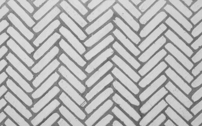
- Herringbone: The Showpiece
- Basket Weave, Windmill, and Square-Based Patterns
- Diagonal (45°) and Diamond Lay
- Pattern Comparison Table
- Matching Pattern to Your Shower’s Real Constraints
- Layout Rules That Make Any Pattern Look Professional
Stacked (Straight Lay): The Modern Default
Tiles aligned in a clean grid, joints stacked vertically and horizontally. Ten years ago this read as commercial; today, horizontal stacked subway or large-format rectangles are the signature modern look. Stacked patterns demand precision — because every joint lines up, every wobble telegraphs — and they demand flat tile, since aligned edges make warpage (lippage) obvious. Use tile with tight caliber (rectified edges are worth the upcharge here), 1/8-inch joints, and leveling clips.
- Best with: large-format rectangles (12×24, 12×36), subway, square tile.
- Waste factor: ~10%, the lowest of any pattern.
- Labor: baseline. Most setters charge their standard rate, roughly $10–$20 per square foot for shower walls.
- Effect: horizontal stacking widens a narrow shower; vertical stacking (joints running floor to ceiling) pulls the eye up and makes an 8-foot ceiling feel taller.
Running Bond (Offset): The Classic That Has a Catch
Each row offset from the last — the brick-wall look, and the pattern most people picture when they think subway tile. A 50% offset is traditional and forgiving of minor size variation, which is why it’s survived a century.
Here’s the catch nobody tells homeowners: with large-format tile (any side over 15 inches), a 50% offset puts the crown of each slightly bowed tile next to the dipped end of its neighbor, creating lippage you can feel and see in shower lighting. Industry guidance (and every manufacturer’s spec sheet) says to drop to a 33% offset — a one-third stagger — for large format. It looks nearly as classic and lays dramatically flatter. For 3×6 subway, 50% offset remains perfect.
- Waste factor: ~10%.
- Labor: baseline.
- Effect: relaxed, traditional, hides minor wall imperfections better than stacked.
Vertical Layouts: The Cheap Ceiling Raise
Take the same subway or plank tile and run it vertically — stacked or offset — and a standard 32×60 shower suddenly feels like a taller room. This option works especially well in older homes with 8-foot ceilings and in tub-to-shower conversions where the space feels boxy. Vertical herringbone (below) does the same thing with more energy. No cost penalty over the horizontal version of the same pattern; it’s purely a layout decision made before the first tile goes on the wall.
Herringbone: The Showpiece
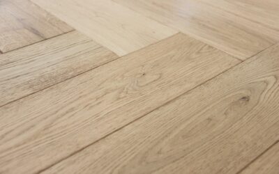
Rectangles set in a zigzag at 90° to each other (classic) or 45° to the floor (more dynamic, more cuts). Herringbone in a shower niche, on an accent wall, or across the entire enclosure is one of the most-requested upgrade patterns. It reads high-end because everyone knows it takes work — every edge tile is an angle cut.
- Best with: 3×6, 2×8, 3×12, 4×12 tile. Skip it with tile over about 6×24; the pattern gets clumsy at large scale in a small enclosure.
- Waste factor: 15–20% — order accordingly.
- Labor: expect a 25–50% premium; a wall that would cost $600 to tile in running bond might run $800–$900 in herringbone.
- Field tip: snap layout lines and dry-lay the first few courses on the floor. The pattern’s success is decided in the first two rows, and centering the “V” spine on the plumbing wall or the niche makes the whole shower look intentional.
Chevron is herringbone’s cousin — tile ends cut at an angle so the zigzag meets in a continuous point. It requires tile manufactured as chevron (or a lot of miter cuts) and photographs beautifully, but it’s the least forgiving pattern on this list.
Basket Weave, Windmill, and Square-Based Patterns
Pairs of rectangles alternating direction (basket weave), or four rectangles boxed around a small square (windmill/pinwheel), deliver vintage 1920s character — natural partners for hex floor tile and classic white-and-black schemes. Mosaic versions come mesh-mounted in 12×12 sheets ($8–$20 per square foot), which moves the complexity from the setter’s layout to the factory and keeps labor near baseline. Sheet-mounted patterns are the best way for most homeowners to get intricate looks without intricate labor bills.
Diagonal (45°) and Diamond Lay
Square tile rotated 45 degrees. It makes small showers feel bigger because the eye follows the long diagonal lines, and it hides walls that are out of square — genuinely useful in old houses where nothing is plumb. Every perimeter tile becomes a diagonal cut, so waste rises to about 15% and labor bumps 15–25%. A diagonal field with a straight border course is a classic combination that frames the shower nicely.
Pattern Comparison Table
| Pattern | Waste Factor | Labor vs. Baseline | Best Tile Sizes | Visual Effect |
|---|---|---|---|---|
| Stacked grid | 10% | Baseline | Large format, subway | Modern, clean; needs flat tile |
| 50% running bond | 10% | Baseline | 3×6 to 4×12 | Classic, forgiving |
| 33% offset | 10% | Baseline | 12×24+ large format | Classic look, controls lippage |
| Vertical stack/offset | 10% | Baseline | Subway, planks | Adds visual height |
| Herringbone | 15–20% | +25–50% | 2×8 to 4×12 | High-end, dynamic |
| Chevron | 15–20% | +30–50% | Chevron-cut planks | Continuous zigzag, dramatic |
| Diagonal 45° | 15% | +15–25% | Square tile | Expands small spaces |
| Basket weave (sheets) | 10% | Baseline | Mosaic sheets | Vintage character |
Matching Pattern to Your Shower’s Real Constraints
The best shower tile patterns for your project depend on the room’s real geometry, not the inspiration photo. A few decision rules:
- Small shower (3×3 or tub surround): keep the field simple — stacked or running bond — and spend the drama budget on the niche or one accent band. Busy patterns shrink small spaces.
- Low ceiling: vertical stack, vertical offset, or vertical herringbone.
- Narrow shower: horizontal stacked large-format stretches the walls.
- Walls out of plumb (older homes): running bond or diagonal; avoid stacked, which highlights every deviation.
- Busy tile (heavy veining, strong color variation): simple pattern. Busy tile plus busy pattern is visual noise. Conversely, plain white subway earns an upgrade to herringbone.
- Shower floor: pattern matters less than piece size — 2×2 or smaller (typically mosaic sheets) is standard so the floor can follow the slope to the drain and provide grip. Save the statement pattern for the walls; a linear drain is what unlocks large-format tile on a shower floor.
Layout Rules That Make Any Pattern Look Professional
All shower tile patterns share one truth: pattern choice gets the attention, but layout execution is what people subconsciously read as quality. Center the pattern on the wall you see when you walk in — usually the plumbing wall — so cuts land evenly at both corners. Avoid slivers: if your layout leaves a cut under about 2 inches at a corner or ceiling, shift the whole field half a tile. Plan the niche so its borders land on grout lines. Establish a dead-level ledger board for the first course rather than trusting the tub or pan edge, because they’re never level. And buy the waste factor up front — pattern-matched dye lots are not always available six months later when you’re one box short.
Grout choice is the pattern’s supporting actor, and it’s worth deciding together: a contrasting grout (grey on white) makes any of these layouts read louder, while a matched grout softens even herringbone into texture. If you’re nervous about a bold pattern, matched grout is the volume knob that lets you keep it subtle; if you’re paying the herringbone labor premium, a shade of contrast makes sure everyone can see what they’re standing in front of.
Pick the pattern with your tile in hand, not from a screen. Dry-lay a few square feet on the floor in your top two candidates and look at them from across the room — scale and grout-line density read completely differently in person. And if the budget forces a choice between fancier tile and a fancier pattern, take the pattern. Labor outlives trends, plain tile in a great layout beats great tile in a lazy layout, and the difference on a typical shower is a few hundred dollars for something you’ll look at every morning for twenty years.
Prefer to explore on your own?
See how new flooring looks in your actual room in seconds — free, no signup.
Try the free Floor Studio →