The tile you choose gets all the attention, but the grout between it quietly decides whether a floor or backsplash looks crisp and intentional or busy and dated. Getting tile and grout color combinations right is the difference between a design that reads as custom and one that fights itself. Grout lines can disappear into the tile for a seamless expanse, or frame every piece to celebrate a pattern. This guide explains how to pair the two, which combinations flatter which tiles, and the mistakes that lead to expensive regret.
Part of our Tile & Grout guide — explore the full guide →
- The Three Core Strategies
- Matching Grout for a Seamless Look
- Contrasting Grout for Pattern and Drama
- Best Combinations by Tile Color
- Don’t Forget Grout Width and Type
- How Lighting and Room Size Change the Result
- Common Mistakes to Avoid
- Sealing and Long-Term Color
- Putting It Together
- Popular Combinations Room by Room
- Warm vs. Cool Undertones
- Testing Before You Commit
The Three Core Strategies
Every grout decision falls into one of three approaches:
- Matching grout: A grout color close to the tile makes joints recede, creating a smooth, continuous surface. This is the move for large-format floors and monochromatic modern spaces where you want the tile to feel expansive.
- Contrasting grout: A grout that clearly differs from the tile outlines each piece, emphasizing shape, pattern, and craftsmanship. Think white subway tile with charcoal grout, a look that has defined farmhouse and industrial kitchens for a decade.
- Blended or slightly-off grout: A tone a shade or two darker than the tile splits the difference, adding subtle definition without a stark grid. This is the safest all-around choice and ages gracefully.
Matching Grout for a Seamless Look
When you want a floor to feel like one continuous plane, match the grout to the tile’s dominant color. Large-format porcelain (24×24 inches or bigger) with tight, matching grout lines reads almost like poured stone. Marble-look tile paired with a soft gray or greige grout hides joints and preserves the veined, natural effect. The trade-off: matching light grout on a floor shows dirt and can look uneven if your installer’s joints wander, so precision matters more here.
Contrasting Grout for Pattern and Drama
Contrast turns tile into graphic art. Classic pairings include:
- White or cream subway tile with dark gray or black grout for a bold, defined backsplash.
- Hexagon floor tile with contrasting grout to showcase the honeycomb geometry.
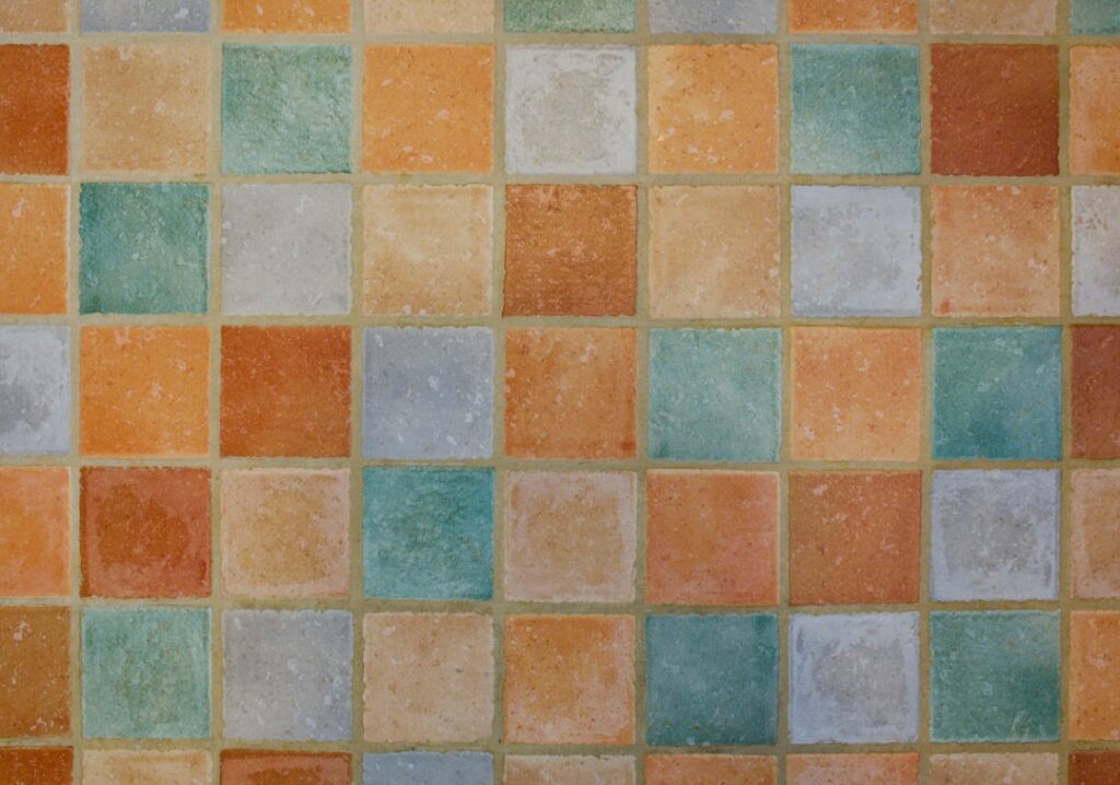
- Encaustic and patterned cement tiles, which usually look best with a neutral gray grout that lets the tile’s own pattern lead rather than competing.
Be deliberate: high contrast highlights every imperfection, so uneven tiles or sloppy spacing will show. Contrast also commits you to a stronger style statement that may feel trendy in ten years, whereas a blended joint stays quiet.
Best Combinations by Tile Color
White tile: Pair with white or off-white grout for a clean, timeless surface, or with gray to charcoal for definition. Avoid stark bright-white grout on floors, as it shows every footprint.
Gray tile: A matching medium gray grout is nearly foolproof. Go darker for subtle depth or lighter for an airy feel. Gray is the most forgiving tile color for hiding dirt.
Beige, cream, and greige tile: Match with a warm sand or almond grout. Warm tiles paired with cool gray grout can look muddy, so keep the undertone consistent.
Black or dark tile: Dark grout amplifies the moody, seamless look; a lighter gray grout creates a bold grid but shows more of the tile edges. Bright white grout with black tile is a dramatic, high-maintenance statement.
Wood-look plank tile: Choose a grout that matches the mid-tone of the plank so the joints mimic the thin gaps of real hardwood. Contrasting grout ruins the wood illusion instantly.
Don’t Forget Grout Width and Type
Color is only part of the story. Narrow grout lines (1/16 to 1/8 inch) with rectified tile minimize the joint’s visual weight regardless of color, while wide joints (1/4 inch or more) on rustic tile make grout color a much bigger design factor. Sanded grout suits joints 1/8 inch and wider; unsanded suits narrow joints and polished tiles that scratch easily. Epoxy grout resists stains and holds color better than cement grout, a real advantage for light grout in high-traffic or wet areas, though it costs more and is harder to install.
How Lighting and Room Size Change the Result
Grout that looks perfect on a small sample can read completely differently across a whole wall. High contrast in a small bathroom can feel busy and shrink the space, while it energizes a large kitchen backsplash. Natural light cools colors and artificial light warms them, so test samples in the actual room at different times of day. Always dry-fit a few tiles with sample grout, or view a grouted display board, before committing.
Common Mistakes to Avoid
- Choosing bright white grout for floors: It looks pristine for a month, then permanently grays. Pick a slightly off-white or seal it religiously.
- Ignoring undertones: A cool-gray grout beside warm cream tile creates a dingy clash. Match warm to warm, cool to cool.
- Going maximum contrast on imperfect tile: Handmade or budget tiles have size variation that dark grout exposes.
- Judging from a tiny chip: Grout dries lighter than the wet sample and looks different at scale. Always test at full size.
- Forgetting maintenance reality: Light grout in a mudroom or shower will demand scrubbing and sealing. Match the color to how much cleaning you will actually do.
Sealing and Long-Term Color
Cement grout is porous and will absorb dirt and change tone over time unless sealed. Apply a penetrating sealer after the grout cures and reapply every year or two in wet areas. If you love a light grout but dread the upkeep, epoxy grout or a quality colored sealer keeps the shade you chose. Grout colorant products can also refresh or even completely change existing grout color years later without retiling, a useful escape hatch if your combination stops pleasing you.
Putting It Together
Popular Combinations Room by Room
Different rooms reward different pairings. In a kitchen backsplash, white subway tile with light gray grout is the enduring crowd-pleaser, giving subtle definition without the high-maintenance stark contrast that shows every splatter. For a bathroom shower, match grout close to the tile to minimize the visual clutter of many small grout lines in a compact space, and lean toward epoxy grout for its stain and mildew resistance in the wet environment. On a kitchen or entry floor, choose a mid-tone gray or greige grout regardless of tile color, because light floor grout shows every footprint and dark grout on a light floor can look harsh. For a fireplace surround or accent wall, where cleaning is not a concern, you can indulge in bold contrast to make the feature pop.
Warm vs. Cool Undertones
The single most overlooked factor in tile and grout pairing is undertone. Every white, gray, and beige has a warm or cool bias, and mixing the two creates a subtle but persistent clash that reads as “off” even when people cannot name why. A warm cream tile paired with a cool blue-gray grout looks muddy and dingy; the same tile with a warm sand grout looks rich and intentional. Before you commit, hold your grout sample directly against the tile in natural light and ask whether they share a temperature. When in doubt, a true neutral gray grout with no strong warm or cool bias plays safely against almost any tile, which is part of why medium gray is the most-recommended all-purpose grout color.
Testing Before You Commit
Grout is permanent and expensive to change, so testing is worth the effort. Order grout sample sticks or have your tile supplier make a small grouted sample board with your actual tile and candidate grout colors. View it in the real room at morning, midday, and evening, and under the artificial lighting you use at night, because color shifts dramatically with light. Remember that wet grout looks much darker than cured grout, so never judge from the freshly mixed sample. Lay a few tiles with the sample grout and live with the board propped in place for a day or two before finalizing. This small step prevents the expensive regret of a whole backsplash or floor grouted in a color that fights the tile.
Start with the mood you want. For calm and expansive, match tile and grout. For pattern and personality, add contrast. For a safe, enduring middle ground, pick a grout one or two shades darker than the tile. Confirm undertones agree, test at full scale in the real room’s light, and factor in how much cleaning the color demands. Nail those steps and your tile and grout color combinations will look deliberate and hold up for years, long after the trend cycle moves on.
Prefer to explore on your own?
See how new flooring looks in your actual room in seconds — free, no signup.
Try the free Floor Studio →