
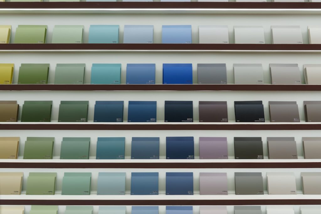
A tile grout color chart is the tool that helps you visualize how different grout shades will look against your tile, turning a confusing decision into a confident one. Grout color is one of the most powerful design choices in any tile project, capable of making a floor or backsplash look seamless and calm or bold and graphic. This guide explains how to read and use a grout color chart, how to decide between matching and contrasting grout, how to test your choice, and how to keep the color looking great for years.
Part of our Tile & Grout guide — explore the full guide →
What a Grout Color Chart Shows
A grout color chart is a printed or physical display of the available grout shades from a manufacturer, usually organized from light to dark. Many charts group colors into families such as whites, grays, beiges, browns, and darker charcoals and blacks, so you can quickly find the tone range you are considering.
The most useful charts are physical samples rather than on-screen images, because grout color on a monitor rarely matches the cured result. If you can get a physical chart or sample sticks from a retailer, hold them directly against your tile to judge the real relationship between the two.
Matching vs Contrasting Grout
The first big decision is whether you want your grout to blend with the tile or stand out against it. Both approaches are valid; the right one depends on the look you are after.
- Matching grout: a shade close to the tile minimizes the grid lines, creating a smooth, expansive, modern look that suits large-format tile.
- Contrasting grout: a noticeably lighter or darker shade frames each tile, emphasizing the pattern, shape, and layout. Classic example: dark grout with white subway tile.
- Neutral mid-tone grout: a shade between the tile color and a strong contrast, which softens the lines while hiding dirt better than bright white.
For busy patterned tiles, a matching or neutral grout keeps the look from becoming too chaotic. For simple field tiles where you want to show off the layout, contrast adds character and definition.
How to Use the Chart With Your Tile
A grout color chart is most powerful when used hands-on with your actual tile. Color choices that look right on paper can surprise you once placed side by side with the real material.
- Bring a loose tile to the store, or bring the chart home to your tile.
- Hold several candidate grout shades against the tile under the room’s lighting.
- Decide whether you want to blend, contrast, or land somewhere in between.
- Narrow to two or three finalists rather than agonizing over every shade.
- Consider how the grout will look across the whole installation, not just one tile.
Lighting changes everything. A grout that looks warm under store fluorescents can read cooler in a sunlit bathroom, so always evaluate finalists in the actual room if you can.
Practical Factors Beyond Looks
Color is not only about aesthetics; it affects how the grout looks over time and how much maintenance it demands. Keep these practical points in mind as you consult the tile grout color chart.
- Light grout shows dirt: bright white grout, especially on floors, reveals every smudge and stain.
- Dark grout shows residue: very dark grout can show soap scum, lint, and efflorescence (mineral haze).
- Mid-tones hide the most: grays and beiges in the middle of the chart disguise daily dirt best.
- High-traffic areas: floors and entryways benefit from forgiving mid-tone colors.
- Wet areas: showers and backsplashes need sealing regardless of color to resist staining.
For a kitchen floor or mudroom, choosing a forgiving mid-tone from the chart will save you endless scrubbing compared to a stark white. Reserve crisp white for areas you can keep clean and are willing to maintain.
The Wet vs Dry Color Trap
One of the most common surprises in grouting is that wet grout looks much darker than it does once cured. The color on the chart represents the dried, finished result, not how it appears while you are spreading it. If you judge the color while wet, you may panic and think you chose wrong.
To avoid this, mix a small test batch, apply it on a sample board or spare tile, and let it cure fully before deciding. Seeing the true cured color removes the guesswork and confirms your chart selection before you commit to the whole project.
Achieving Consistent Color
Even the perfect color from the chart can look uneven if mixed and applied carelessly. Consistency depends on disciplined technique.
- Use the same water-to-grout ratio for every batch, measuring rather than guessing.
- Mix thoroughly and let the grout slake as directed before use.
- Do not add extra water mid-job to loosen grout, since that lightens the color.
- Wipe with a damp, well-wrung sponge; too much water washes pigment from the surface.
- Remove haze on schedule so dried film does not distort the final shade.
Inconsistent water content is the leading cause of blotchy grout. Treat your mixing ratio like a recipe and repeat it exactly across every batch for uniform color.
Keeping Grout Color Looking New
Once your grout is in and cured, a little maintenance preserves the color you chose. Seal cement-based grout with a penetrating sealer after the recommended cure time, especially in wet and high-traffic areas, so it resists stains without changing the color. Clean with a pH-neutral cleaner rather than harsh acids or bleach, which can lighten or discolor grout over time.
If existing grout has faded or stained, a grout colorant can refresh or completely change the color without re-grouting, and it adds a layer of sealing protection. Whether you are starting fresh or renewing old joints, using a tile grout color chart thoughtfully, testing your choice, and maintaining it properly ensures your tile looks exactly the way you envisioned for years to come.
If you are still undecided after narrowing the chart to a couple of finalists, a safe default is to pick a grout that is one or two shades different from your tile rather than an extreme match or contrast. That middle path keeps the lines subtle without erasing them entirely, flatters most tile, and hides dirt reasonably well. You can always lean bolder once you are confident, but a gentle, slightly-off shade is the choice fewer homeowners regret, and it photographs and ages gracefully in nearly any room.
Prefer to explore on your own?
See how new flooring looks in your actual room in seconds — free, no signup.
Try the free Floor Studio →

