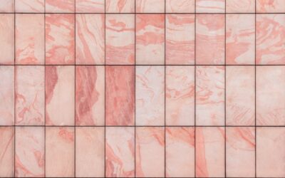
Subway tile has been laid in the same offset brick pattern for a century, so when designers wanted a fresh take, they simply turned the tiles and stacked them. The vertical stacked tile pattern, tiles set upright and aligned in perfectly straight columns rather than offset rows, has become one of the most requested looks in modern kitchens and bathrooms. It draws the eye upward, makes ceilings feel taller, and delivers a crisp, contemporary grid that feels intentional and architectural. But those unforgiving straight lines demand precision, so a great result depends on careful layout and a flat surface.
Part of our Tile & Grout guide — explore the full guide →
- What Makes the Vertical Stack Different
- Why Vertical Orientation Works Visually
- Best Places to Use a Vertical Stack
- Choosing the Right Tile
- Layout Planning for Straight Lines
- Grout: The Detail That Defines the Look
- Common Mistakes to Avoid
- DIY Difficulty and When to Hire Out
- Vertical Stack Versus Other Modern Patterns
- Color and Material Choices That Elevate the Look
- Final Thoughts
What Makes the Vertical Stack Different
In a traditional running bond, each row of tile is offset from the one below, hiding small imperfections in the staggered joints. A vertical stack does the opposite: tiles stand on end and line up in continuous vertical and horizontal grout lines, forming an exact grid. There is nowhere to hide. Every joint must align, every tile must sit plumb, and any variation in tile size or wall flatness shows immediately. That precision is exactly what gives the pattern its clean, modern authority, and also what makes it less forgiving than a brick layout.
Why Vertical Orientation Works Visually
Turning tiles vertical does something powerful to a space. The continuous vertical grout lines act like pinstripes, drawing the eye up and making walls read taller and ceilings higher. In a small bathroom or a galley kitchen with limited headroom, that heightening effect is genuinely useful. Vertically stacked tile also lends a sleek, gallery-like calm compared to the busier rhythm of offset patterns, which is why it suits minimalist and modern interiors so well.
Best Places to Use a Vertical Stack
The pattern is versatile, but it shines in certain applications:
- Kitchen backsplashes: A vertical stack behind a range or along a counter run looks current and keeps the eye moving up toward cabinets.
- Shower and tub surrounds: The heightening effect makes a shower feel more spacious, and the clean grid reads as spa-like.
- Accent and feature walls: A full wall of stacked tile becomes a textural focal point without pattern noise.
- Fireplace surrounds: Vertical stacking emphasizes the vertical thrust of a fireplace and chimney breast.
- Powder rooms: Floor-to-ceiling stacked tile turns a tiny room into a statement.
Choosing the Right Tile
Because alignment is everything, tile selection matters more than usual. Rectified tiles, which are machine-ground to a precise, consistent size with sharp square edges, are strongly preferred for stacked patterns because their uniformity keeps the grid true. Standard cushion-edge subway tiles vary slightly in size and have rounded edges, which makes perfectly aligned joints harder to achieve and leaves wider grout lines.
Elongated formats like 3-by-12 or 4-by-16 inch tiles emphasize the vertical effect dramatically, while classic 3-by-6 subway tiles give a subtler stack. Larger square or rectangular tiles also stack beautifully for a bold, gridded modern look. Whatever you choose, buy from a single production lot so color and size stay consistent across the wall.
Layout Planning for Straight Lines
The whole appeal of the pattern lives or dies on straight, aligned grout lines, so layout planning is non-negotiable. Follow these steps before setting a single tile:
- Find the center and work out. Mark a vertical centerline on your wall and balance the tiles symmetrically so cut pieces at the edges are equal and not skinny slivers.
- Establish a level baseline. Never trust the counter or tub edge to be level. Snap a level line and, if needed, tack a temporary ledger board to start your first full course perfectly straight.
- Check the wall for flatness. Stacked tile magnifies any bow in the wall. Skim-coat or float low spots so the finished grid sits in one plane.
- Use tile spacers or a leveling system. Consistent spacers keep every joint identical, and a leveling clip system keeps adjacent tile faces flush to prevent lippage.
- Dry-lay a section to confirm your spacing and reveal any size variation before committing.
Grout: The Detail That Defines the Look
Grout choice transforms a vertical stack. Because the grid is so clean, the grout lines become a design element in their own right, and you can play them two ways:
Matching Grout for a Seamless Look
A grout color close to the tile makes the joints recede, emphasizing the tile itself and giving a smooth, monolithic wall. This is the go-to for a serene, minimalist result.
Contrasting Grout for a Graphic Grid
A darker or lighter grout against the tile turns the joints into a bold grid, making the geometry the star. Charcoal grout with white tile is a striking modern classic, though contrasting grout demands even more precise alignment since every wobble shows.
Keep grout joints narrow, typically 1/16 to 1/8 inch, for the tightest, most contemporary grid. Use an unsanded grout for these fine joints, and seal cement-based grout to keep it clean in wet areas.
Common Mistakes to Avoid
The pattern is unforgiving, so watch for these pitfalls:
- Skipping wall prep: A bowed or out-of-plane wall guarantees lippage and wandering lines.
- Trusting existing edges: Counters, tubs, and floors are rarely level; always work from a snapped level line.
- Uneven grout joints: Inconsistent spacing destroys the crisp grid; use spacers religiously.
- Ignoring lippage: Without a leveling system, tiles pop proud of their neighbors and catch the light.
- Poor tile choice: Non-rectified tiles with size variation make perfect alignment nearly impossible.
DIY Difficulty and When to Hire Out
A vertical stack is more demanding than a forgiving offset pattern, but a patient DIYer with good prep can absolutely do it on a modest backsplash. The keys are a flat wall, a level starting line, quality rectified tile, and a leveling clip system. For a large feature wall, a full shower surround, or contrasting grout where every flaw shows, hiring an experienced tile setter, typically $8 to $20 per square foot in labor, buys the precision the pattern demands. If your walls are badly out of plane, that professional help pays for itself in a straight, lippage-free result.
Vertical Stack Versus Other Modern Patterns
It helps to know how the vertical stack compares to the other looks you might be weighing. A horizontal stack uses the same aligned grid but runs tiles lengthwise, widening a space rather than heightening it, a good choice for a low, wide backsplash. The classic offset running bond staggers rows and hides imperfections but reads more traditional. Herringbone and chevron bring energetic movement but far more cutting and waste. Among these, the vertical stack sits in a sweet spot: it delivers a bold, modern grid with relatively simple cuts, since tiles run straight up in columns with no angled joints. If you want contemporary impact without the labor of herringbone, the vertical stack is the efficient choice, provided your surface is flat and your tile is uniform.
Color and Material Choices That Elevate the Look
Because the pattern itself is so clean, the tile’s color and finish carry a lot of the design weight. Glossy white or soft-hued tiles keep the look bright and timeless, reflecting light and reinforcing the airy, heightening effect. Matte tiles in warm neutrals or deep tones give a more sophisticated, muted result. Handmade or zellige-style tiles with subtle color variation add organic depth to the rigid grid, softening its precision so it feels crafted rather than clinical. For a bold statement, a saturated color, emerald, navy, or terracotta, stacked vertically becomes a dramatic feature wall. Elongated formats amplify the vertical thrust, while glass tiles add luminous depth in a shower. Whatever you choose, the interplay between the strict geometry of the stack and the character of the tile surface is what makes the finished wall feel designed rather than merely tiled.
Final Thoughts
The vertical stacked tile pattern rewards precision with one of the cleanest, most modern looks in tile design, drawing the eye upward and turning a simple grid into architecture. Success comes down to preparation and alignment: a flat wall, a truly level starting line, uniform rectified tile, tight consistent grout joints, and a leveling system to keep faces flush. Nail those fundamentals, choose your grout to either soften or sharpen the grid, and a vertical stack will give your kitchen or bath a crisp, elevated edge that feels current for years.
Prefer to explore on your own?
See how new flooring looks in your actual room in seconds — free, no signup.
Try the free Floor Studio →