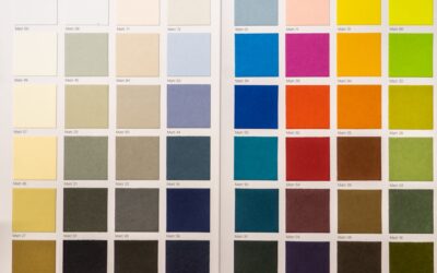
White seems like the safest color choice until you stand in the paint aisle staring at two hundred swatches that all look, well, white. The truth is that white paint colors carry undertones of yellow, gray, blue, pink, or green that only reveal themselves on your walls under your light. That is why one homeowner’s fresh, gallery-clean white becomes another’s stark hospital wall or dingy cream.
Part of our Paint & Walls guide — explore the full guide →
Choosing well comes down to understanding warm versus cool whites, reading undertones, and testing against your own light and finishes. This guide covers the best whites for walls, trim, and cabinets, and how to pair them so your rooms feel crisp and intentional.
- Warm White vs. Cool White
- Understanding LRV and Undertones
- Best Warm White Paint Colors
- Best Cool and Bright White Paint Colors
- Choosing White for Trim, Walls, and Cabinets
- How Lighting Transforms White
- Pairing Whites With Other Colors
- Choosing the Right Finish
- Common Mistakes to Avoid
- White for Ceilings and Exterior Trim
- Whites in Kitchens and Bathrooms
- Why Whites Look Different Store to Home
Warm White vs. Cool White
Every white leans one direction. Warm whites carry yellow, cream, or beige undertones and make a room feel cozy and inviting; they flatter traditional homes and spaces with lots of wood. Cool whites carry gray or blue undertones and read crisp, modern, and clean; they suit contemporary interiors and bright, sunny rooms.
A room with abundant warm afternoon light can handle a cooler white without feeling cold, while a dim north-facing room usually needs a warm white to avoid looking gray and lifeless. Matching the white’s temperature to your light is the first decision.
Understanding LRV and Undertones
Two technical concepts guide a smart choice. LRV, or Light Reflectance Value, measures brightness on a scale of 0 to 100; most whites fall between 80 and 95, and higher numbers bounce more light for a brighter, airier feel. A white below about 84 LRV reads as a soft off-white rather than a bright white.
Undertone is the subtle color hiding beneath. To spot it, place your white sample beside a pure white sheet of paper; the sample’s yellow, gray, or pink cast becomes obvious by comparison. This one trick prevents most white-paint regrets.
Best Warm White Paint Colors
Warm whites are the most forgiving and popular for whole-home use, generally $50 to $75 per gallon in premium lines:
- Sherwin-Williams Alabaster (SW 7008): A soft, warm white with an LRV of 82, a longtime bestseller for walls and trim alike.
- Benjamin Moore White Dove (OC-17): A gentle off-white with a whisper of warm gray; superb on trim, doors, and cabinets.
- Benjamin Moore Swiss Coffee (OC-45): A creamy warm white for a cozy, welcoming backdrop.
- Sherwin-Williams Greek Villa (SW 7551): A slightly brighter warm white than Alabaster for those wanting more light.
Best Cool and Bright White Paint Colors
When you want maximum brightness and a crisp, modern look, cool and true whites deliver:
- Benjamin Moore Chantilly Lace (OC-65): A clean, bright near-true white with an LRV around 90, the go-to for modern trim and cabinets.
- Sherwin-Williams Pure White (SW 7005): A crisp white with the faintest warmth, versatile on both walls and trim.
- Benjamin Moore Simply White (OC-117): A bright white with a hint of warmth that photographs beautifully.
- Sherwin-Williams High Reflective White (SW 7757): The brightest white available, near LRV 93, for a truly clean ceiling or gallery wall.
Choosing White for Trim, Walls, and Cabinets
Different surfaces call for different approaches. For trim and doors, a crisp bright white like Chantilly Lace or Pure White creates clean lines against colored or off-white walls. For walls, a soft warm white keeps the room from feeling clinical.
For cabinets, warmth reads as high-end and hides everyday smudges better than a stark white; White Dove and Alabaster are the two most-requested cabinet whites for good reason. A common, foolproof scheme uses a warm white on walls with the same or a slightly brighter white on trim.
How Lighting Transforms White
No color is more sensitive to light than white. North-facing rooms cast cool, flat light that makes cool whites look gray, so choose a warm white to compensate. South-facing rooms flood with warm light that keeps even cool whites balanced.
- Buy sample pots and paint large patches on at least two walls.
- Check the white in morning, midday, and evening artificial light.
- Compare it against your flooring, counters, and existing trim.
- Notice how it looks next to any adjacent rooms visible through doorways.
Artificial lighting matters too: warm 2700K bulbs push whites yellow, while cool 4000K-plus bulbs make them look blue. Choose bulbs that complement your chosen white.
Pairing Whites With Other Colors
White is the ultimate team player, but pairing still requires an eye for undertones. Match warm whites with warm woods, brass, cream, and beige for a soft, organic feel. Pair cool whites with black hardware, marble, and cool grays for a crisp, modern scheme.
When using white trim against a colored wall, keep the undertones compatible; a warm greige wall wants a warm white trim, while a cool gray wall pairs with a crisp white. Mismatched undertones are what make a fresh paint job look subtly off.
Choosing the Right Finish
Sheen shapes both durability and appearance. Use flat or matte on ceilings to hide imperfections, eggshell or satin on walls for a subtle glow and washability, and satin or semi-gloss on trim, doors, and cabinets so the crisp white wipes clean and reflects a little light. Higher sheen also emphasizes surface flaws, so prep smooth before you brush.
Common Mistakes to Avoid
The biggest error is assuming white needs no sampling; it needs it more than any color. The second is ignoring undertones and ending up with a wall that reads pink or blue. The third is pairing incompatible whites, so trim and walls fight each other.
White for Ceilings and Exterior Trim
Ceilings deserve their own thought. A bright, high-LRV white like High Reflective White or the same wall white lightened by 25 percent keeps a ceiling feeling tall and airy. A flat sheen hides the roller marks and drywall imperfections that overhead light tends to expose. Avoid a pure stark white ceiling over warm walls, since the contrast can look harsh.
On exteriors, whites behave differently because natural daylight is far brighter and cooler than indoor light. A white that looks perfect inside can appear blindingly stark on siding. For exterior trim and siding, slightly softer whites with a warm undertone, such as White Dove or Alabaster, tend to read cleaner and less clinical in full sun.
Whites in Kitchens and Bathrooms
Kitchens and baths add reflective surfaces, tile, quartz, marble, and chrome, that bounce color and reveal a white’s undertone. In these rooms, coordinate the wall and cabinet white with the countertop and backsplash. A warm white cabinet against a cool marble counter can look slightly yellow, while a cool white against warm wood floors can look sterile.
For cabinets specifically, a soft warm white like White Dove hides fingerprints and everyday wear better than a stark bright white, and it pairs beautifully with both brass and black hardware. Test your white against the actual counter and tile samples before committing, since these fixed finishes are expensive to change.
Why Whites Look Different Store to Home
Homeowners are often baffled when a white looks nothing like the store chip. The reason is metamerism, the way a color shifts under different light sources. Store fluorescents, home LEDs, and natural daylight each render a white differently, so a chip that looked crisp under retail lighting can turn dull or yellow at home.
- Warm bulbs around 2700K push whites toward yellow and cream.
- Cool bulbs at 4000K and above push whites toward blue and gray.
- North light is cool and flattens warm whites; south light is warm and softens cool whites.
- The only reliable test is a large sample on your own wall, in your own light.
With attention to warm versus cool, a look at LRV, and honest home samples, the best white paint colors give you rooms that feel bright, clean, and timeless. Test against your light and finishes, keep your undertones consistent, and you will land a white that looks intentional in every corner of your home.