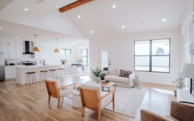
The all-white kitchen ruled magazines and Pinterest boards from 2012 through 2020, but the two-tone look has quietly taken over in current builds and remodels. White upper cabinets wood lower kitchens combine the brightness of painted uppers with the warmth and grounded feel of natural wood bases. Done well, this layout reads timeless rather than trendy because it pairs two materials that have anchored kitchens for over a century. Done poorly, the wood looks orange, the white looks flat, and the room feels disjointed. After designing roughly 30 two-tone kitchens for clients between $40,000 and $120,000 budgets, the rules below consistently produce kitchens that age gracefully.
Part of our Kitchen Remodeling guide — explore the full guide →
Why the Two-Tone Layout Works
Visually, the human eye reads light at the top and weight at the bottom as natural and grounded. White uppers reflect overhead light back into the workspace, brightening countertops and making small kitchens feel larger. Wood lowers add visual weight at the floor level, anchor the room, and hide the inevitable scuffs, dings, and dog tail strikes that destroy painted lower cabinets within five years.
From a maintenance standpoint, wood lowers age better than painted lowers. Touch-up on a stained or oiled wood door is invisible. Touch-up on white paint always shows a slight color or sheen mismatch within two years.
Choosing the Right Wood Species
Not every wood species photographs well as a kitchen base cabinet. Some woods turn orange or yellow as they age. Others stay neutral. The species you choose dictates whether the kitchen still looks current in 2035.
- White oak: The current favorite, stays neutral with a subtle grey-tan tone, $$$
- Rift-sawn white oak: Tightest, most linear grain, very modern, $$$$
- Walnut: Deep chocolate brown with purple undertones, warm and rich, $$$$
- Maple: Light and creamy, takes stain unevenly, best left natural or clear-finished, $$
- Cherry: Starts pinkish and darkens to reddish-brown over 2 to 3 years, $$$
- Red oak: Strong grain pattern but orange undertone, dates a kitchen quickly, $
I steer clients away from red oak and away from heavily stained dark cabinets. Both lock the kitchen into a specific decade. White oak in a natural or light wire-brushed finish reads contemporary in 2026 and will still read contemporary in 2040.
The Right White for the Upper Cabinets
Picking the white is harder than picking the wood. The white needs to coordinate with the undertone of the floor, countertop, and wood lowers without competing for attention. For most two-tone kitchens, a slightly warm white works better than a stark pure white. Cool whites can read blue against warm wood and create visual tension.
Reliable choices from major paint brands include Benjamin Moore White Dove (OC-17), Sherwin-Williams Alabaster (SW 7008), and Behr Swiss Coffee (12). All three have a subtle warm undertone that flatters white oak and walnut without going cream. Apply in cabinet-grade enamel like Benjamin Moore Advance or Sherwin-Williams Emerald Urethane in satin finish for the best balance of washability and sheen.
Countertop Choices That Bridge Both Tones
The countertop has to live between two colors. White quartz with subtle grey veining bridges the painted uppers and wood lowers without choosing a side. Options like Cambria Brittanicca Warm, Caesarstone London Grey, and Silestone Calacatta Gold range from $65 to $110 per square foot installed.
Avoid stark pure white quartz with no veining in a two-tone kitchen. It reads as a flat plane that disconnects the uppers from the lowers. Avoid black or very dark countertops as well unless you are committed to a high-contrast modern look. The dark surface visually splits the kitchen at the work surface and makes both cabinet sets recede.
Hardware and Metal Finishes
Hardware is where the two cabinet sets either pull together or split apart. Use a single metal finish across both painted and wood cabinets, never one finish on top and a different one on the bottom. Brushed brass, polished nickel, and matte black are the three finishes that work consistently across both materials.
Pull length should scale with door size. A 24-inch base cabinet needs an 8 to 10 inch pull, a 36-inch base needs a 12 to 18 inch pull. On uppers, 4 to 6 inch knobs or 5 inch pulls keep the proportion right. Sources like Rejuvenation, Schoolhouse, and Top Knobs sell solid brass pulls in the $20 to $40 per piece range that hold up far better than the budget options.
Floor Choices Under a Two-Tone Kitchen
The floor should contrast both cabinet colors slightly without competing with the wood lowers. Engineered white oak flooring 5 to 7 inches wide creates a tone-on-tone look that feels expensive without going monochrome. Aim for a floor stain one or two shades different from the lower cabinets, never an exact match.
Porcelain tile in a soft greige tone works in regions where wood floors do not make sense (Florida slab-on-grade, Phoenix high temperatures). Large format 24 by 48 inch tiles read as a single surface and minimize grout lines. Avoid small-format tile, which adds visual busyness that fights the cabinet grain.
Lighting to Show Off the Materials
Wood and painted finishes both look different under different color temperatures. Use 2700K to 3000K warm white LEDs for under-cabinet lighting to flatter the wood. Cooler 4000K bulbs make wood look dull and grey. Recessed lights should match the under-cabinet temperature.
Pendant lights over an island offer the opportunity to introduce a third material like blackened steel, antique brass, or hand-blown glass. Three matching pendants over a 7 to 8 foot island, hung 30 to 34 inches above the countertop, deliver the most-photographed view in any white upper cabinets wood lower kitchen. Done right, this is the layout buyers will pay a premium for ten years from now.