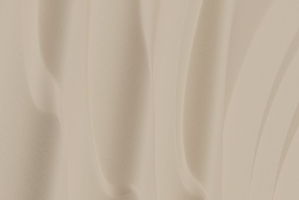
Sherwin-Williams Accessible Beige has been a go-to neutral for years for one reason: it reads as beige without the yellow or pink that made older beiges feel dated. The Accessible Beige paint color (SW 7036) sits right on the line between beige and greige, so it can look warm and cozy in a sunny living room and soft and slightly gray in a shaded hallway. That flexibility is its strength, and also why sampling matters.
Part of our Paint & Walls guide — explore the full guide →
Here are the numbers straight from Sherwin-Williams: an LRV of 57.67 (usually rounded to 58), a hex value of #D1C7B8, and RGB 209, 199, 184. It belongs to the neutral family and sits on fan deck location 249-C1. In plain terms, it is a light-to-mid neutral, not a bright white-adjacent shade, so it needs reasonable light to look its best.
- Accessible Beige Paint Color Specs at a Glance
- Understanding the Undertones
- Best Rooms for Accessible Beige
- Trim Colors and Pairings
- Close Alternatives and Comparisons
- How to Sample It Properly
- Sheen and Application Tips
- Troubleshooting Color Problems
- Cost and When to Hire a Painter
- Frequently Asked Questions
If you want walls that feel warm but not yellow, pair well with wood floors, and work with both white and wood trim, this color is a strong candidate. If your room is dark, north-facing or full of cream finishes, keep reading before you buy gallons.
Accessible Beige Paint Color Specs at a Glance
| Spec | Value | What it means |
|---|---|---|
| Code | SW 7036 | The number to give the paint counter for an exact mix |
| LRV | 57.67 (about 58) | Light, but at the lower end of the light range; reflects a bit more than half the light hitting it |
| Hex / RGB | #D1C7B8 / 209, 199, 184 | Useful for digital mockups; screens never show paint perfectly |
| Color family | Neutral | Beige with a noticeable gray base, often called greige |
| Undertone | Warm, gray-leaning | Less yellow than traditional beige; can show faint green or pink in some light |
| Fan deck location | 249-C1 | Where to find the chip on the in-store color strips |
| Manufacturer coordinates | Aesthetic White (SW 7035), Sanderling (SW 7513), Cadet (SW 9143) | Sherwin-Williams’ own suggested pairings |
Understanding the Undertones
Accessible Beige is a beige built on a gray base. That gray is what keeps it from turning orange or peach the way many 1990s beiges did. Most of the time, it reads as a warm, calm neutral with a slight earthy depth.
Undertones are where people get surprised, though. In certain conditions, the color can lean:
- Slightly green: next to pink-orange countertops, red-toned wood or heavy green landscaping outside a window. Reflected light changes what you see on the wall.
- Slightly pink or taupe: in cool, north-facing light, where it can look more like a taupe-greige than a beige.
- Warmer and sandier: in south- and west-facing rooms with strong afternoon sun.
None of these shifts are dramatic, but they explain why one homeowner calls it the perfect beige and another says it looked muddy. Light and surroundings make the difference, not the paint.
How bulbs change it
Warm-white bulbs around 2700K to 3000K keep it cozy and beige. Daylight bulbs at 5000K and up pull it grayer and can make it feel flat. If your fixtures use cool bulbs, test the swatch at night as well as during the day.
Best Rooms for Accessible Beige
The Accessible Beige paint color does its best work in rooms with moderate to good natural light. Strong candidates include:
- Living rooms and family rooms: it reads warm and welcoming, and it hides scuffs better than bright whites.
- Open-concept spaces: a single neutral that flows between kitchen, dining and living areas without looking stark.
- Bedrooms: the gray base keeps it restful rather than golden.
- Hallways and stairwells with some daylight: it disguises fingerprints and wear.
- Exteriors: as a body color it can work well when the roof, stone or brick share its earthy undertone.
Be more careful in dark rooms. With an LRV around 58, Accessible Beige absorbs a fair amount of light, and a basement or north-facing room with small windows can make it look heavier than the chip suggests. For whole-house use, some homeowners find it a touch dark and choose a lighter neighbor for low-light rooms.
Walls vs cabinets
On cabinets, the color reads lighter and more beige because of the sheen and the way light hits doors at different angles, which is a separate decision with its own considerations for countertops and hardware.
Trim Colors and Pairings
For trim, a clean white with a little warmth usually wins. Sherwin-Williams Pure White (SW 7005) is a popular choice because it is soft without looking yellow, and Alabaster (SW 7008) works if you want a warmer, more tonal look. Very yellow creams tend to fight the gray base and can make the walls look dingy.
Sherwin-Williams’ own coordinating colors give three directions:
- Aesthetic White (SW 7035): a lighter, closely related off-white for ceilings or trim in a tonal scheme.
- Sanderling (SW 7513): a soft, light neutral that works for adjoining rooms.
- Cadet (SW 9143): a muted blue-gray accent for doors, an island or a feature wall.
Beyond those, the color pairs well with muted greens and green-grays, deeper greiges for an accent wall, earthy browns, and natural materials like oak, walnut and jute. Avoid strongly pink-toned woods; the contrast can push the walls toward green.
With flooring
Mid-tone oak and white oak are classic partners. Gray-washed laminate or vinyl plank also works because it echoes the gray base. Very orange wood, such as heavily ambered red oak, can make the walls look slightly green by comparison. Tile with a warm gray or cream-gray body is easier to pair than bright white tile.
Close Alternatives and Comparisons
If Accessible Beige is almost right but not quite, these comparisons help you choose a direction:
- Agreeable Gray (SW 7029): slightly lighter (LRV 60) and more gray than beige. Pick it if you want a cooler greige.
- Shiitake (SW 9173): a step deeper with a touch more warmth and more contrast against white trim.
- Natural Tan (SW 7567): noticeably lighter and a little greener; useful for darker rooms.
- Balanced Beige (SW 7037): a noticeably deeper beige (LRV around 46) with a similar character, for an accent wall or a lower-light den you want cozy.
Comparisons like these are approximate. Always view chips side by side on the actual wall, not on a white sheet of paper, because the surrounding white exaggerates undertones.
How to Sample It Properly
Sampling is where most color mistakes are avoided, and the Accessible Beige paint color rewards a careful test because of its shifting undertones. Peel-and-stick paint samples are the easiest method because you can move them around the room without painting test patches on your walls.
- Get large swatches. Aim for at least 8 by 8 inches; small chips mislead.
- Place them on every wall. Light differs on each wall, especially opposite a window.
- Check at three times of day. Morning, mid-afternoon and evening under your normal bulbs.
- Hold them against fixed finishes. Countertops, flooring, tile and large furniture affect undertones the most.
- Compare with one alternative. Putting Accessible Beige next to Agreeable Gray or a warmer beige makes its undertone obvious.
- Live with it for two or three days. First impressions change once you stop staring at it.
Sheen and Application Tips
Eggshell is the usual choice for living spaces and bedrooms because it cleans reasonably well without shine. Satin is better for kitchens, bathrooms and high-traffic halls. Flat or matte finishes hide wall imperfections but scuff more easily. On trim, semi-gloss in your chosen white gives a durable, wipeable surface and a crisp line against the walls.
Plan on two coats over a primed or previously painted surface. If you’re covering a much darker color, a tinted primer helps the color land true. Cut in and roll one wall at a time to keep a wet edge and avoid lap marks.
Troubleshooting Color Problems
It looks too dark
Add light first: brighter bulbs in warm white, sheer window coverings, or mirrors. If that doesn’t help, step to a lighter neutral for that room only.
It looks green
Look at what’s reflecting onto the wall: landscaping, countertops, rugs or wood tones. Changing bulbs to warm white usually reduces the effect.
It looks pink or purple
Cool, north light can do this. A slightly warmer, yellower beige may hold up better in that room.
The trim looks dirty
The trim white is probably too creamy. Switch to a cleaner white with less yellow.
Cost and When to Hire a Painter
Interior paint for a typical room usually runs from a few dozen dollars for one or two gallons of mid-grade paint to over a hundred for premium lines. Hiring a painter typically costs a few hundred dollars for a small room and more for large spaces, high ceilings or detailed trim. Consider a pro for two-story foyers, stairwells and any job that needs scaffolding, or when walls need significant patching before paint.
Frequently Asked Questions
What is the LRV of Accessible Beige?
Sherwin-Williams lists an LRV of 57.67, usually rounded to 58. That makes it a light neutral at the lower end of the light range.
Is Accessible Beige warm or cool?
It is a warm neutral with a gray base. It reads warmer in sunny rooms and grayer in north-facing light.
Does Accessible Beige look green?
It can show a faint green next to pink-orange countertops, red-toned wood or green landscaping. Warm bulbs and neutral surroundings reduce the effect.
What white trim goes with Accessible Beige?
Pure White (SW 7005) is a popular clean, soft option. Alabaster (SW 7008) works if you want a warmer, more tonal look.
Is Accessible Beige good for a dark room?
It can feel heavy in low light. If a room gets little daylight, consider a lighter neutral or add warm lighting.
Is Accessible Beige paint still popular?
Yes. It remains one of the most widely used warm neutrals because it bridges beige and greige and suits many flooring and trim combinations.