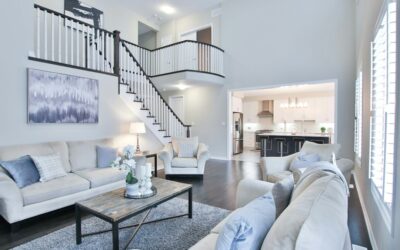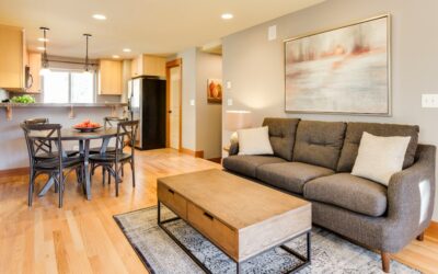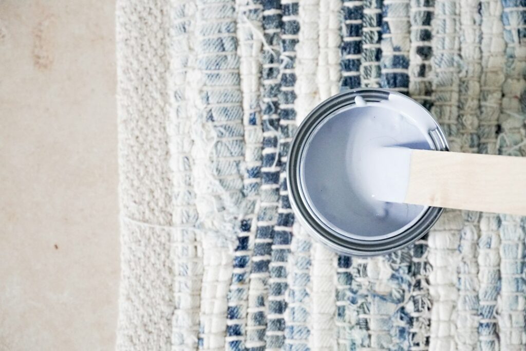
The Kilim Beige paint color, Sherwin-Williams SW 6106, is a warm, light-to-mid beige that has stayed on popular-color lists for years because it is easy to live with. It is warmer than a greige, softer than a tan, and has enough depth to keep white trim from looking stark. With a light reflectance value of about 57, it sits squarely in the middle of the light scale: bright enough for most rooms, deep enough to read as a real color.
Part of our Paint & Walls guide — explore the full guide →
Its undertones lean yellow and slightly peach, which is what gives it that cozy, sunlit feel. The maker files it under its orange color family, which surprises people who expect a beige to be neutral. In practice that warmth shows up most in south and west light and under warm bulbs, while north light tames it toward a soft sand.
- Kilim Beige Paint Color Specs
- Undertones and How Light Changes It
- Best Rooms for Kilim Beige
- Trim and Coordinating Colors
- Kilim Beige vs Accessible Beige
- How to Paint With Kilim Beige
- Pairing Kilim Beige With Floors and Finishes
- Troubleshooting
- Cost and When to Hire a Painter
- Frequently Asked Questions
Kilim Beige suits living rooms, bedrooms and open-plan spaces that need warmth, and it works with wood floors, warm stone and brass. It is a less natural fit if your home is full of cool grays or blue-toned finishes.
Kilim Beige Paint Color Specs
These values come from the manufacturer’s color page. Screen colors vary, so use the hex code only as a rough reference and sample the real paint.
| Spec | Value | What it means |
|---|---|---|
| Color number | SW 6106 | Use this when ordering |
| LRV | About 57 (light) | Reflects more than half the light that hits it |
| Color family | Orange (warm beige) | Warm, with yellow and slight peach undertones |
| Hex / RGB | #D7C5AE / 215, 197, 174 | Screen approximation only |
| Fan deck location | 204-C1 | Helps find the chip in store |
| Maker’s coordinating colors | Divine White SW 6105, Latte SW 6108, Storm Cloud SW 6249 | Trim, deeper accent and cool contrast |
| Use | Interior and exterior | Works on siding and stucco too |
Deeper colors from the same warm family make easy tonal partners for accent walls or adjoining rooms, and Latte SW 6108 is the maker’s own pick for that role.
Undertones and How Light Changes It
Kilim Beige reads as a warm beige with a yellow base and a soft peach note. The peach is subtle on a chip and more visible on large walls, especially near warm wood floors or in rooms with orange-toned evening light.
- South-facing rooms: Strong warm light makes it glow golden. It can look a step lighter and more yellow.
- North-facing rooms: Cooler light mutes the yellow and makes it read like a soft sand or light khaki. This is where it often looks its most balanced.
- East and west rooms: Expect a shift through the day, warm in the direct sun hours and calmer the rest of the time.
- Artificial light: Warm white bulbs (2700K) push it toward peach. Neutral bulbs (3000K to 3500K) keep it closer to a true beige.
Peel-and-stick paint sample swatches are the easiest way to check this. Place a few on different walls and look at them over a full day before buying gallons.
Best Rooms for Kilim Beige
Living rooms and family rooms
This is where Kilim Beige does its best work. It warms up large spaces, flatters wood furniture and leather, and forgives the scuffs and shadows of daily life better than white.
Bedrooms
The warmth feels restful. Pair it with linen bedding, light wood and a creamy trim for a soft, calm look.
Kitchens
Works well with warm wood cabinets, cream cabinets, butcher block and warm stone. It can clash with cool white quartz or gray-veined marble, so sample beside your countertops.
Hallways and open plans
A good whole-house color for connected spaces. Its LRV keeps hallways from feeling dark, and the warmth ties rooms together.
Exteriors
On stucco, siding or brick-accented homes it gives a warm sand look. Bright sun washes colors out, so it will look lighter outdoors than on an interior wall.
Trim and Coordinating Colors
The maker pairs Kilim Beige with Divine White, Latte and Storm Cloud. Those three show the main directions:
- Warm white trim: Divine White SW 6105 is a soft warm white that keeps contrast gentle. Most warm or creamy whites work.
- Bright white trim: A clean, neutral white gives more contrast and a crisper look. Avoid very blue whites, which can make the beige look dingy.
- Deeper tonal accent: Latte SW 6108 is a deeper warm tan for accent walls, cabinets or an adjoining room.
- Cool contrast: Storm Cloud SW 6249 brings a muted blue-gray that balances the warmth on doors, an island or a dining room.
- Greens and blues: Sage, olive and dusty navy accents in fabrics or a front door complement the yellow undertone.
Kilim Beige vs Accessible Beige
This is the comparison most people make, since both are popular warm neutrals from the same maker with nearly identical LRVs.
| Feature | Kilim Beige SW 6106 | Accessible Beige SW 7036 |
|---|---|---|
| LRV | About 57 | About 58 |
| Color family | Orange (warm beige) | Neutral (greige) |
| Undertone | Yellow with slight peach | Gray-beige, can show a slight green |
| Feel | Warm and sunny | Balanced, more muted |
| Best with | Warm wood, brass, cream | Mixed warm and cool finishes |
Because the LRVs are so close, the difference is about warmth, not lightness. Choose the Kilim Beige paint color if you want a true warm beige. Choose Accessible Beige if you need a color that bridges warm wood and cool gray finishes.
How to Paint With Kilim Beige
- Sample on two walls. Check it in morning, midday and evening light, next to floors and furniture.
- Choose the sheen. Eggshell or satin for most walls, flat or matte for ceilings and low-traffic rooms, semi-gloss for trim.
- Prep. Clean walls, fill holes, sand smooth and dust off.
- Prime when needed. Use primer over new drywall, stains or a dark previous color.
- Cut in and roll. Keep a wet edge and work wall by wall.
- Apply a second coat. Follow the recoat time on the can.
For trim, a semi-gloss in your chosen white gives a clean edge and wipes down easily. If you are painting cabinets or doors in a deeper partner color such as Latte, use a dedicated cabinet or door enamel in satin, which levels better and resists sticking. On exteriors, use an exterior-rated line and paint in mild, dry weather within the temperature range on the label.
Ventilate while you paint. Homes built before 1978 should be tested for lead before sanding old paint.
Pairing Kilim Beige With Floors and Finishes
Wall color and flooring have to work together, and warm beiges are pickier about floors than most people expect. Medium oak, hickory and walnut look rich against Kilim Beige because they share its warm base. Very orange or red-toned floors, such as some older cherry or honey oak finishes, can push the walls toward peach. In that case, add green or blue-gray in rugs and fabrics to break up the warmth.
Gray-washed or ashy laminate and vinyl plank floors are the hardest match. The cool floor makes the wall look more yellow, and the wall makes the floor look colder. If you have cool floors and want a beige, sample a greige next to Kilim Beige before deciding.
Tile and stone follow the same rule. Travertine, warm limestone and cream porcelain suit it well. Charcoal slate or blue-gray tile can work in small doses as contrast, such as a fireplace surround, but large areas of cool stone fight the undertone.
Metal finishes matter less but still help. Brass, bronze and oil-rubbed finishes lean into the warmth. Matte black works as a neutral contrast. Polished chrome and nickel are fine in bathrooms, though the room will feel a little cooler overall.
Troubleshooting
Looks too yellow: Switch to neutral-white bulbs, add cooler accents such as blue-gray or green, and use a clean white trim instead of a creamy one.
Looks too pink or peach: This usually comes from warm bulbs and orange-toned wood floors. Neutral lighting and green accents counteract it.
Looks dull or muddy: Low light in a north room can flatten it. Add lamps and a brighter white trim for contrast.
Clashes with countertops: Cool gray stone fights the yellow undertone. A greige may suit that kitchen better.
Cost and When to Hire a Painter
Color does not change price; the paint line and sheen do. A typical 12 by 14 foot room with 8-foot ceilings needs about two gallons for two coats on the walls. Most homeowners can handle it themselves. Hire a painter for high ceilings, stairwells, exteriors or large houses, and follow ladder safety for any work above shoulder height.
Frequently Asked Questions
What is the LRV of Kilim Beige?
The manufacturer lists an LRV of about 57, which classifies it as a light color.
What undertones does Kilim Beige have?
It has warm yellow undertones with a subtle peach note. The maker places it in its orange color family.
What trim color goes with the Kilim Beige paint color?
Divine White SW 6105 is a coordinated warm white. A clean, neutral white works for more contrast.
Is Kilim Beige warmer than Accessible Beige?
Yes. Both have similar LRVs, but Kilim Beige is a warmer, yellower beige while Accessible Beige is a more muted greige.
Can Kilim Beige be used outside?
Yes. It is offered for interior and exterior use, and it reads lighter in direct sun.
Does Kilim Beige look good in north-facing rooms?
Usually, yes. Cool north light tones down the yellow and makes it read as a soft sand.