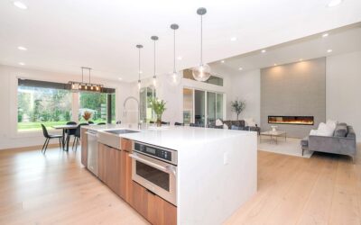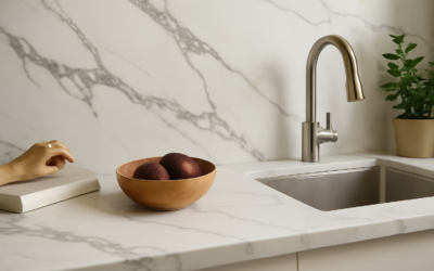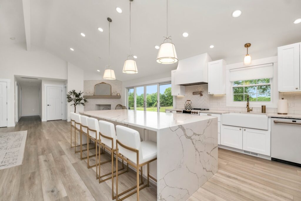
The bold, dramatic veining everyone associates with luxury marble can now live on a countertop that never stains or etches. Calacatta quartz colors span a surprisingly wide range, from warm white slabs streaked with gold to crisp, cool surfaces threaded with charcoal gray, all engineered to mimic the look of rare Calacatta marble without its fragility. Choosing among them is less about right and wrong and more about matching the vein style and undertone to the rest of your kitchen. Once you understand the spectrum, picking the right slab becomes far easier.
Part of our Countertops guide — explore the full guide →
- What Makes a Quartz Calacatta
- The Most Popular Calacatta Quartz Shades
- Warm Versus Cool Undertones
- Vein Style and Movement
- Matching Calacatta Quartz to Your Kitchen
- Finish Options
- Why Choose Quartz Over Real Marble
- Calacatta Versus Carrara Versus Statuario
- How Lighting Changes the Look
- Choosing the Right Slab for You
What Makes a Quartz Calacatta
Calacatta refers to a specific look borrowed from a prized Italian marble: a bright, often nearly white background crossed by bold, dramatic veins. That contrast is the signature. It differs from Carrara, the other famous white marble, which has a softer gray background and finer, more feathery gray veining. Calacatta quartz reproduces the high-contrast Calacatta look in a manufactured slab made of ground quartz and resin, giving you the striking marble appearance with the hardness, stain resistance, and low maintenance of engineered quartz.
The Most Popular Calacatta Quartz Shades
Manufacturers offer dozens of Calacatta-inspired patterns, but they cluster into a few recognizable families.
- Classic white with gray veins: A bright white base with bold gray veining, the most versatile and widely used.
- Warm gold-veined: Cream or warm-white backgrounds with gold and taupe veins, pairing beautifully with warm woods and brass.
- Cool gray-toned: Slightly grayer backgrounds with charcoal veins for a modern, crisp look.
- High-drama bold vein: Thick, sweeping veins with strong contrast for a statement island.
- Subtle and soft: Fine, delicate veining over a clean white base for a quieter, timeless feel.
Warm Versus Cool Undertones
The single most important color decision is undertone, because it determines what the slab pairs with. Warm Calacatta quartz leans toward cream, beige, and gold, and it flatters warm cabinetry, wood floors, and brass or gold hardware. Cool Calacatta quartz reads brighter and whiter, sometimes with a hint of blue or gray, and it suits crisp white cabinets, gray tones, and chrome or matte-black fixtures. Holding a sample against your cabinets and flooring in your actual kitchen light is the only reliable way to judge this, since showroom lighting distorts undertones.
Vein Style and Movement
Color is only half the story; the way the veins move across the slab changes the whole personality of a counter.
- Bold, sweeping veins: Create drama and draw the eye, ideal for an island or a feature wall.
- Fine, linear veins: Read as elegant and restrained, easier to match across multiple slabs.
- Random, organic veining: Mimics natural marble most convincingly but is harder to bookmatch.
- Directional veining: Runs predominantly one way, which affects how you orient the slab on long runs.
If you want a large island to look like a single piece of marble, ask about bookmatching, where two adjacent slabs mirror each other for a continuous flowing pattern.
Matching Calacatta Quartz to Your Kitchen
The slab should harmonize with the elements you are not replacing. With white shaker cabinets and gold hardware, a warm gold-veined Calacatta feels luxurious and cohesive. Against deep navy or green cabinets, a bright white slab with crisp gray veining provides striking contrast. In a modern gray kitchen, a cool-toned Calacatta with charcoal veins keeps the palette tight and contemporary. The backsplash matters too: extending the same quartz up the wall as a slab backsplash creates a seamless, high-end look, while a simpler tile lets the countertop be the star.
Finish Options
Most Calacatta quartz comes in a polished finish, which delivers the glossy, reflective surface that makes the white background pop and the veins gleam. A growing number of slabs also come in a honed or matte finish, which has a softer, more contemporary, more marble-like appearance with less shine. Matte finishes hide fingerprints and water spots better but can show smudges from oils more readily and may require a bit more wiping. For most kitchens, polished remains the popular default, but honed is worth considering if you want a less glossy, more natural-stone feel.
Why Choose Quartz Over Real Marble
The reason Calacatta quartz exists at all is practical. Real Calacatta marble is gorgeous but porous and soft, which means it etches when acidic foods like lemon or wine touch it and stains if spills sit. It needs regular sealing and careful handling. Quartz delivers the same dramatic look in a surface that is non-porous, stain-resistant, and never needs sealing. For a busy kitchen where the counter takes real daily use, that durability is the whole point. You get the visual luxury of marble with the toughness of engineered stone.
Calacatta Versus Carrara Versus Statuario
The white-marble look comes in several named styles that are easy to confuse, and knowing the difference sharpens your choice. Calacatta has a bright, often pure-white background with bold, dramatic, widely spaced veins, the highest-contrast and most luxurious of the group. Carrara has a softer, grayer background with finer, more feathery gray veining, reading more subtle and casual. Statuario sits between them, with a bright white background and crisp, prominent gray veining. When you are shopping quartz, the same naming applies to the engineered patterns, so a slab labeled Calacatta will show that signature bold veining on a white field, while a Carrara-style quartz will feel quieter and grayer.
How Lighting Changes the Look
Few people realize how much light transforms a white quartz countertop until the slab is installed. Warm incandescent and soft LED lighting pulls out the gold and cream undertones in a warm Calacatta, making it glow, while cool daylight and bright white LEDs emphasize the crisp whites and grays. A slab that looked perfectly neutral in a fluorescent-lit showroom can read noticeably warm or cool once it is under your kitchen’s actual fixtures. This is why bringing a large sample home and viewing it at different times of day, in your real lighting, is the single best thing you can do before committing. The veining also reflects differently under a polished versus honed finish as the light hits it.
Choosing the Right Slab for You
Start by deciding warm or cool based on your cabinets, flooring, and hardware, then pick a vein style that matches the energy you want, bold for a statement or fine for understated elegance. Always view a full-size slab or a large sample in your own kitchen light rather than judging from a small chip, since veining and undertone shift dramatically at scale. Whether you land on a warm gold-veined white or a cool gray-streaked surface, Calacatta quartz colors give you the timeless marble look in a countertop built to survive everyday life.