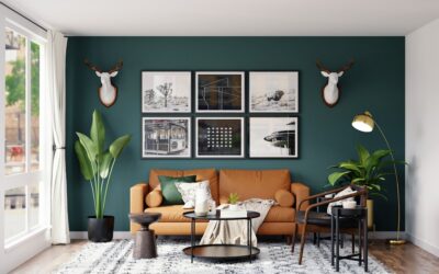
Green is the easiest bold color to live with, which is exactly why a green feature wall has become one of the most requested accents in living rooms, bedrooms, and home offices. Unlike a bright red or navy statement wall, green reads as restful instead of loud, borrowing the calm of the outdoors. The trick is choosing the right shade and the right surface, because a flat coat of paint, a paneled wall, and a living plant wall all create wildly different effects. Get the green right and the whole room feels intentional.
Why Green Works So Well as an Accent
Green sits in the middle of the color wheel, so it pairs comfortably with both warm and cool tones. That flexibility is rare. A sage wall flatters white trim, brass hardware, oak floors, and black accents without clashing. Because the eye associates green with nature, even a deep forest shade feels grounding rather than aggressive in an enclosed space.
Pick the wall the eye lands on first. Usually that is the wall behind a bed, the wall with the fireplace, or the wall a sofa faces. Painting a less prominent wall wastes the effect and can make the room feel oddly unbalanced.
Choosing the Right Shade of Green
Greens span a huge range, and the undertone matters more than the name on the swatch. Bring large sample squares home and look at them in morning and evening light before committing. Here are the families worth considering:
- Sage and gray-green: Muted, soft, and forgiving. Ideal for bedrooms and north-facing rooms that get cool light. Reads neutral enough to live with for years.
- Olive and earthy green: Warm and slightly yellow. Pairs beautifully with terracotta, leather, and wood for a cozy, organic feel.
- Forest and emerald: Deep and saturated. Dramatic behind a bed or in a dining room, especially with brass or gold accents.
- Mint and seafoam: Light, cool, and fresh. Best in bathrooms, laundry rooms, and small spaces that benefit from an airy lift.
In a small or dark room, lighter sage keeps things open. In a large room with plenty of natural light, a deep emerald or forest green can absorb the brightness and add intimacy.
Paint Finish and Application Tips
For a feature wall, an eggshell or matte finish hides surface imperfections and gives green that velvety, sophisticated look. Save satin or semi-gloss for trim, doors, and high-moisture rooms. Deep greens almost always need two coats over a tinted gray primer to reach full, even color; skipping primer on a saturated shade usually means a patchy third coat later.
Cut in the corners and edges with a quality angled brush, then roll the field while the cut-in paint is still wet to avoid lap marks. A 3/8-inch nap roller works well on standard drywall. Keep a wet edge and work in roughly 3-foot sections.
Adding Texture with Paneling
Paint alone is striking, but texture turns a feature wall into architecture. Board and batten, vertical slat wood, beadboard, and fluted panels all read beautifully in green because the shadows between boards add depth. Slat walls in particular have surged in popularity and pair naturally with a forest or olive finish.
You can paint MDF paneling any green you like, or stain real wood for a more organic look. For a budget project, peel-and-stick fluted panels installed over flat drywall give a high-end result for a fraction of the cost of solid millwork. Prime MDF before painting so the color sits evenly.
The Living Green Wall Option
If you want literal green, a plant wall delivers it. Living walls range from a simple grid of mounted planters to full modular systems with built-in irrigation. For most homeowners, a vertical garden of pothos, philodendron, ferns, and trailing ivy in wall-mounted pots is the realistic, low-maintenance route.
Be honest with yourself about light and watering before installing real plants. A true living wall needs bright, indirect light and consistent moisture, and it can stress drywall if water is not managed carefully. Use a waterproof backing or a self-contained planter system, and keep the wall away from outlets. If conditions are poor, high-quality faux greenery panels give the look without the upkeep.
Styling the Wall Once It’s Done
A green wall is a backdrop, so let it breathe. Natural wood frames, rattan, black metal, and brass all pop against green. White or cream furniture keeps a sage wall light, while warm woods and leather make an olive wall feel cozy. Avoid crowding the wall with too many competing colors; one or two accent tones is plenty.
Lighting matters too. Warm-white bulbs around 2700K to 3000K keep greens looking rich and earthy, while cool daylight bulbs can push some shades toward gray or blue. A picture light or a pair of sconces flanking artwork makes the wall feel finished after dark.
Wallpaper and Other Green Options
Paint and paneling are not your only routes to a green feature wall. Removable peel-and-stick wallpaper in a botanical or textured green print delivers pattern and color without the commitment of painting, and it lifts off cleanly when you are ready for a change, which makes it popular with renters. Grasscloth wallpaper in a muted green adds genuine woven texture that reads expensive and pairs beautifully with natural wood furniture.
For a softer, more organic green, consider a limewash or mineral paint finish. These create a subtle, cloudy variation across the wall, almost like aged plaster, that flat latex cannot replicate. The effect is especially striking in olive and sage tones, where the mottled depth makes the color feel layered and alive rather than uniform.
How Light Direction Changes Your Green
Before you commit, think about which way your room faces, because natural light dramatically shifts how green appears. North-facing rooms get cool, indirect light that can push greens toward gray or blue, so a slightly warmer olive or a green with a yellow base often looks better there. South-facing rooms flood with warm light that intensifies color, so a deep forest or emerald stays rich without going muddy. East-facing rooms read fresh and bright in the morning, while west-facing rooms warm up in the afternoon, which flatters earthy greens. Always tape your samples to the actual wall and check them at several times of day before buying gallons.
Common Mistakes to Avoid
Three errors trip people up most often. First, choosing a green from a tiny chip instead of a large sample, which almost always reads more saturated on a full wall. Second, ignoring undertones, so a cool mint clashes with warm wood floors. Third, picking the wrong wall, which scatters the focal point instead of anchoring it.
Take your time with sampling, commit to the wall the room naturally centers on, and your green feature wall will feel calm, current, and timeless for years rather than something you redo next season.