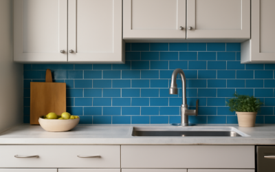
Walk into a kitchen with a light blue backsplash and the room feels calmer, cleaner, and a little bigger than it actually is. That is no accident. Pale blues bounce light, soften the hard edges of cabinets and countertops, and read as fresh without shouting for attention. The catch is that “light blue” covers everything from icy gray-blue to a sunny sky tone, and picking the wrong shade can leave a kitchen feeling cold or dated. This guide walks through materials, shades, layouts, and the small decisions that separate a backsplash you love from one you tolerate.
Part of our Kitchen Remodeling guide — explore the full guide →
Why Light Blue Works in So Many Kitchens
Blue sits opposite warm wood tones and brass hardware on the color wheel, which is exactly why it flatters them. A pale blue tile makes honey oak cabinets look richer and warms up cool gray cabinetry at the same time. It is one of the few colors that bridges traditional and modern kitchens without committing fully to either.
There is a practical angle too. Light surfaces hide water spots and hard-water film better than dark glossy ones, and a soft blue forgives the occasional splatter that a stark white tile would broadcast. If your kitchen runs short on natural light, a reflective light blue can claw some of it back.
Choosing the Right Shade of Blue
Not all light blues behave the same way under kitchen lighting. The undertone is what you are really choosing.
- Gray-blue: Sophisticated and quiet. Pairs with white, charcoal, and stainless. Reads modern.
- Sky blue: Cheerful and a touch traditional. Great with white shaker cabinets and butcher block.
- Powder blue: Soft and vintage. Works in cottage and farmhouse kitchens.
- Aqua/blue-green: Coastal energy. Pairs with sandy tones and natural wood.
Always test under your actual bulbs. Warm 2700K LEDs push blue toward green, while cooler 4000K bulbs make it crisper. Tape a sample tile to the wall and look at it morning, noon, and night before you commit.
Best Materials for a Light Blue Backsplash
The material drives both the look and the price, so match it to how the kitchen actually gets used.
Ceramic and Porcelain Tile
The workhorse choice. Glossy ceramic subway tile in a pale blue runs roughly $3 to $10 per square foot for the tile itself, and it wipes clean with a damp cloth. Porcelain costs a little more but resists scratches and moisture better, which matters behind a sink.
Glass Tile
Glass gives light blue real depth because light passes into the tile and reflects back off the wall. Expect $12 to $30 per square foot. It is stunning but less forgiving to install, since the adhesive shows through.
Zellige and Handmade Tile
Moroccan zellige in a watery blue has subtle color variation and a glossy, slightly uneven surface that catches light beautifully. Budget $20 to $50 per square foot and accept that no two tiles match exactly. That irregularity is the point.
Layout Patterns That Flatter Blue
The same tile reads completely differently depending on how it is set. A classic running-bond subway layout is timeless and cheap to install. A vertical stack makes ceilings feel taller and leans modern. Herringbone adds movement and works well when the tile color is quiet enough to carry busier geometry.
For a small kitchen, larger tiles with fewer grout lines keep the wall from looking choppy. In a generous kitchen you have room to play with a mosaic or a picket-shape tile without it feeling overwhelming.
Grout Color Makes or Breaks It
Grout is the detail most homeowners underthink. A white grout against light blue keeps the look airy and highlights the tile shape. A pale gray grout hides dirt and softens the grid so the wall reads as one calm surface. Avoid dark grout with pale blue unless you specifically want a graphic, high-contrast effect, because it can fight the softness you chose blue for in the first place.
Use a stain-resistant urethane or epoxy grout behind the stove and sink. It costs more and is fussier to apply, but it will not yellow or absorb cooking grease the way standard cement grout does.
Pairing Countertops and Cabinets
Light blue is generous about partners. White quartz with faint gray veining is the safe, bright choice. Butcher block or warm walnut counters give a cozier, more grounded feel. For cabinets, crisp white is the default, but a light blue backsplash also looks intentional against pale gray, soft green, or natural wood cabinetry.
One rule keeps it from going wrong: let the backsplash be the loudest blue in the room, or pair it with cabinets in a clearly different family of color. Two competing blues that are almost-but-not-quite matching is the most common misstep.
Installation and Cost Expectations
A standard backsplash runs about 30 square feet for an average kitchen. Material plus professional installation typically lands between $1,000 and $3,500 depending on tile choice and complexity. DIY-ing it with ceramic subway tile can cut that to a few hundred dollars in materials if you are comfortable with a tile cutter and a level.
If you do it yourself, dry-lay a full row on the counter first, start from the most visible corner, and use tile spacers religiously. Seal cement grout after it cures and reseal once a year behind wet zones.
Common Mistakes to Avoid
A few missteps trip up homeowners again and again. The first is choosing a blue that is too saturated for a backsplash, which reads as bold rather than soft and quickly tires the eye in a room you spend hours in. The second is ignoring the sheen; a high-gloss tile in a sunny kitchen can throw glare across the counter, while a matte or satin finish stays calm. A third is forgetting the trim. End the backsplash with a bullnose tile, a metal Schluter edge, or a clean caulk line, never a raw cut edge, since the perimeter is what makes the job look finished.
Lastly, do not skip the transition where the backsplash meets the counter and the wall above. A thin bead of color-matched caulk in those corners, rather than grout, lets the materials move without cracking and keeps water out of the seam.
Final Thoughts
A light blue backsplash is one of the lowest-risk ways to add personality to a kitchen. It plays well with nearly every cabinet and counter combination, it brightens dim rooms, and it stays out of trend-chasing territory. Nail the undertone, pick a grout that supports the tile rather than fights it, and you will have a backsplash that still looks right a decade from now.