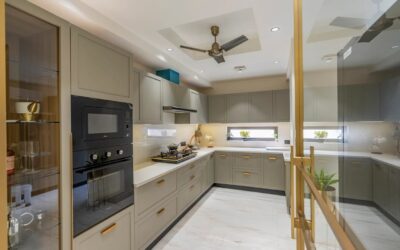
I’ve remodeled hundreds of kitchens, and the request I hear most these days is for clean, calm, uncluttered space. That’s where minimalist kitchen cabinets come in. Done right, minimalist kitchen cabinets make a kitchen feel bigger, brighter, and more expensive than it actually was to build. Done wrong, they look cold and cheap. The difference is in the details, so let me walk you through everything that matters, from door style to hardware to the finishes that hide fingerprints.
Part of our Kitchen Remodeling guide — explore the full guide →
- Start With the Door: Flat-Slab Is King
- Go Handleless for the Cleanest Look
- Frameless European Boxes Matter More Than You Think
- Choose Matte Finishes That Hide Fingerprints
- Building a Minimalist Color Palette
- Storage: The Secret to Staying Clutter-Free
- Get the Proportions and Reveals Right
- Balance the Coolness With Warmth
- Hide the Appliances for a Seamless Wall
- What It Costs and Is It Worth It
- Mistakes That Ruin the Look
Start With the Door: Flat-Slab Is King
The foundation of any minimalist kitchen is the flat-slab door, also called a slab-front. There’s no raised panel, no beveled frame, no decorative profile, just a single smooth surface. That simplicity is the entire point. It reads as modern, it’s easy to wipe clean, and it lets your countertop and backsplash do the talking.
Compare that to a shaker door, which has a recessed center panel and a visible frame. Shaker is a beautiful transitional style, but those frame lines and the grooves that collect crumbs work against a true minimalist look. If you love a little texture, a shaker can lean minimal in a soft matte white, but the purist choice is always the slab.
Go Handleless for the Cleanest Look
Nothing breaks up a run of cabinets faster than a row of knobs and pulls. Minimalist design solves this three ways:
- Push-to-open latches. A gentle press on the door face releases a spring mechanism, no hardware at all. Perfect for uppers where you don’t need heavy-duty daily grip.
- Integrated finger pulls. A routed channel or angled edge along the top or bottom of the door gives you something to grab without any visible hardware.
- Continuous J-channel or reveal. A recessed aluminum rail runs behind the top edge of the doors so you hook your fingers underneath. This is the European look you see in high-end showrooms.
If you insist on some hardware, choose a slim edge pull in matte black or brushed brass, no more than a quarter inch thick. Restraint is everything here.
Frameless European Boxes Matter More Than You Think
Here’s something most homeowners never consider: the cabinet box construction. American cabinets are traditionally face-frame, meaning a wood frame sits on the front of the box. European or frameless cabinets skip that frame, so the doors mount directly to the box sides. The result is wider door openings, more usable interior space, and that seamless full-overlay look where doors sit flush against each other with just a razor-thin reveal between them.
For a minimalist kitchen, frameless is the way to go. IKEA’s SEKTION system is frameless and remarkably affordable, which is why designers quietly use IKEA boxes with upgraded custom slab doors from third-party companies. You get European construction at a fraction of custom pricing.
Choose Matte Finishes That Hide Fingerprints
Finish is where a lot of minimalist kitchens go wrong. High-gloss looks stunning in a photo and shows every single fingerprint in real life. On a dark gloss door, you’ll be wiping smudges twice a day. I steer clients toward matte and super-matte finishes instead.
Look for laminate or thermofoil doors with an anti-fingerprint matte coating, or a painted MDF slab in a flat sheen. Matte surfaces diffuse light softly, hide oils, and feel warm to the touch. A textured woodgrain melamine is another great option; it brings organic warmth while staying low-maintenance. Save the high gloss for a single accent, like an island, if you love the drama.
Building a Minimalist Color Palette
Minimalism is not the same as all-white, though white certainly works. The trick is a restrained palette of one to two colors plus a natural material. Some combinations I keep coming back to:
- Warm white and pale oak. Timeless, bright, and forgiving. The oak grain keeps it from feeling clinical.
- Greige and matte black. Soft gray-beige cabinets with black hardware and fixtures read sophisticated and hide wear.
- Deep forest or charcoal with brushed brass. A moodier take that still feels calm because the palette stays tight.
- Monochrome white on white. Cabinets, counters, and backsplash in one tone, letting form and light carry the room.
The rule is simple: fewer colors, higher quality materials. When you strip away decoration, everything else has to be excellent because there’s nowhere to hide.
Storage: The Secret to Staying Clutter-Free
A minimalist kitchen only stays minimalist if everything has a home behind those clean doors. This is where you invest. Deep drawers instead of lower cabinets with shelves make everything reachable and visible. Full-extension soft-close glides on every drawer are non-negotiable at this level. Inside, add:
- Custom drawer dividers and pegboard inserts for dishes and cookware
- A tall pull-out pantry to corral dry goods behind a single flush door
- An appliance garage with a pocket door to hide the toaster and coffee maker off the counter
- Integrated waste and recycling pull-outs so no bin ever sits in the open
Clear counters are the visual signature of minimalist design. If your storage is smart, the surfaces stay empty, and that emptiness is exactly the calm you paid for.
Get the Proportions and Reveals Right
Minimalism lives and dies by precision. When there’s no decoration to distract the eye, every gap and misalignment jumps out. This is where a good installer earns their fee. The reveal, that thin shadow line between doors, should be consistent all the way across a run, typically an eighth of an inch. Doors should align at the top and bottom so the horizontal lines flow unbroken.
Think about scale too. Taller upper cabinets that run to the ceiling eliminate the dust-collecting gap above and give you a clean, floor-to-ceiling plane. Drawer fronts stacked in equal heights look more deliberate than a random mix. And full-height slab doors on a pantry read as one calm surface rather than a busy grid. These are small decisions, but stacked together they’re the difference between a kitchen that looks designed and one that just looks bare.
Balance the Coolness With Warmth
The most common mistake I see is a minimalist kitchen that ends up feeling like a hospital corridor. Clean lines can tip into cold if you’re not careful, so build in warmth deliberately. A run of pale oak or walnut on the island breaks up an all-white scheme. Natural stone with visible veining, brass or wood accents, and warm under-cabinet lighting at around 2,700 Kelvin all soften the space. Even a single open shelf in wood, styled with a couple of real objects, keeps the room feeling lived in rather than sterile. Minimalism should feel serene, not empty.
Hide the Appliances for a Seamless Wall
To finish the look, consider panel-ready appliances. Your refrigerator and dishwasher get fronted with the same slab doors as the cabinets, so they disappear into the run. A panel-ready dishwasher adds a few hundred dollars, and an integrated fridge is a bigger investment, but the effect of one unbroken wall of cabinetry is what separates a truly high-end minimalist kitchen from one that just looks plain.
What It Costs and Is It Worth It
Minimalist cabinets span a wide range. An IKEA-box kitchen with upgraded slab doors might run $6,000 to $12,000 in materials for an average kitchen. Semi-custom frameless lines land around $15,000 to $30,000, and full custom European cabinetry can exceed $50,000. The good news is that the clean-lined aesthetic actually scales down well; simple slab doors are cheaper to manufacture than ornate ones, so you’re often paying for quality construction rather than decoration. Spend where it counts, on the boxes, the hardware, and the storage inserts, and your kitchen will feel serene and expensive for years.
Mistakes That Ruin the Look
Over the years I’ve been called in to fix plenty of minimalist kitchens that missed the mark, and the failures repeat themselves. Learn from them:
- Cheap hinges and slides. Handleless doors rely on push-to-open and soft-close mechanisms working flawlessly. Bargain hardware fails within a year and turns a sleek kitchen into a frustrating one. Buy Blum or Hettich and don’t look back.
- Too much high gloss. An entire kitchen in dark gloss becomes a full-time fingerprint-wiping chore. Reserve gloss for accents.
- Ignoring the ceiling gap. Uppers that stop short of the ceiling leave a dust shelf that reads as unfinished. Run them up or add a filler.
- Forgetting the toe kick. A recessed, dark toe kick makes cabinets appear to float and keeps the base line clean. A clunky matching toe kick weighs the whole run down.
Avoid those four and you’re most of the way to a kitchen that looks like it came out of a design magazine rather than a builder’s catalog.